Agency: formascope agency
–
Description:
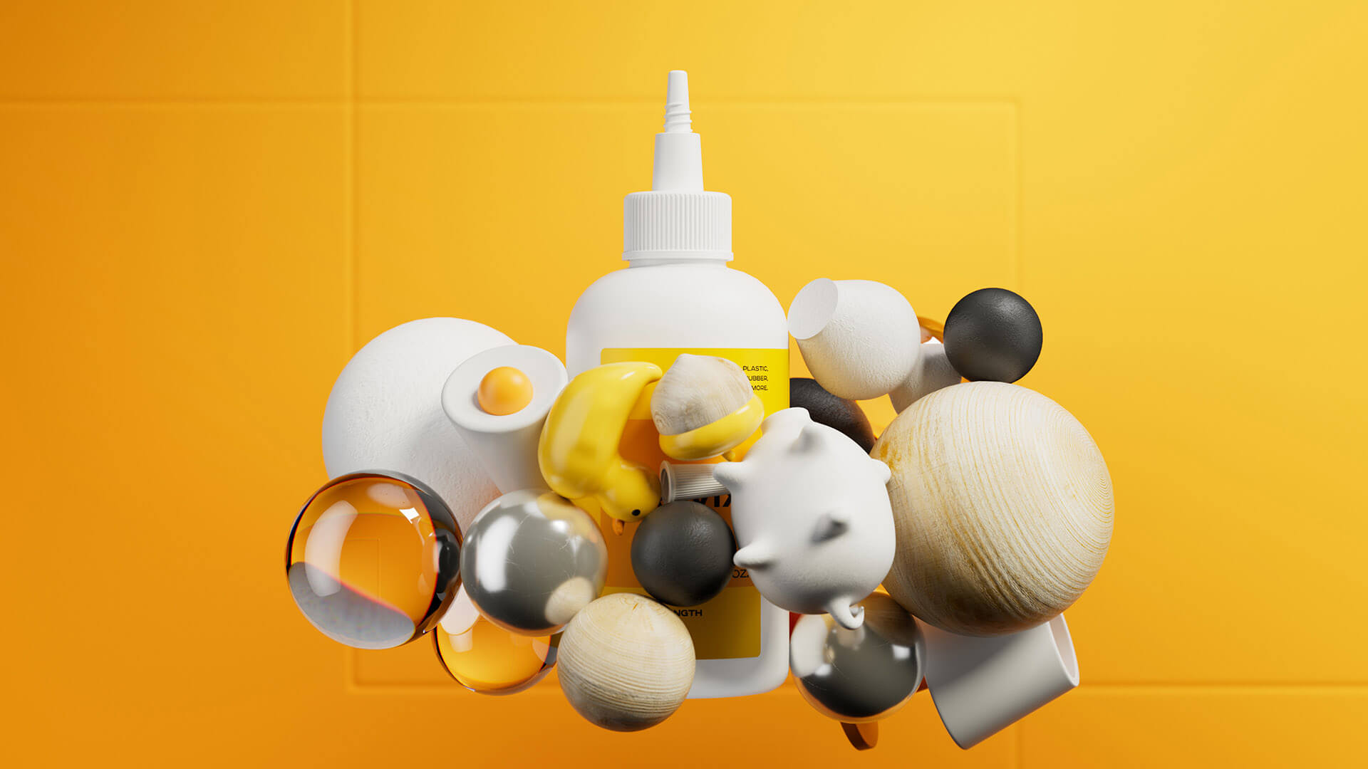
Gluemasters is a famous premium quality glue in the US market.
After completing the rebranding for Gluemasters, the company approached us to create a new brand for the European market.
Our challenge was to create a brand name that is easy to pronounce in that market; a brand concept; and a packaging design that reveals the power of the product and its right positioning in the market.
Target audience: People who use glue for household projects and repairs, arts & crafts, and for their professional hobbies.
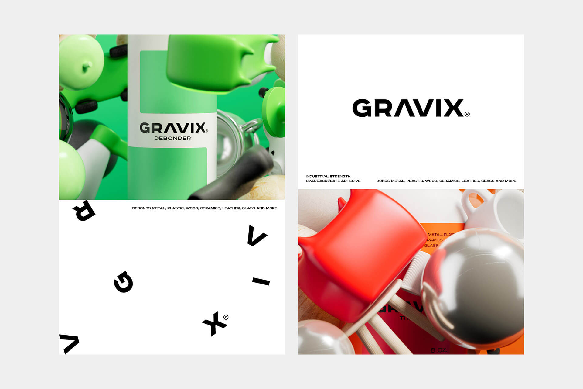
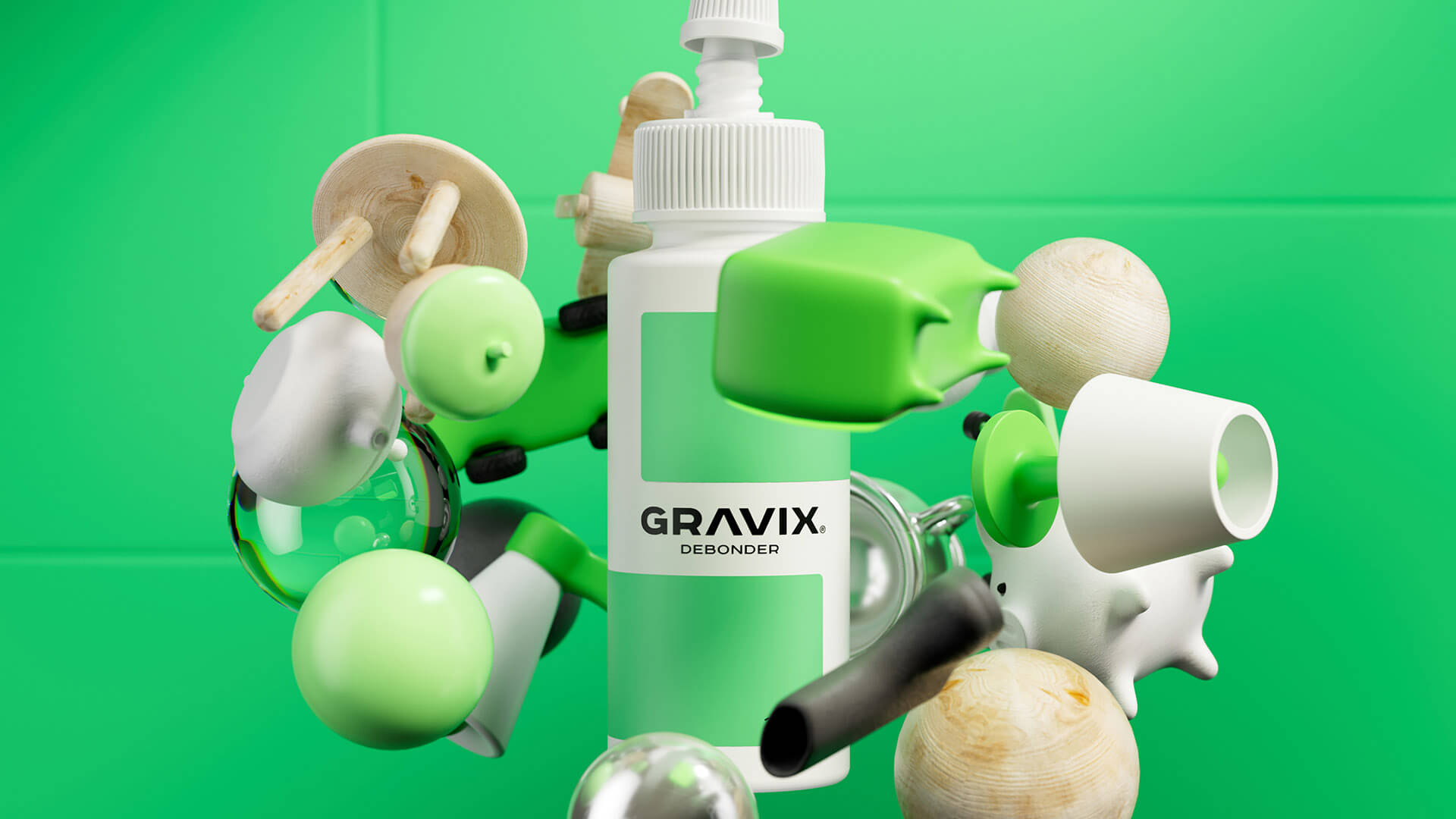
What does glue have in common with gravity? How is it possible to show the functionality of glue through gravity?
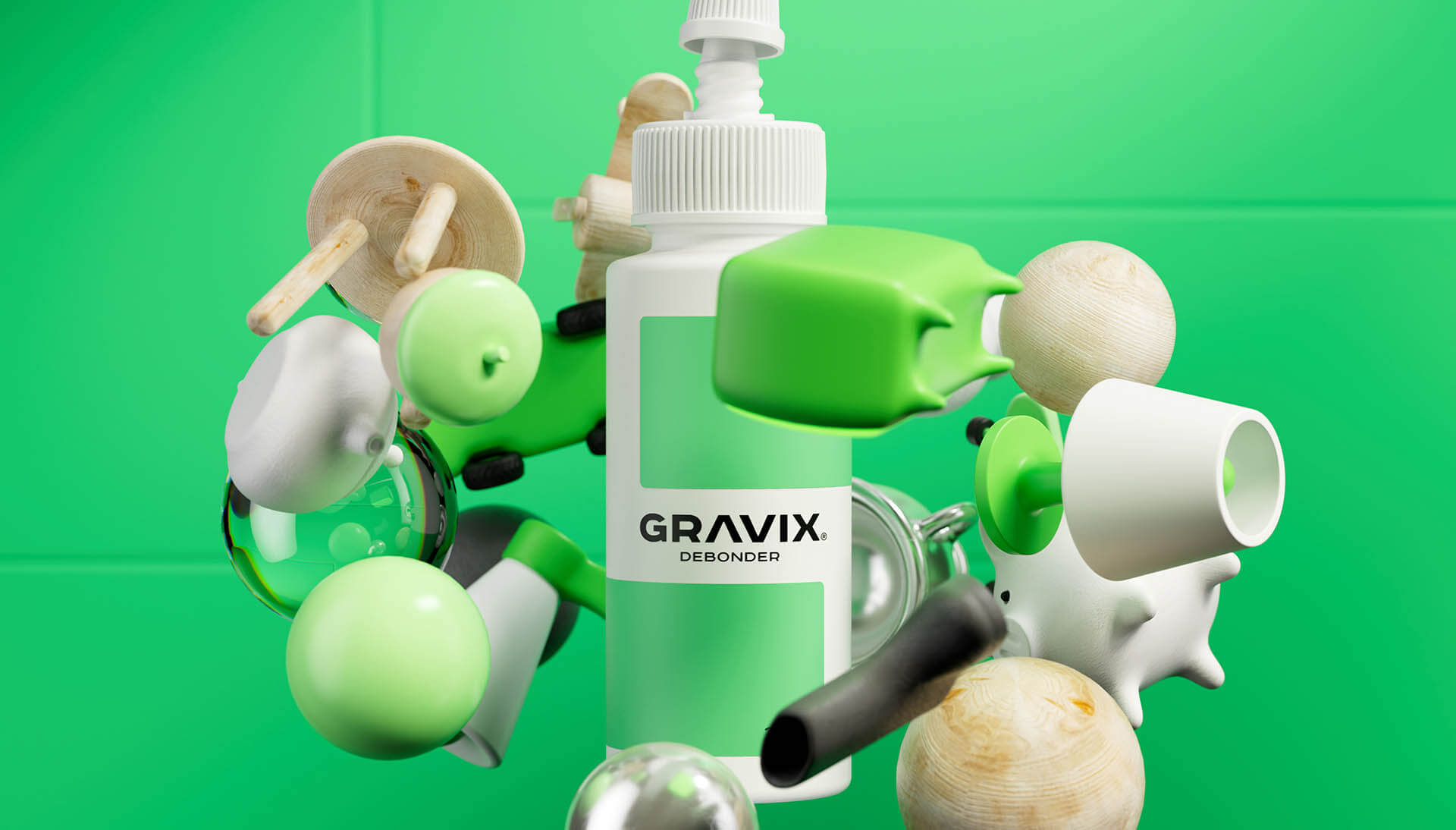
We emphasized the strong formula of the glue and drew a parallel between two things: gravity and glue. The concept is based on the law of physics, mostly the force of attraction. Taking into consideration that force, a brand name Gravix has been created.
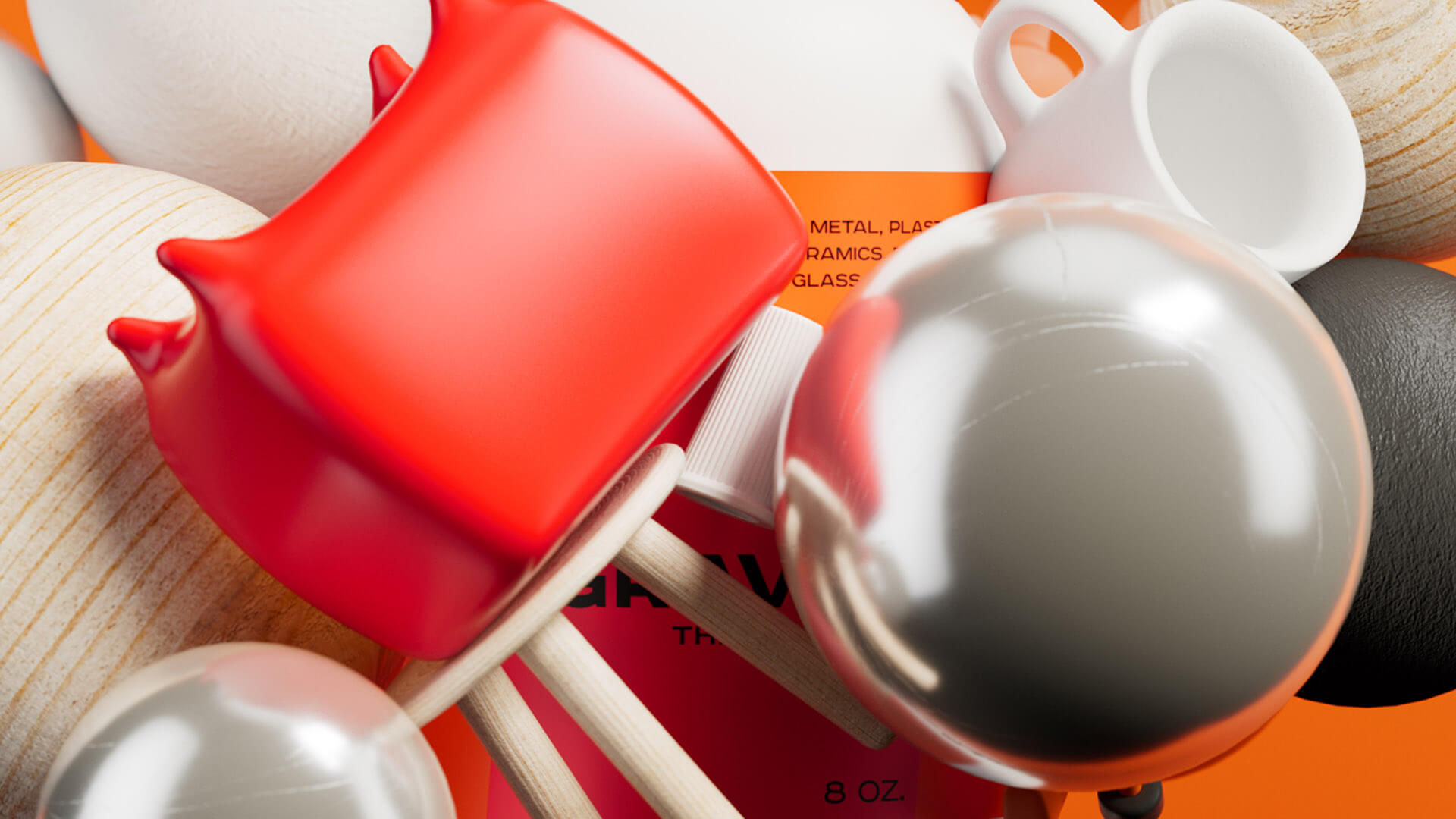
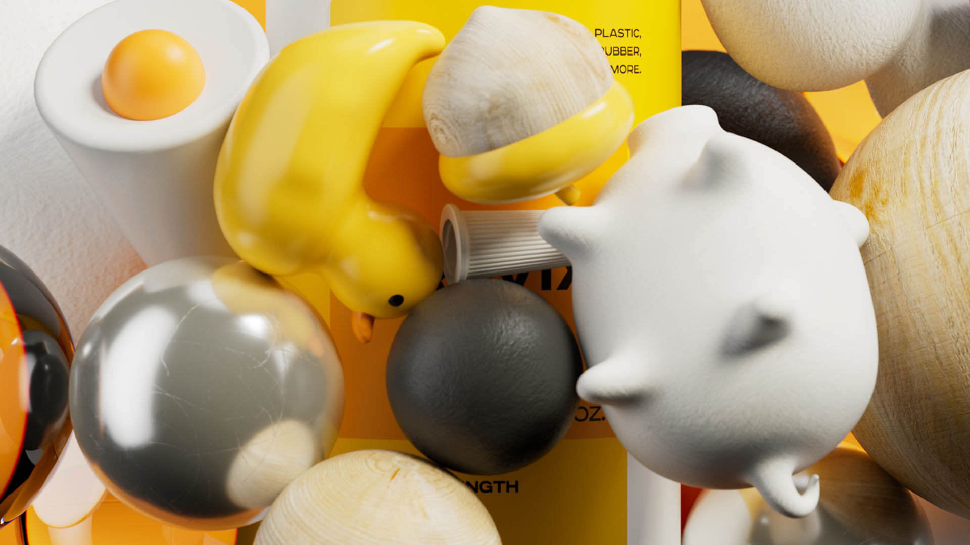
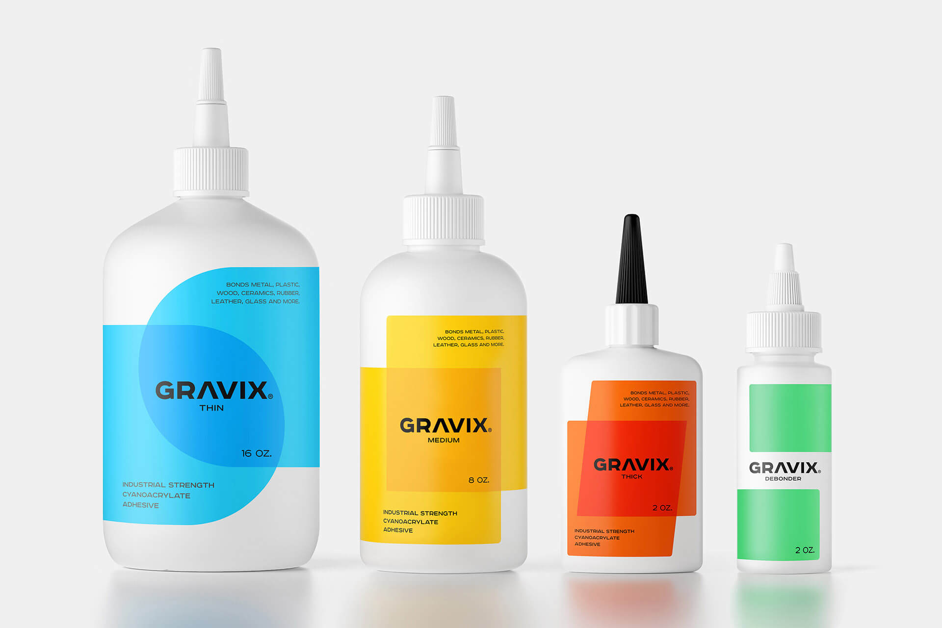
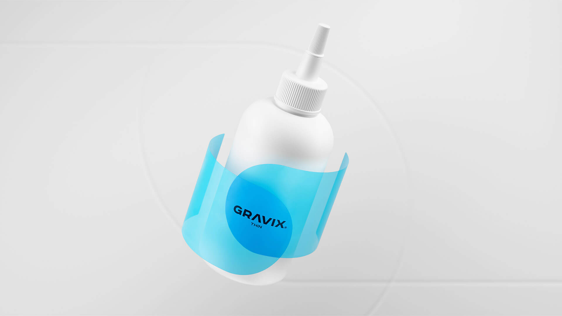
It consists of two words (gravity and fix). On the label design, there are 2 objects that are connected to each other.
By changing the forms, we got adhesives of different viscosities (thin, thick, medium).
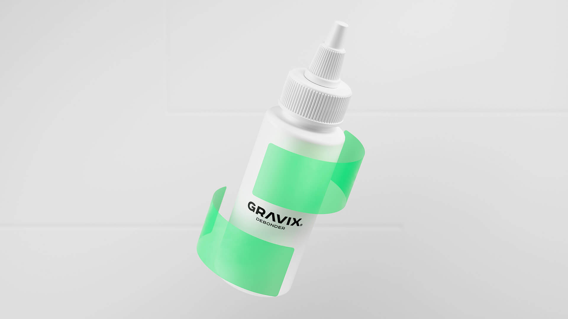
The overlapping forms show the percentage of fluidity – the rounder the wetter, the pointer the denser. Besides adhesives, there is a debonder (an adhesive remover) in the product line. On the label packaging, 2 objects are separating from each other, showing that the gravity has “ceased.”
Featured on Package Inspiration
We are young team which works to inspire packaging designers every day! Our team select the best packaging of today and shares with you.
