
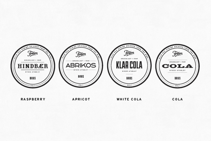
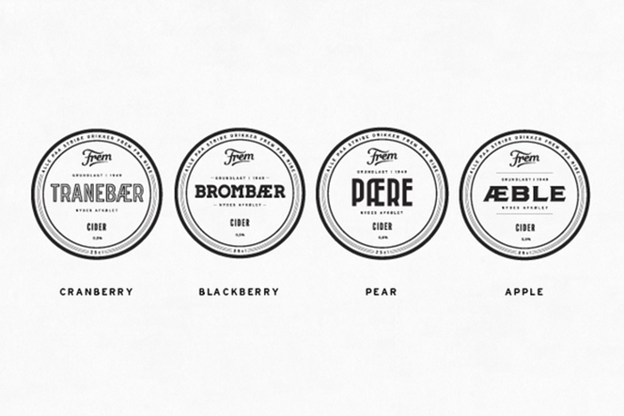
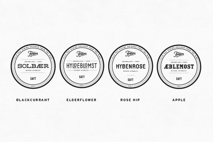
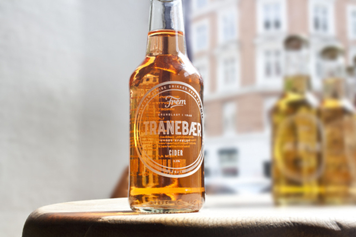
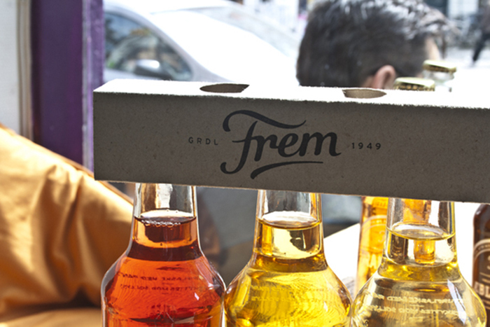
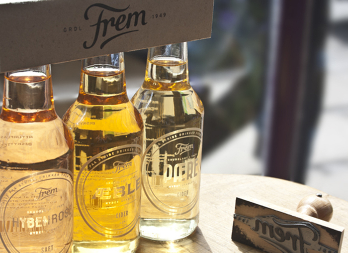
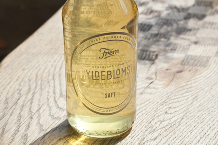
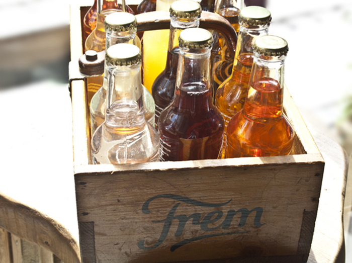
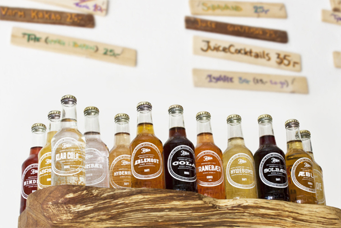
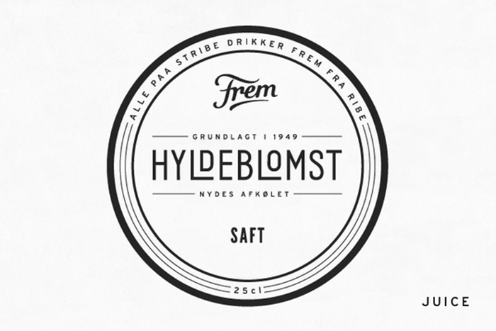
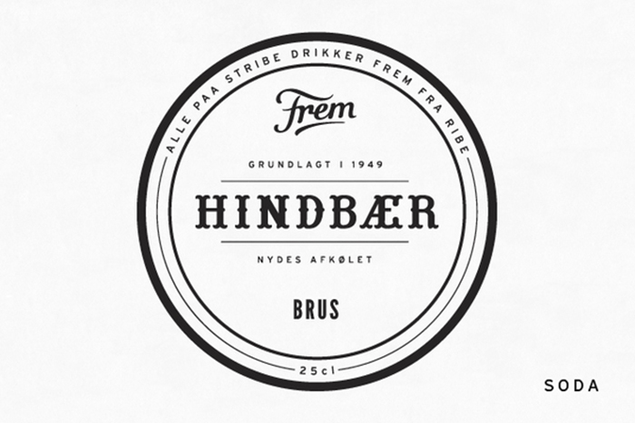
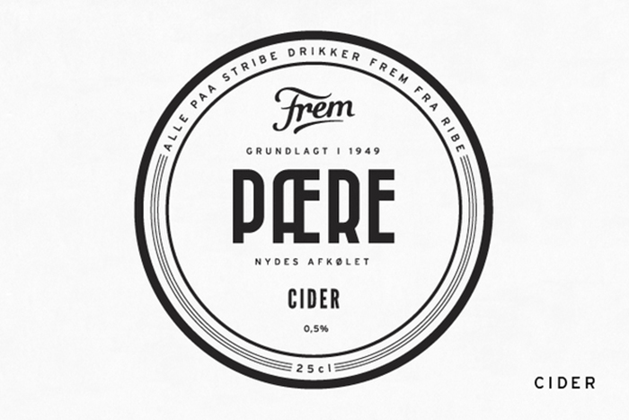
A packaging redesign of “Frem” which is a danish soft drink factory. I did twelve unique bottles and some extra packaging just to show how their full identity could look like. The factory was established in 1949 and I have focused on history, craftmanship and authenticity. All the typography is hand drawn and the labels are white paint directly on the bottle – reveal rather than hide. The twelve display fonts are made from associations, cliches, shapes and so on. Raspberry and pear are for instance inspired by the shape of the fruit/berry and Cola is an amereican cliche with a typical western wood type.
Designed by: Jonathan Faust, Denmark.






Featured on Package Inspiration