–
Designed by: Asprey Creative, Australia.
–
In a category experiencing strong overall growth, the Frantelle brand was losing share due to increasing pressure from private label and budget brands. Our challenge was to create a compelling brand story for a trusted Australian brand with high awareness, but needing to differentiate itself from other waters.
With rational benefit so difficult to differentiate in bottled water, we knew we needed to build an entirely emotional reason to believe. We gave the brand a distinctive personality and tone of voice to re-engage with bottled water consumers.
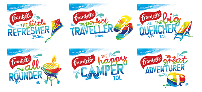
Our solution breaks new ground in the water category by building a bold, motivational and fun call to action on each pack format that’s specific to its primary usage occasion. We built a brand story around gently and light- heartedly encouraging people to think about the need to keep hydrated and the occasions when water would be handy. And we drew on some iconic Aussie symbology to reinforce the brand’s heritage and newly found wit.
The new look Frantelle is anything but boring – it’s contemporary, witty, energetic, and stands out in a sea of bottled water sameness.

Featured on Package Inspiration