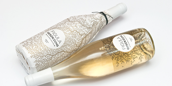
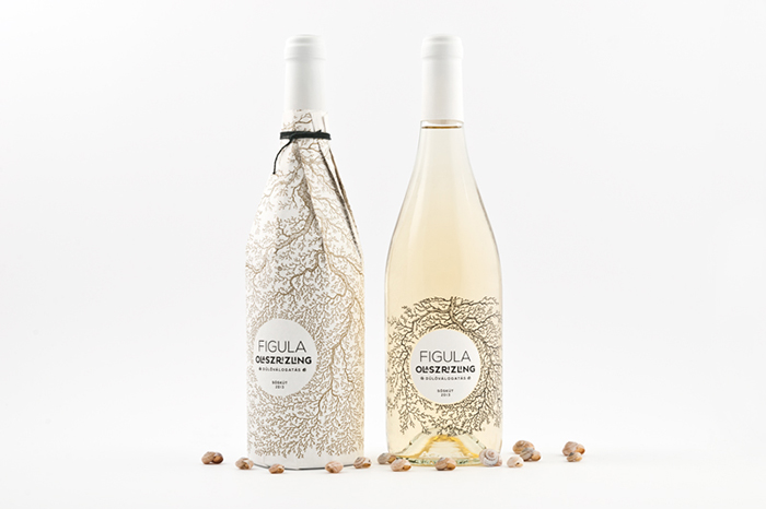
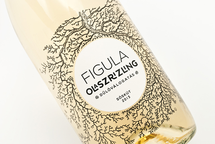
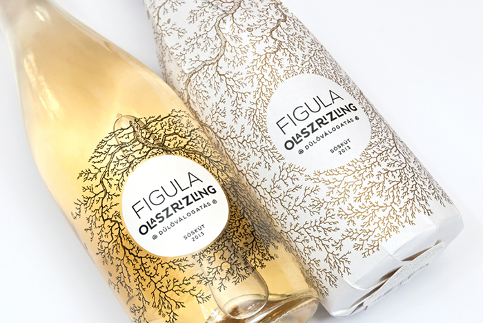
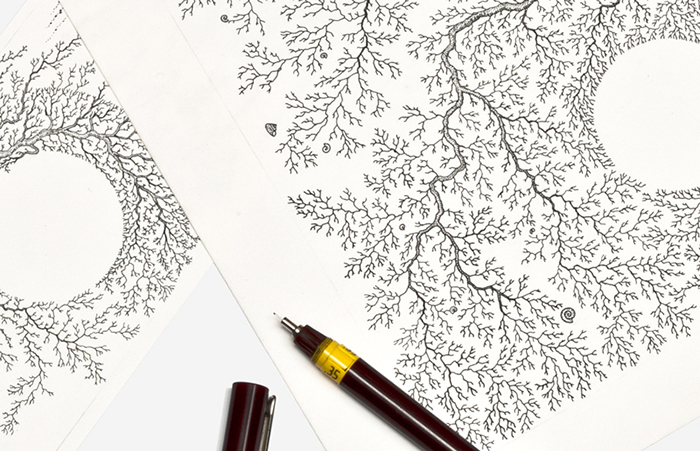
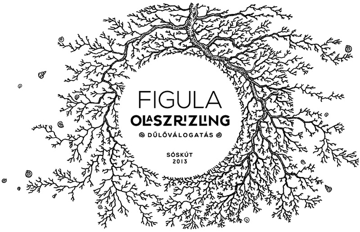
Our work intends to highlight the importance of the land and the vine as a plant on which a great emphasis was placed on the description of the competition. The focus is mainly on the 35-year-old roots, witch enmeshes the bottle defining a circle that marks the location of the typography as the nature outlines the wine. To do this, we have created custom typography and drawing. The simplicity of the label and the lacy drawing help each other, the Olaszrizling playfully emphasized as the title of the vine, the vineyard selection (dűlőválogatás) is marked between two snail houses from the illustration. The snail is as perfect and living form that appears on the label, which symbolizes the good and healthy living soil. The root on the outside wrapping is gold, which creates a feeling of quality and aesthetic effect and on the inside gold is the color of the wine and the roots are black.
The wine label designed for the Cégér a jó bornak creative competition was selected amongst the best 10.
Designer: Peltán-Brosz Roland and Rohmann Nóra, Hungary.
Client: Cégér a jó bornak (Competition)






Featured on Package Inspiration