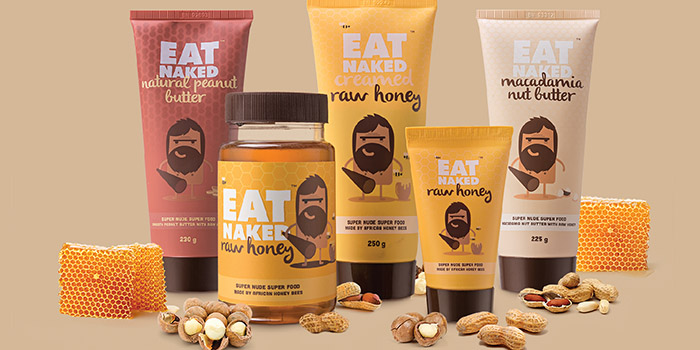
We were approached by a newly-founded health food company to develop its identity, from name generation to packaging design and
everything in between.
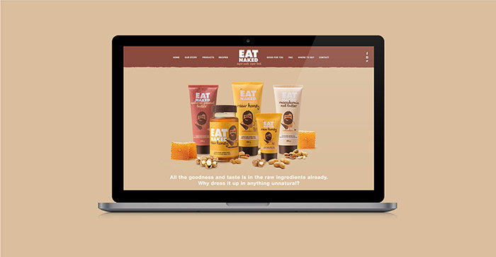
The brand specialises in raw, unadulterated foods free from sugar and unnecessary additives, and was to launch a superior-in-quality raw honey
and honey-infused peanut and macadamia nut butters.
A quick stroll down the health-food aisle revealed that the majority of products have a wholesome, generic “farmstall” look and feel, which tends
to be bland and overused. We wanted to show that wholesome doesn’t equal boring and create a brand that looks as good as its products taste.
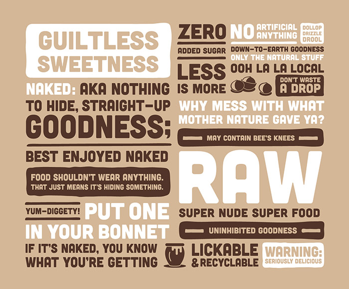
Steering clear from overtraded terms such as ‘pure’ and ‘homemade’, we conceived the name Eat Naked to express the brand’s focus on raw, superior-quality, unadulterated foods that are free from sugar, preservatives and – nonsense. With this in mind, the identity was inspired by our
club-swinging ancestors, prehistoric man, who thrived on a diet of clean, raw foods (while wearing very little clothes).
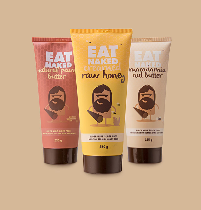
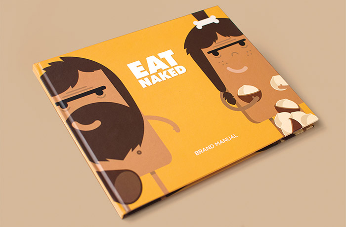
The identity features an illustrated caveman, with a discreetly-placed bam bam club, single-mindedly communicating the concept ‘naked’.
The notion of ‘eating like a caveman’ appeals to the brand’s back-to-basics philosophy. The design in rendered in a flat, vector-illustration style,
unique to this category, and uses a natural yet vibrant colour palette derived from the ingredients themselves.
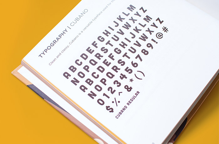
The concept has been translated into the logo type, aka ‘Naked Neanderthal’, which has a subtle stone-chiseled appearance. The velvety-matte
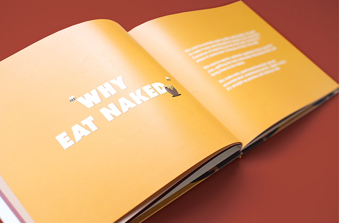
finish of the packaging has been extended to the brand bible cover, reflecting the superior quality of the products.
Designed by: Utopia Agency, Sean Creighton, South Africa.



Featured on Package Inspiration