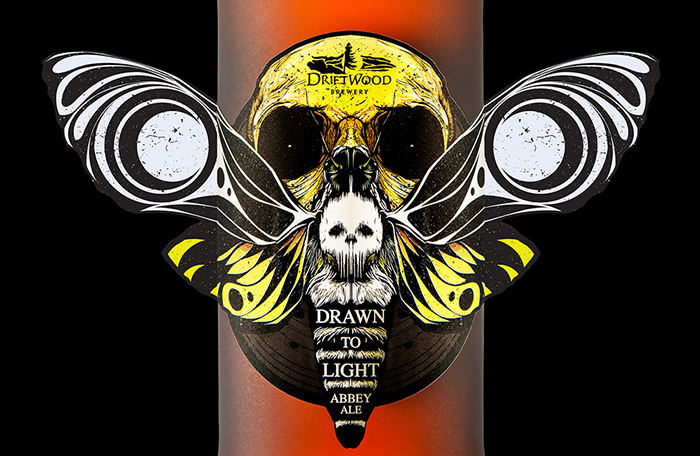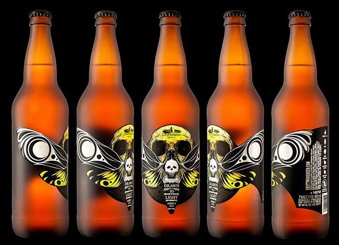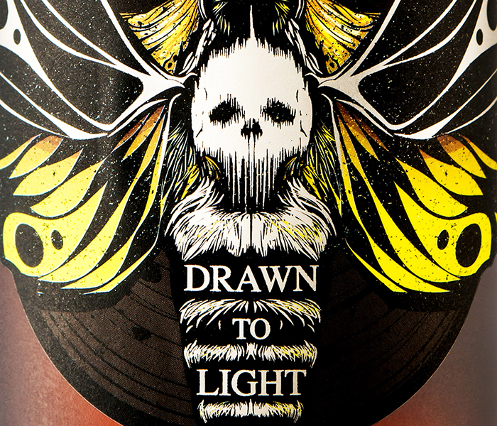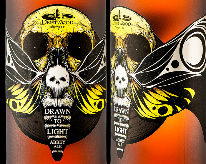
For Driftwood Brewing’s Drawn to Light Abbey Ale, our redesign of the beer formerly known as Spring Rite, we decided to change the name and the visual brand completely, no longer depicting monks directly; rather, we decided on a metaphoric approach to convey the cloistered, darkly candlelit existence of the trappist monks, and the transmutative nature of the beer, illustrating the metamorphosis of a death’s-head hawkmoth. The label features bold, graphic abstraction in the wings, set against hairline-fine illustration, all rendered in tight silver foil on striking black and yellow.
From Sleep’s dark cloister, spinning uneasy dreams of gone lives and long grass, this Abbey Ale has awoken to find itself transformed. Fresh hops when young give way to barnyard rafters with time, and all things are become wild. Wings unfold. The creature is drawn to light.
Designed by: Hired Guns Creative, Canada.
Printer: Westkey Graphics
Photography: Sean Fenzl


Featured on Package Inspiration