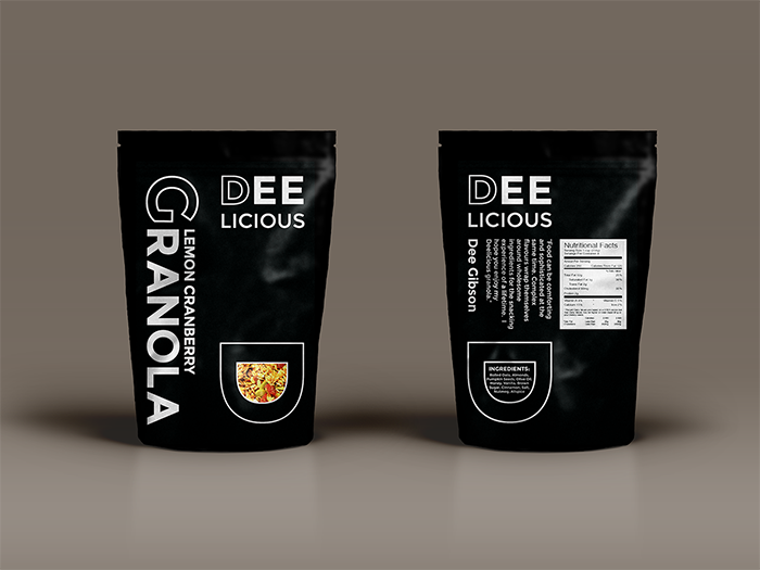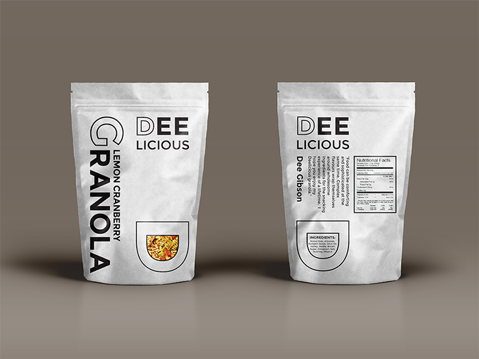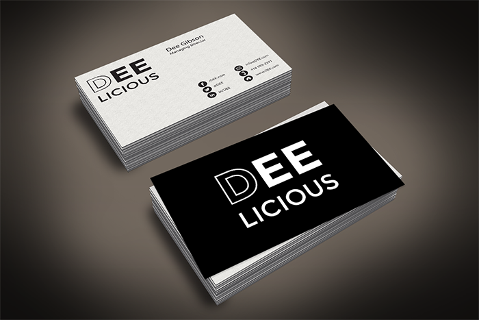
Objective: to design Dee Gibson’s identity, her logo and also packaging for her new granola product. She wanted her identity to reflect her innovative and modern cuisine and her taste for bold clean black and white graphics and typography. I used a modern sans serif font and made the D outline her signature. The D shape also became the bowl for the granola and resembled a mouth or tongue to denote delicious. The modern typesetting reflects her desire to be associated with cutting edge contemporary design.
Designed by: Sarah Fordham, Canada.


Featured on Package Inspiration