Dageraad Brewing bottled their first beer in the Spring of 2014, entering a competitive West Coast craft beer market. Despite a saturated market Dageraad had an opportunity to stand out as one of the only breweries in the area focusing exclusively on Belgian-style beer. Dageraad brews two regular beers and a series of limited edition seasonals, all available in single-serve bottles and refillable growlers.
We worked with Dageraad from their inception to craft the brand character which would establish their presence as a new brewery creating unique and sophisticated beers. A brand language was developed which focused on hand-lettering, and typographic and graphic details influenced by design movements such as the Vienna Secession. The name Dageraad, which in Dutch means ‘dawn’, inspired the more wistful elements of the brand—subtle illustrations of moons, suns and a night sky, and the contrasting light, dark and gold colour palette all allude to the golden hour where night surrenders to day, perhaps to the drinker’s despair.
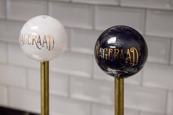
The brand’s primary application and the first product experience is the packaging for which we carefully chose quality material and production methods. Design also extended into custom tap handles, collateral, merchandise, a website, and eventually a tasting room.
Designed by: Eli Horn, Fivethousand Fingers, Canada.

Featured on Package Inspiration