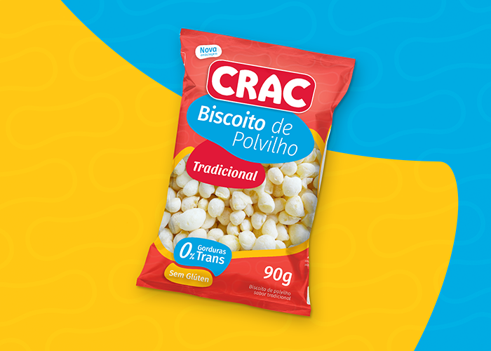
Curves and strong colors that reflect the casualness of tapioca flour biscuit
Crac’s tapioca flour biscuit was made free of trans fats and preservatives. Its ingredients, natural and selected, offer healthier food, always crispy and irresistibly tasty.
The new design was thought to attract the consumer’s attention and to show the product. Happy colors were mixed to express the feeling that the flour biscuit provides. Because of the colors, the packaging stands out at the point of sale, creating a better visibility to the product and greater visual appeal.
On the front of the packaging, Crac’s logo was expanded to highlight the strength of the brand at the POS. The window was redesigned to become broader and show more the product to the consumer. On the back, things were diagrammed to make the information clear, easily readable for the consumer, something that’s very important nowadays.
Designed by: Thail Gomes, Brazil.

Featured on Package Inspiration