Designed by: Path, UK.
Cornerstone, the UK first and biggest subscription-only male grooming brand, is launching a new line of dental care products. This bold step moves the brand closer to achieving its goal to own the bathroom and be the ‘Cornerstone of your day.’
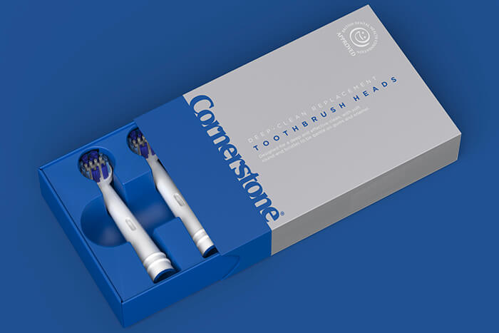
London-based strategic brand agency Path has served as Cornerstone’s creative partner and brand guardian from the beginning. Their work on the brand’s introduction to the market and initial shaving range earned a silver DBA this past year. For this exciting new venture, Path was tasked with developing a brand strategy that provided rationale in positioning the new dental care line within the existing portfolio. This strategy would inform a brand design solution that balanced the efficacy-driven category cues of dental care with the simplicity of the Cornerstone brand. The scope of the project also required a bespoke cardboard structure design for toothbrush heads packaging.
Balancing Act
Notwithstanding a few notable challenger brands, the dental care category characteristically features a clinical aesthetic with an emphasis on efficacy and fresh sensation. The challenge Cornerstone faced was to find a way to reconcile consumer expectations of the category with the stylish simplicity of its current brand identity. Successfully striking the right balance would would convey expertise to answer the consumer’s dental needs whilst also driving their desire for a stylish lifestyle brand.
Beyond effectively launching the dental care range, the solution needed to future-proof the brand for further brand extensions.
The Cool Blue Line
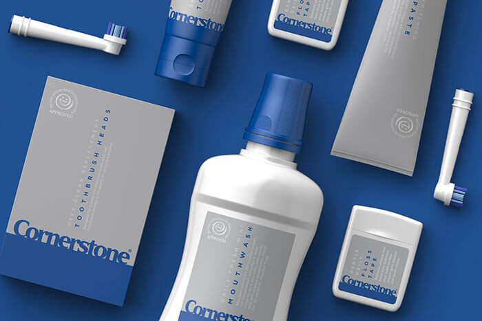
The powerful use of colour supports portfolio architecture, providing intuitive direction for consumers to navigate the different ranges whilst also preserving the modern simplicity of the Cornerstone brand. The new dental care range features a deep yet soft blue that plays to the conventions of the dental care category whilst also distinguishing it from the bold red palette of the shaving range. A metallic silver seal communicates the products’ clinical credentials and further supports the efficacy of the new dental care range. Product information is kept to the minimum, giving the brand a clean and understated aesthetic that reflects the brand’s values of quality and convenience. And finally the brand’s wordmark has retained its powerful presence at the base of the pack to unite the portfolio and elevate Cornerstone’s position as a lifestyle brand.
The Future of Male Grooming
“Cornerstone debuted with a modern identity that made male grooming simple and a unique offering that supported convenience, “ comments Gökçe Şahbaz, Creative Director at Path. “Key to our solution was ensuring that principles were in place to support brand growth without sacrificing the qualities that made it successful in the first place. The new dental care range fits perfectly, providing consumers with the expertise the need from a brand that they want.”
Cornerstone founder, Oliver Bridge comments: “Cornerstone has great ambition to provide the modern men with a better, simpler way to groom. Path have been indispensable partners, providing us with a design system that will support our growth and continue to deliver it to our subscribers with understated style, quality assurance, and simple convenience.”

Featured on Package Inspiration