–
Designed by: musk, Poland.
Collaboration: Agnieszka Starzyńska – copywriter
–
This is our another project for the chocolate industry.
In counterpoint to similar products on the market, which are often designed in the style of luxury goods (gold prints, dark packaging) we focused on simple and light design.
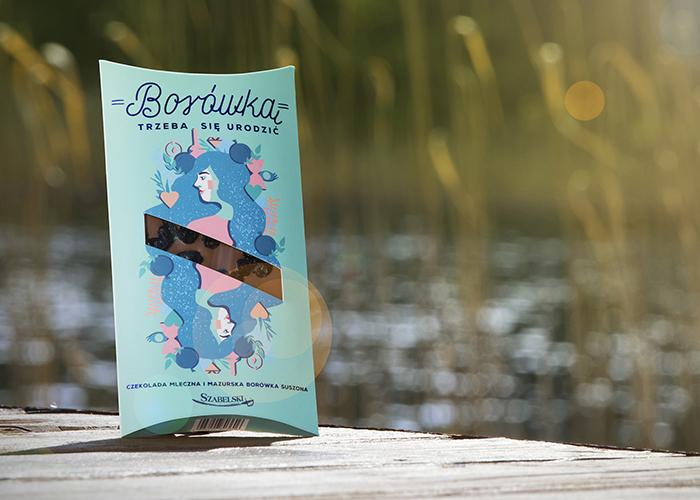
The positive effect of chocolate bars (pictograms of vitality, strength, concentration, vitamins, etc.) has been illustrated with a seriers of brand heros referring to a particular taste (Mr. Walnut, Blueberry Lady, Mrs. Plum, Mrs. Bitter).
Reflected graphics, that reminds playing cards increase readability regardless of the position on the table / shelf in a shop. On the obverse we designed a cutout through which the type of chocolate and flavor is visible.
For the project we prepared copyright titles referring to Poland and Mazury region (in the form of a game with known polish proverbs) and a brief description on the back of the packaging.
The project involves the development of 16 different designs and tastes.

Featured on Package Inspiration