Designed by: Abingo Wang, W/H Design, Taiwan.
The target audience of “Chiko Traditional Essence of Chicken” is the group of 27 to 32 year-old females who are financially independent and start to look after themselves both in health and appearances. “Chiko Traditional Essence of Chicken” aims at being the daily dietary supplement for young women.
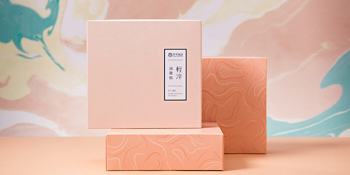
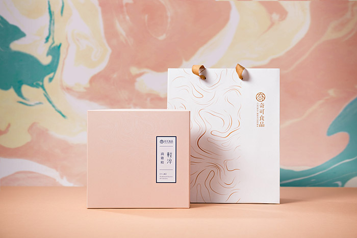
After the market analysis, a variety of similar products with identical packaging designs were found in the current market. Most of the brands in the market inevitably have a clear image of the shape of chicken on their packaging. We then decided to adopt a different visual concept of “flowing liquid” to be the primary vision for the brand to avoid the similarity of other brands. We proposed an imaginative way to bring out the delicious aroma of chicken essence. The use of colors also has the direct visual connection to young women. Instead of focusing on the actual benefits of the product, the design emphasizes on the passion and creation of the brand. The packaging has successfully built brand differentiation in the market. The first launch of “Chiko Traditional Essence of Chicken” has driven hot sales. It is then proved that an effective design strategy will increase the brand’s value.

Featured on Package Inspiration