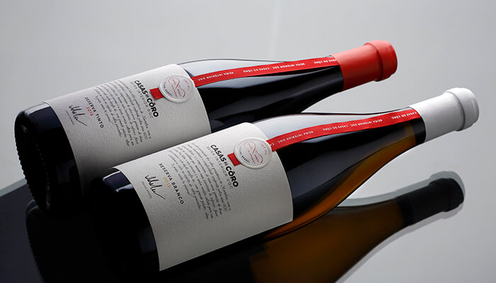
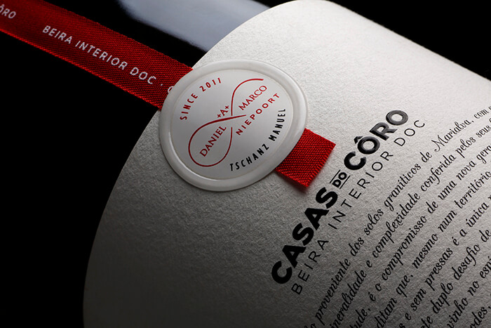
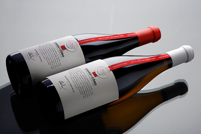
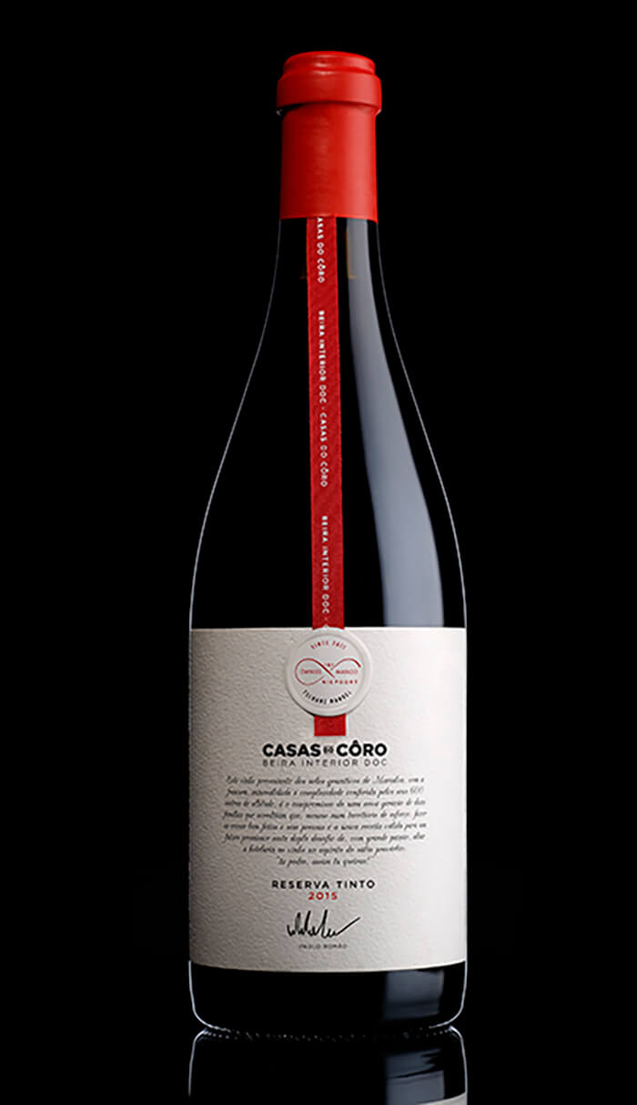
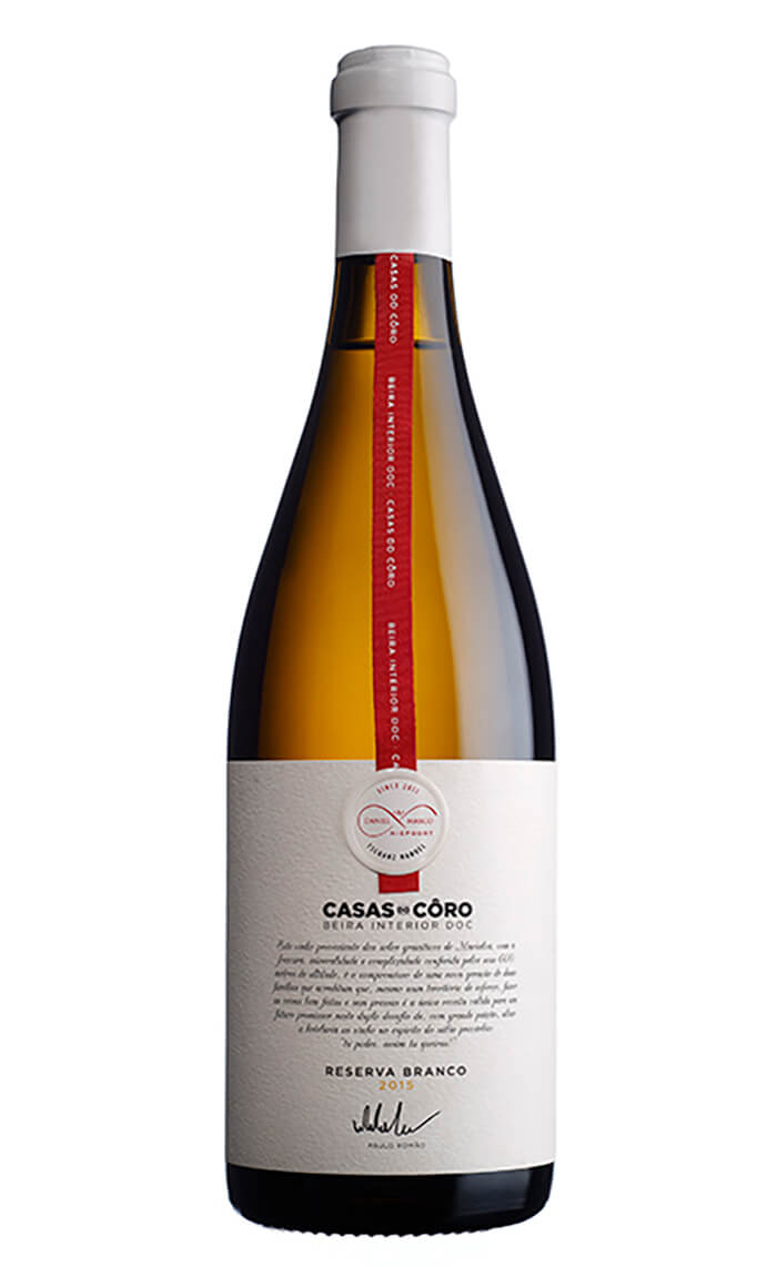
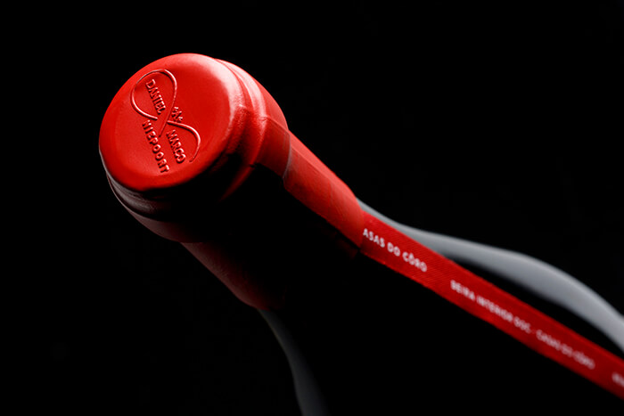
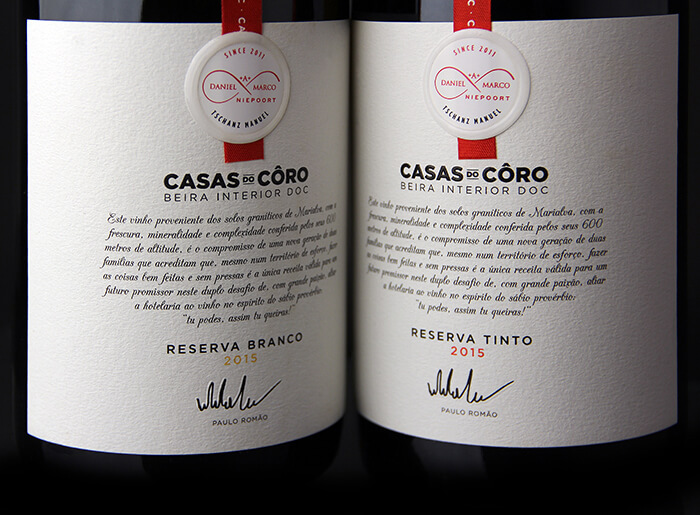
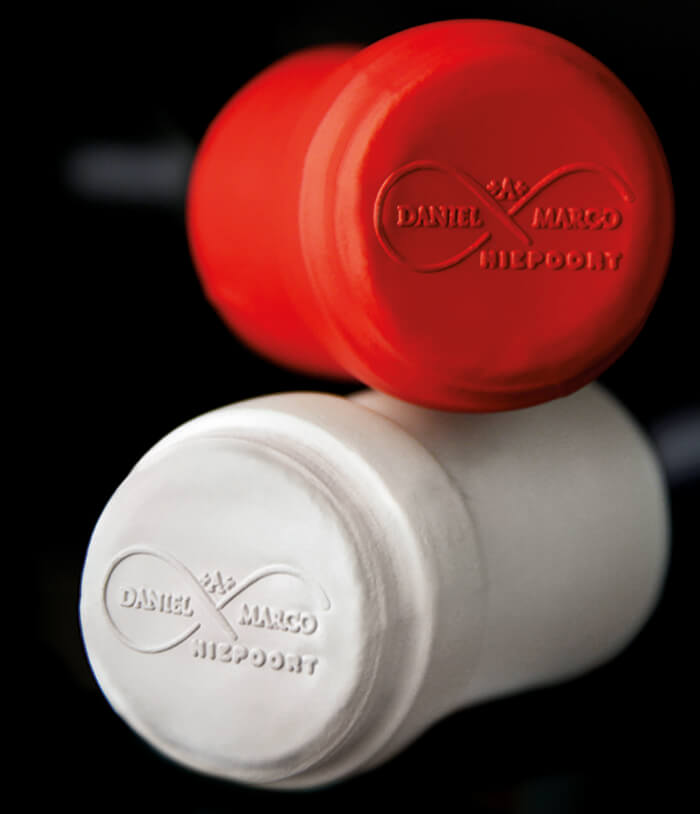
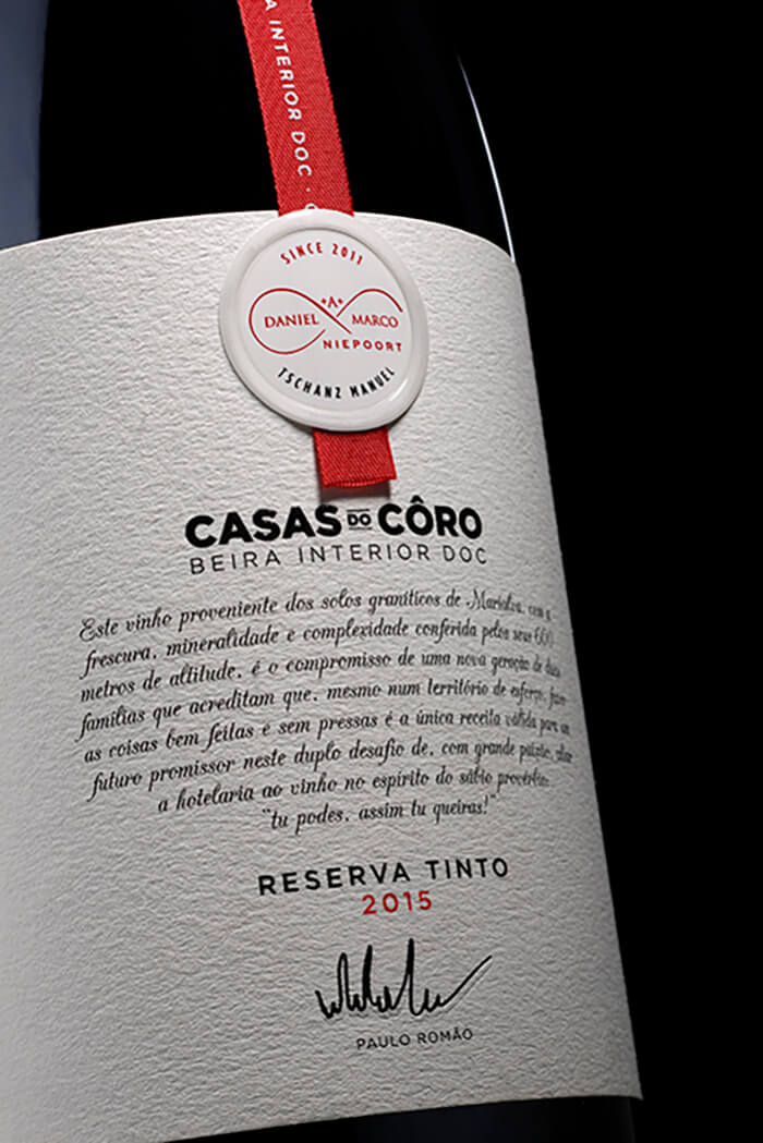
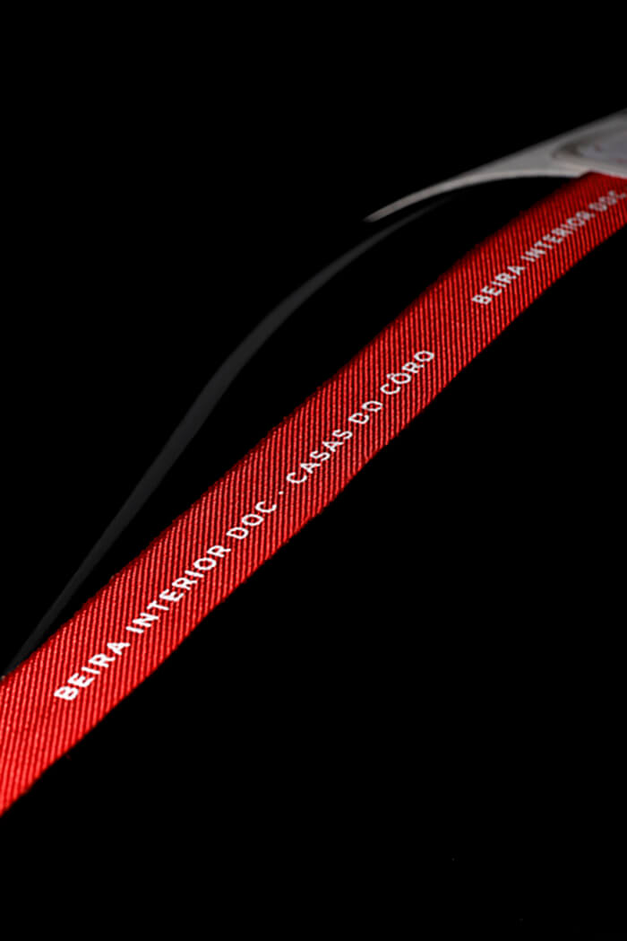
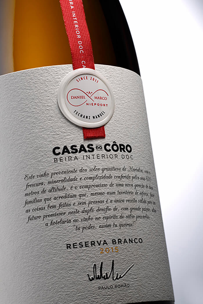
The goal was to create a design that revealed sophistication through simplicity. Therefore, there were applied a red ribbon and a stamp to mirror the values and the profile of the Romão family, the passion they put in everything they develop, as well as to highlight the exclusivity of these wines. Omdesign believes that simplicity combined with an elegant touch provides a distinguished image, which is a know characteristic of Casas do Côro.
These wines picture the brand’s profile and point out their premium touch, especially at the front, where we can find a description of the wine that ends with an inspirational proverb reaffirming the profile of this brand. It says “tu podes, assim tu queiras!” which means you can if you want to. The stamp and the red ribbon are – as well – quality seals, that mark the contribution of two distinctive oenologists well known by their talent.


