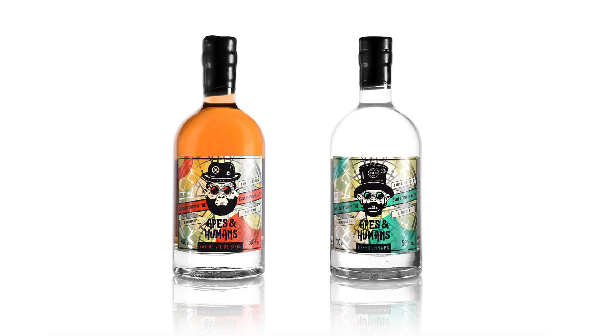
Design by: Making Sense Studio
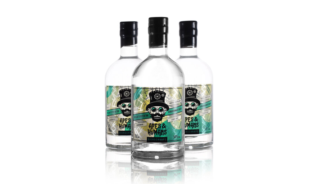
Bierschnaps & Eau de Vie de Bière are the unique products and doesn’t belong to any other main spirit category. The drinks were born from a long and persistent journey towards the evolution of beer when the distillate of beer was purified. It’s a combination of old traditions, craftsmanship and of course the modern science.
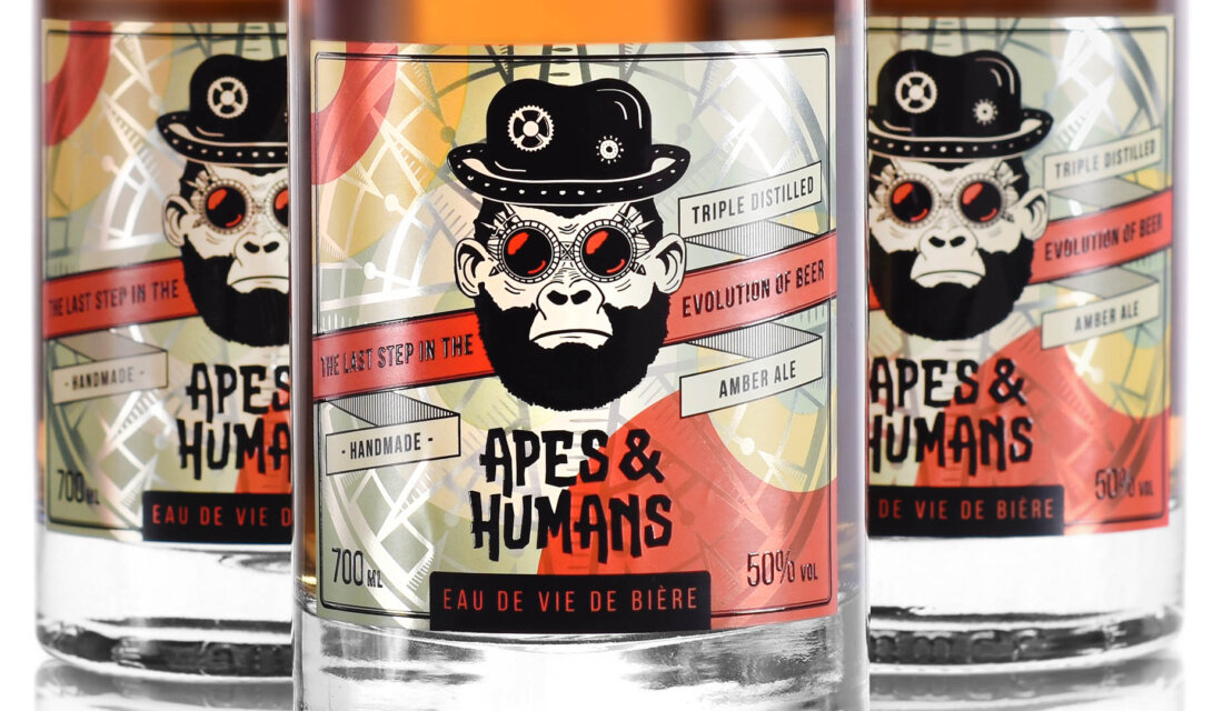
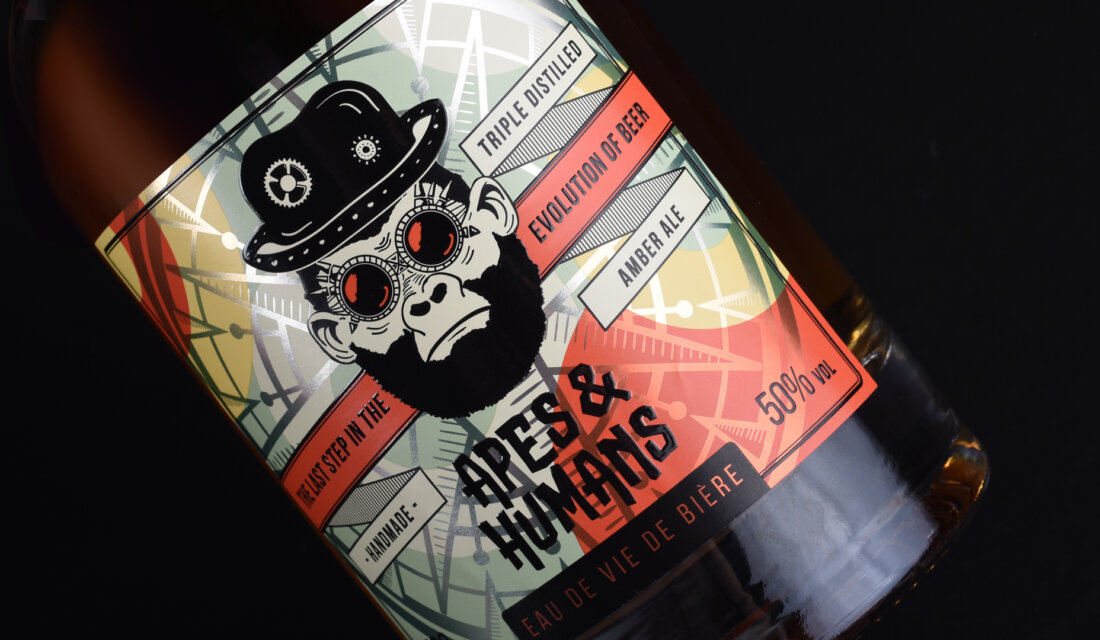
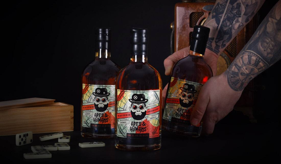
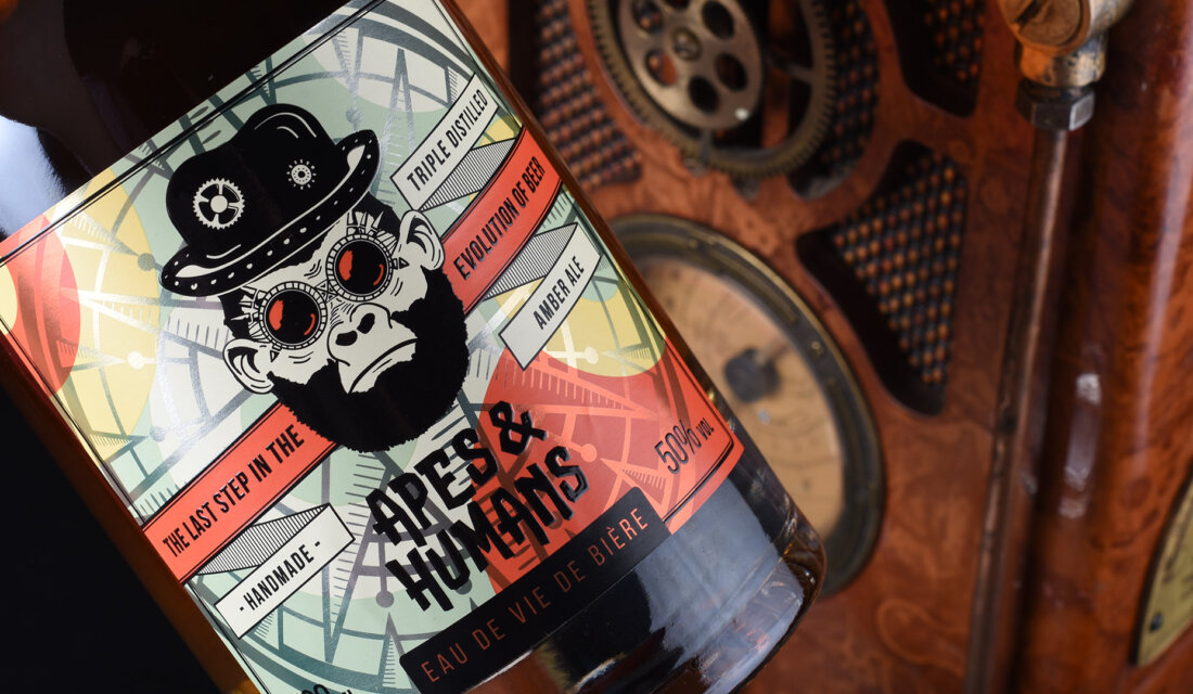
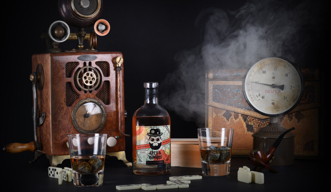
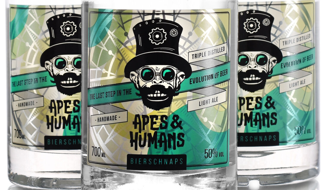
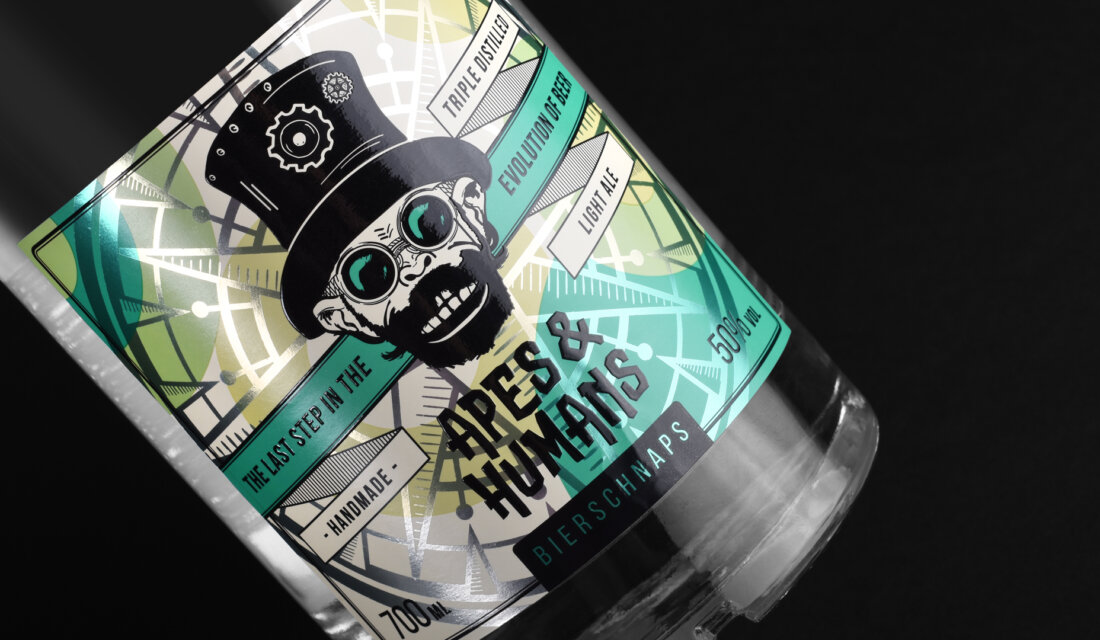
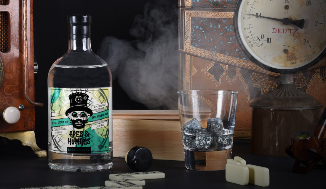
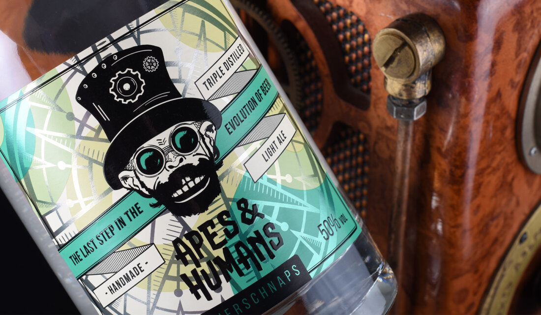
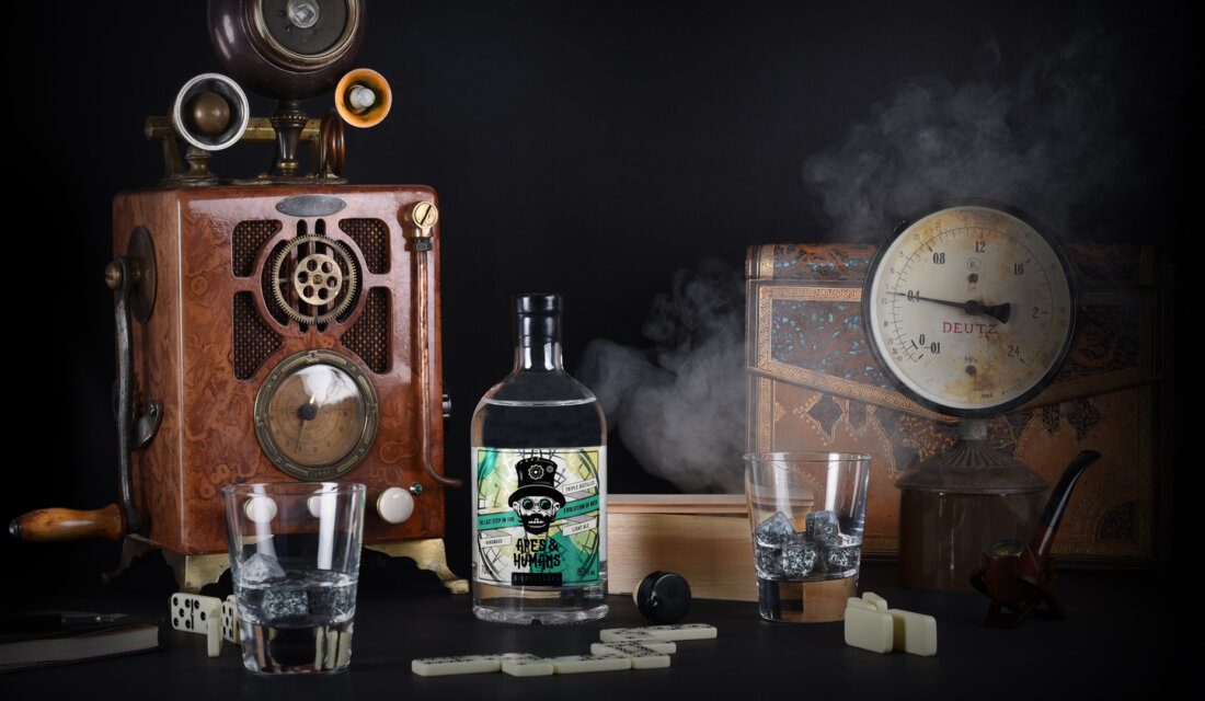
By taking this project we didn’t want to go for an easy solution. We wanted it to be different, bright and loud. We’ve combined steampunk elements together with a modern twist of colours, typography and other graphic elements. It presents how modern technologies can really transform the old standards and most importantly – match perfectly!
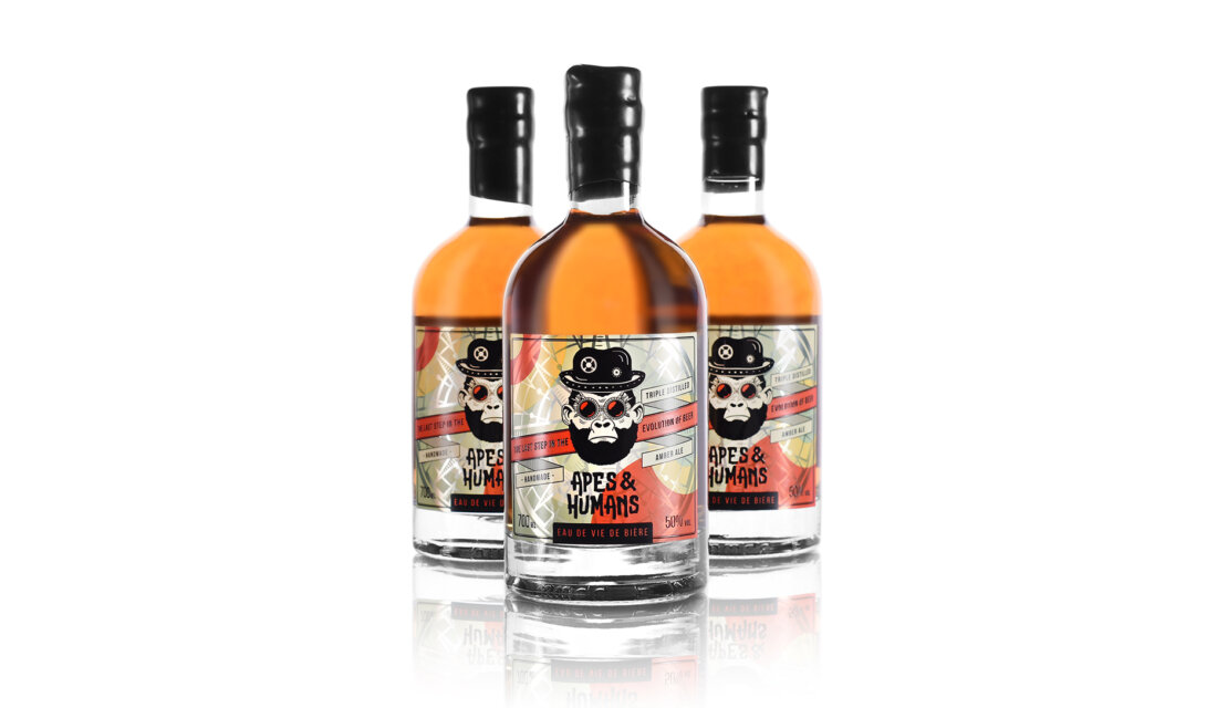
For the packaging we went for a vintage look by choosing pure white clear glass bottle. This really allows to present how clear and rich drinks are. Bottle contains cork closure covered with real wax. Each label design was printed in five colour Pantone flexography. To highlight the label additional technologies such as gloss black 3D silkscreen print and metallic prints were chosen.
Lastly, we just want to say how magnificent the product itself is. It’s called a real soul of beer. It’s the last step between beer and high volume spirit. We call it “the last step in the evolution of beer”.
Featured on Package Inspiration