
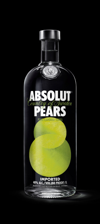
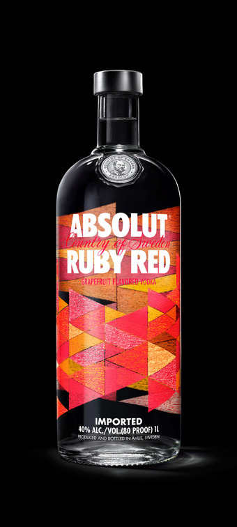
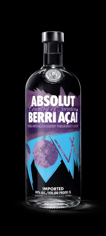
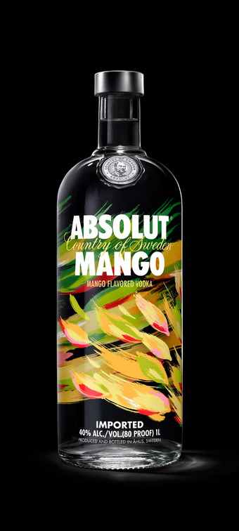
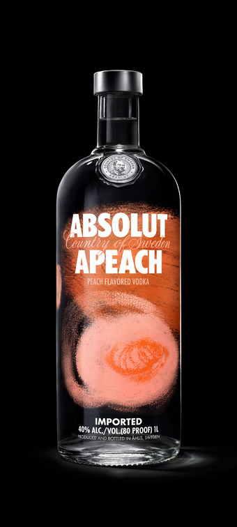
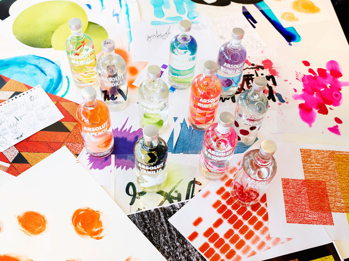
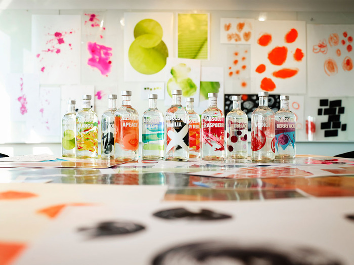
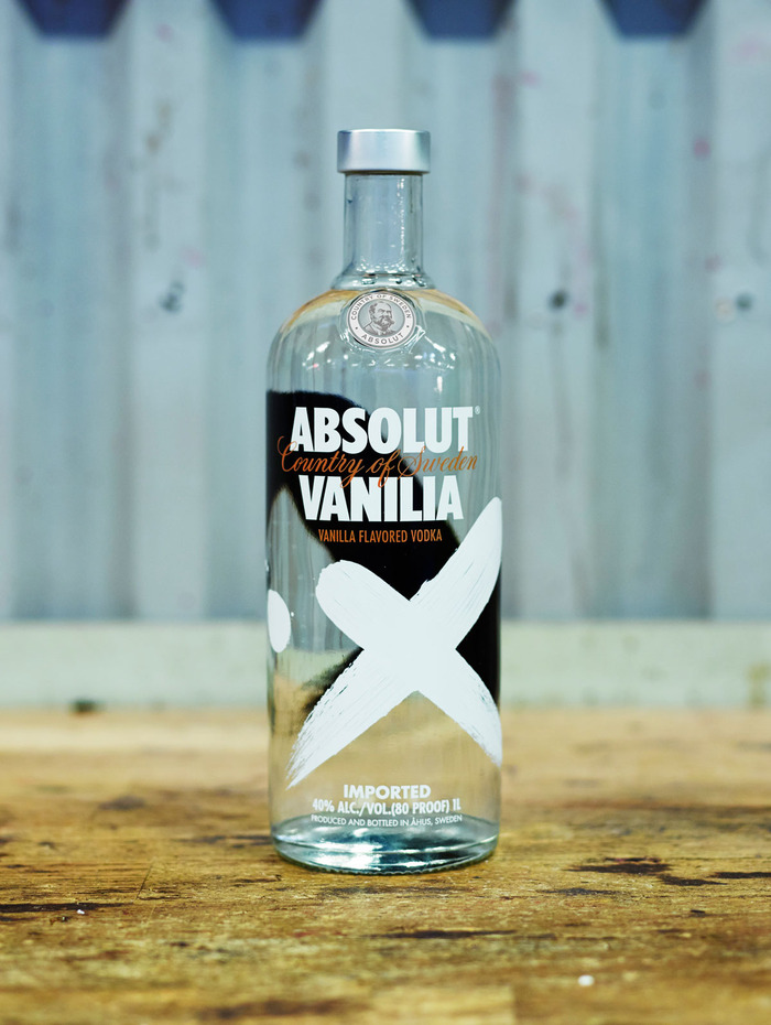
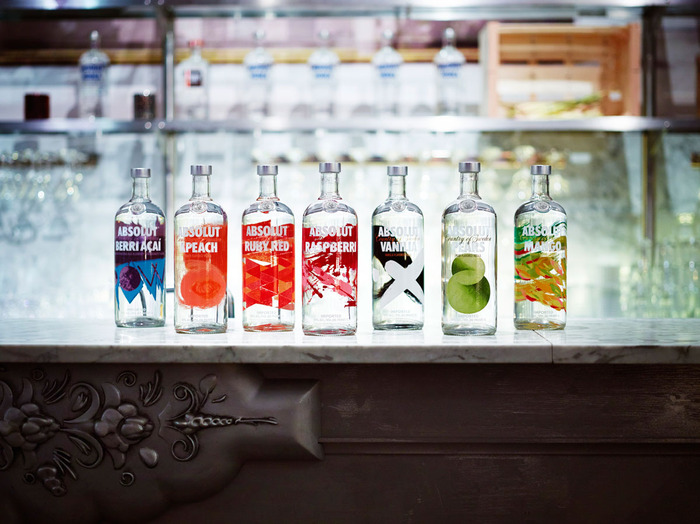
Fresh off the press: Absolut has launched a bold and artistic redesign of their entire range of flavored vodkas. True to the brand’s creative heritage, the vibrant new designs bypass design conventions to artistically express the core essence of each of the flavors in the Absolut Vodka range.
“This is one of the most dramatic changes we’ve ever made, and our biggest and most transformative design project ever. Our goal was to give our customers distinctive designs that are unlike anything one has ever seen. Vibrant, captivating bottles that bring energy to any occasion and celebrate the fact that every flavour in the Absolut Vodka range is something extraordinary. The standard thinking says a fruit-flavoured vodka requires a picture of the fruit on the bottle. We wanted to break that convention. We asked our design team to reach into the symbolism and myths tied to the ingredients to find each flavour’s core essence – and then amplify that essence through art.” – Anna Kamjou, Global Design Director at Absolut.
“Bringing an artistic approach to the redesign of its flavor range makes sense for a company with deep roots in the art world. Since 1985, when the Absolut Vodka bottle appeared in the first art ad, Absolut has been making art part of its consumers’ experience.
‘Absolut has long challenged conventions through creativity. This across-the-board redesign is another example of the brand’s originality and boldness.’ – Anna Kamjou, Global Design Director at Absolut
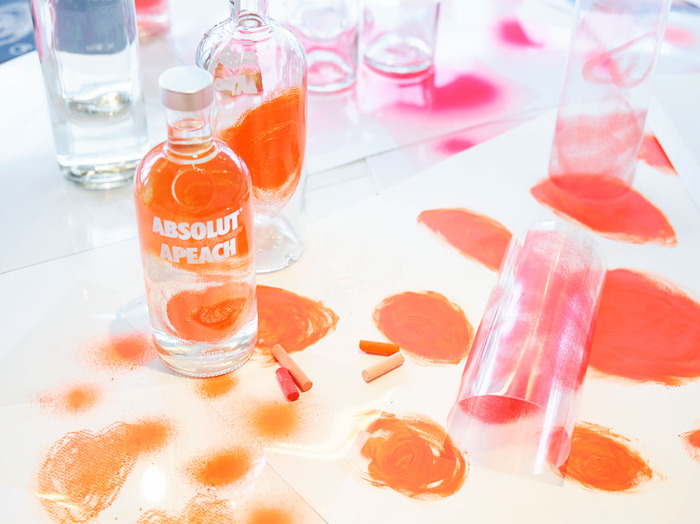
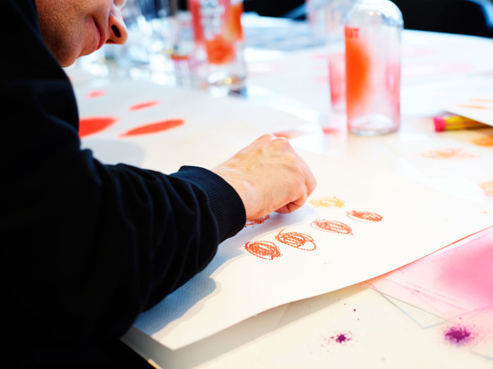
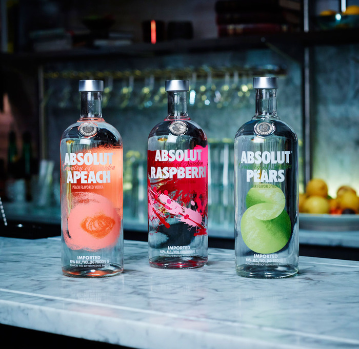
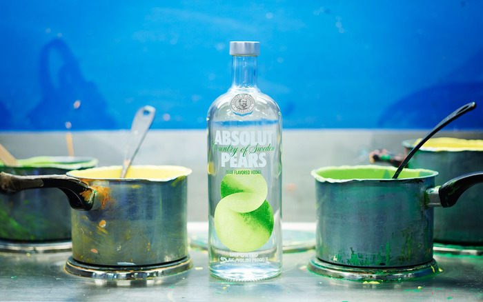
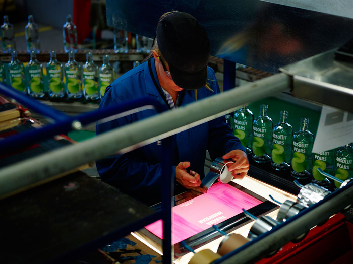
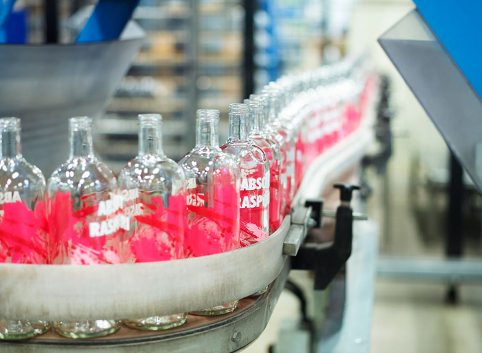
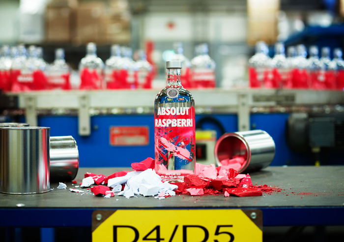
After interpreting each flavour’s core essence, the designers worked to bring these notions alive artistically. They followed a long tradition of Swedish design and craftsmanship, and brought a ‘by-hand’ aesthetic to the project. That is to say, they stepped away from their computers, took up paper, pens and brushes, and set out to communicate not a flavour per se, but the energy behind each flavour. With Absolut Apeach, for example, soft pastels and a light hand-drawn gesture were used to capture the fruit’s evanescent, sweet fragility and convey a sense of romance. The design for Absolut Pears began with the fruit’s symbolic association with longevity and purity, and arrived at an abstract pear shape resembling the symbol for eternity. For Absolut Raspberri, the emotion of love and passion is intensified through the abstract expressionist technique of throwing paint. The same artistic process was repeated across the range.”
Designed by The Brand Union (London, UK) for The Absolut Company (Stockholm, Sweden)
Credits
Global Design Director, The Absolut Company: Anna Kamjou
Global Design Manager, The Absolut Company: Caroline Mörnås
Design Agency: The Brand Union
Creative Director: Mattias Lindstedt
Executive Strategy Director: Jonas Andersson



Featured on Package Inspiration