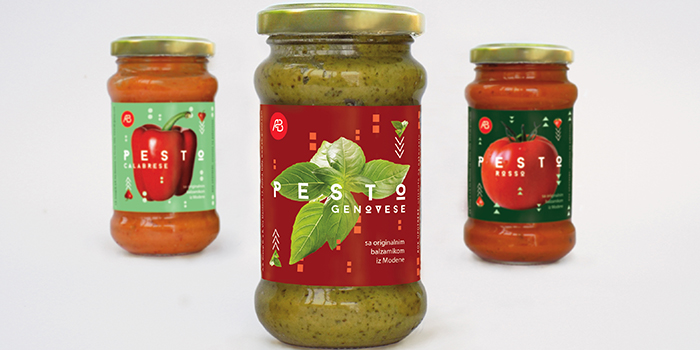
The task was to create not just a series of labels but the whole advertising campaign for the product. The name of the brand (A.B.) is also fictive but it was chosen because, to some extent, it can refer to the term „ABCs“, that is, the rudiments of something-just like this sauce is the key element of Italian pasta dishes and a must- have for every lover of Italian cuisine. The basic shapes on the labels (the circle, triangle and square ) convey this message too. By combining the appealing photographs of the main ingredients for each type of the sauce with fresh and vivid greens and reds, I wanted to create labels with both retro and modern looks.
Font used: Baron by Fontfabric
Designed by: Mina Bakliža, Serbia.

Featured on Package Inspiration