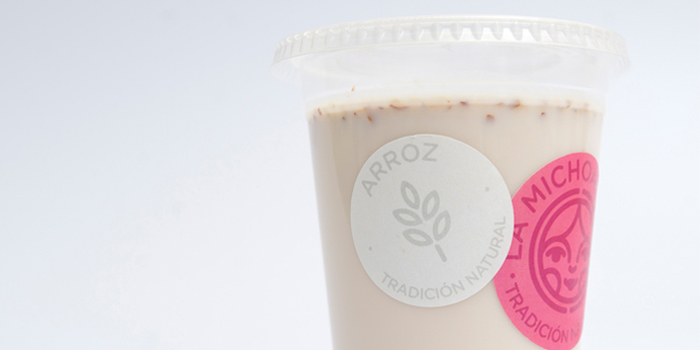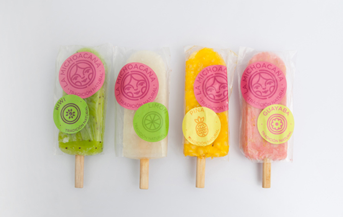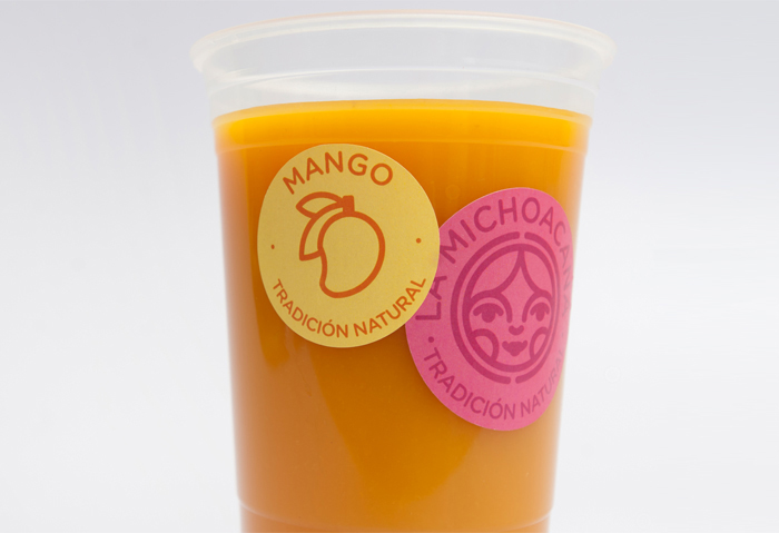
Concept re-branding for La Michoacana created by Parallel. La Michoacana is a traditional mexican “paleteria” which has been in the market for a long time now. During this period, the brand has suffered a constant changing on its corporate identity caused by the non attendance to its marketing, leading to a misunderstanding of the brands core.
“We decided to change the concept by using a new packaging system focused on the substrate and product speech. This will lead to a more natural feel of the product, being able to see it and almost taste it by its natural colors and textures. The logotype was re-designed to make it modern and adjust some old aspects of the first logotype. We decided to conserve the rounded shape and the rounded typography making it more playful and fun. Using just the traditional ‘rosa mexicano’ we designed a vibrant but sophisticated color palette, leading to a more specific target; a traditional brand adjusted to modern times.”
Designed by Parallel, Guadalajara, Mexico


Featured on Package Inspiration