
Designed by: R Agency
Junior Art Director – Alisa Mezhenska
Creative Group Head – Dima Liutyi
Designer/Copywriter – Viktor Synkov
Designer – Arman Enokyan
Senior Account Manager – Maria Ursta
Danone Ukraine: Brand Marketing Manager – Svitlana Korniienko
Junior Brand Manager – Mykyta Khairudinov
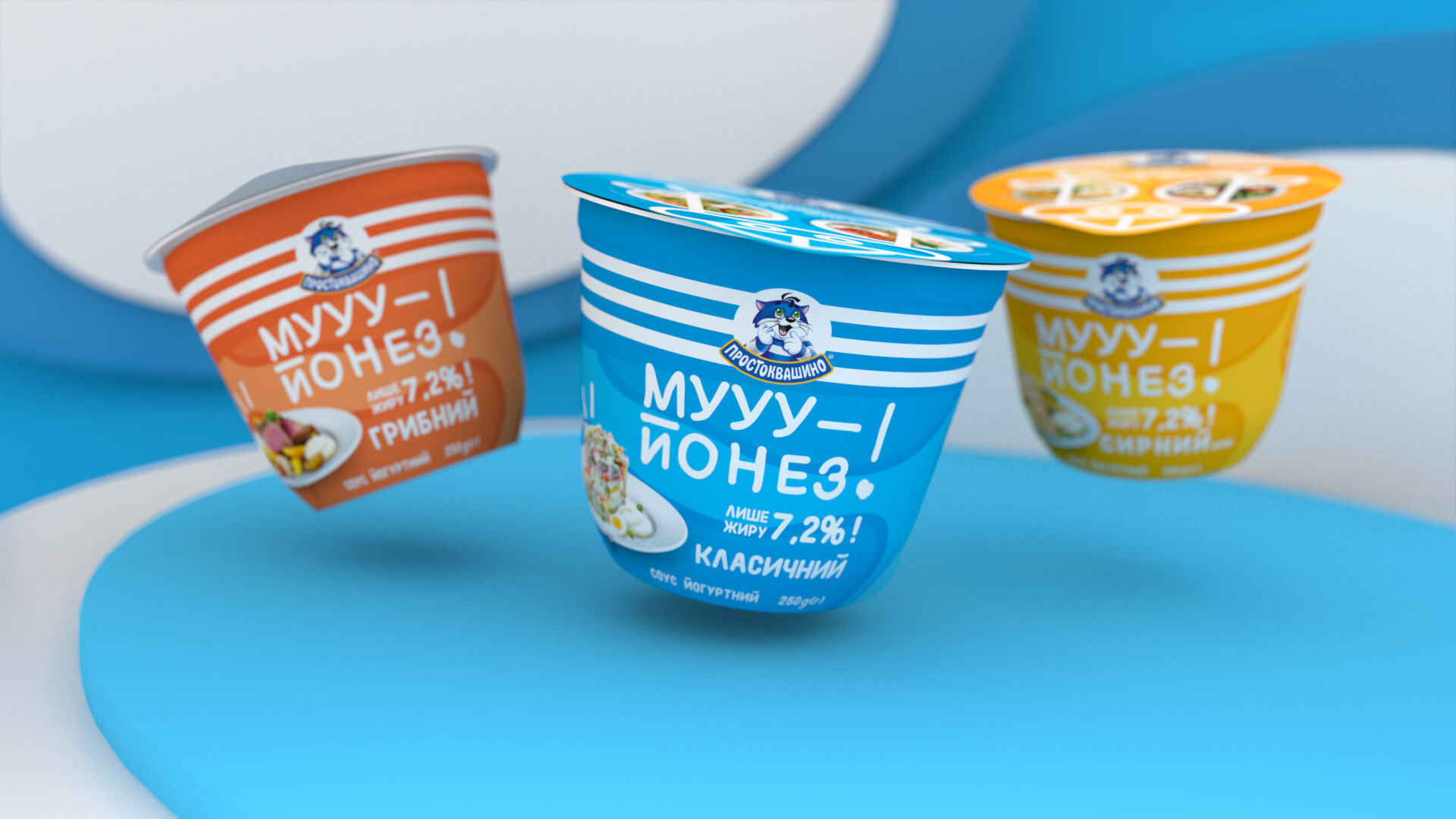
Moo-yonnaise looks like mayonnaise, tastes like mayonnaise and sounds like mayonnaise, but it’s not. It is a yogurt based sauce that has only 7% fat in contrast to 70% in a typical mayonnaise. Thus, our main goal in design was to convey Moo-yonaise’s yogurt nature and lightness.
Yes, we used cow as a symbol to show that it’s a yogurt in the first place. But don’t jump to conclusions — our label still stands out from other dairy products with it’s non-typical for the category bright colors.
To express the lightness and naturalness of the product, we painted label background with airy clouds that look like a “cow print”.
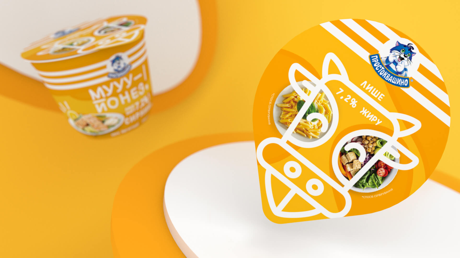
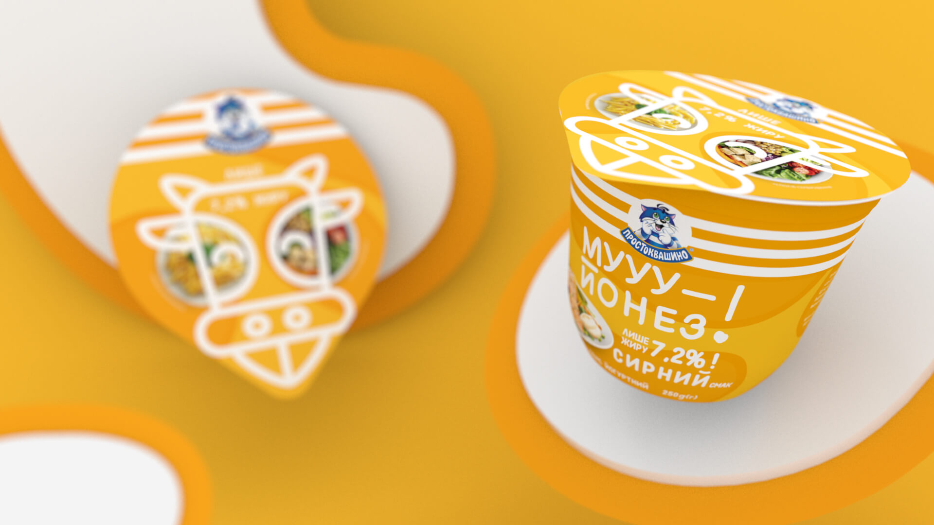
The sauce name is quite joky. It inspired us to highlight it visually, so we chose a playful font and drew a tongue-showing cow on the foil.
Also our team really fell in love with the Moo-yonnaise cow. So we went further and made a funny Instagram mask with it.


Featured on Package Inspiration
We are young team which works to inspire packaging designers every day! Our team select the best packaging of today and shares with you.
