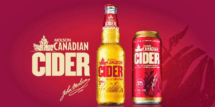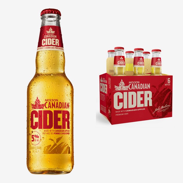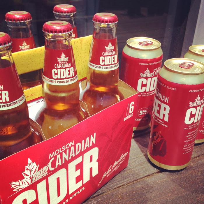
Molson Canadian recognized an opportunity to enter the cider category with a differentiated product and approach that leveraged its strength as a beer brand.
Our design solution visually communicates the intersection of masculinity and bold flavour at the heart of Molson Canadian Cider. Molson Canadian beer equities reinforce the masculine personality, while bold type, deep, rich colors, and textured illustrations come together in a simple, clean layout that conveys confidence and cues flavour.
“Cider represents an exciting breakthrough for the Molson Canadian trademark, our first extension outside of the beer category for this iconic brand. We are thrilled to have arrived at a compelling bundle with the Spring Design Partners team through a process that weaved together consumer insight and packaging research, tremendous design skills and new packaging opportunities including a clear glass bottle.”Madeline Burch – Marketing Manager, Molson Brands.
Designed by Spring Design Partners, United States.


Featured on Package Inspiration