Designed by: FRANK Oslo, Geir Solem Lysbakken, Norway.
Norske Bryggerier
(Norwegian Breweries) is an Oslo based company with a conscious effort to start up small local breweries along the west coast of Norway, and develop a portfolio of high quality craft beer brands.
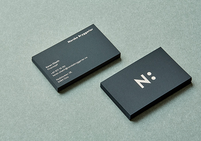
The concept behind the identity is all about ‘a taste for quality beer and “godt selskap” (good company).’ The two circles has the double meaning of a colon, which represents the many breweries, and two glasses for the best company possible. The use of black represents the “dark market” in Norway which stands for law which prohibits the advertising of alchohol or to use promotion of any kind to generate sales.
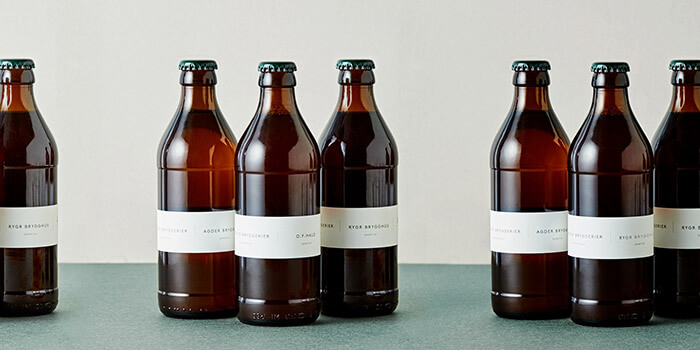
The packaging is a “non-sale” design and is only for internal tasting for quality control before full production commences once the testing is deemed successful. The design is inspired by pharmacy bottles where labelling is purely for practical cardfile system. The reason for a neutral design is so as not to be affected by colours and illustrations which can lead to false expectations, and to purely focus on the tasting process. Norske Bryggerier takes great pride in tasting their products in the knowledge the competition between so many quality breweries in Norway and Internationally is getting harder.

Featured on Package Inspiration