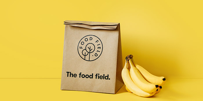
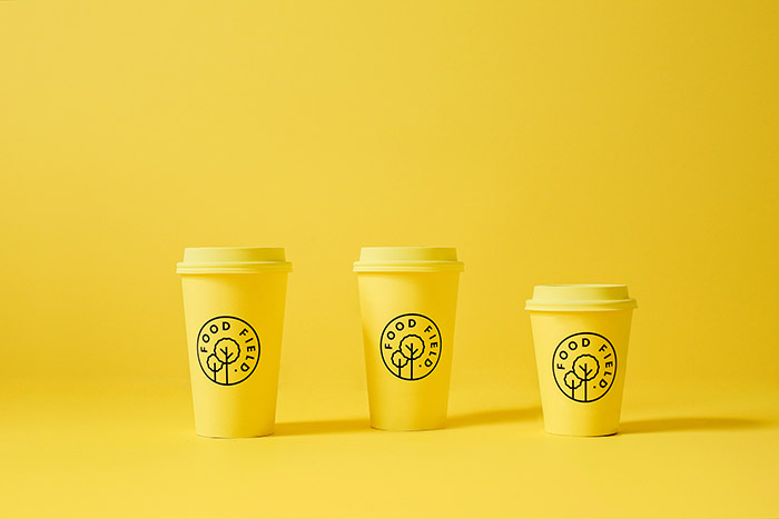
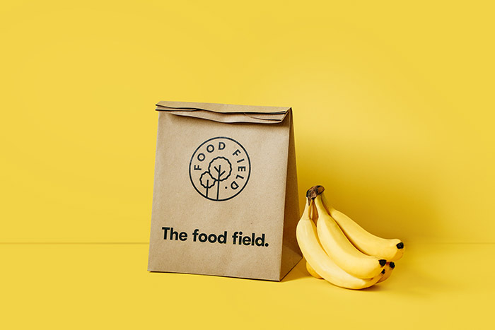
The Food Field
Organic food store located in San Pedro GG, México. We created all the visual identity; from naming, packaging and all sales peripherals. For the color palette we wanted to avoid an obvious green palette so we used instead a set of 3 different shades of yellow which symbolize the dawn and start of a fresh new day. The logotype is accompanied by a simple and geometric icon that can be easily used to mark their wide range of edible products.
Designed by: Parámetro Studio, Mexico.


Featured on Package Inspiration
We are young team which works to inspire packaging designers every day! Our team select the best packaging of today and shares with you.