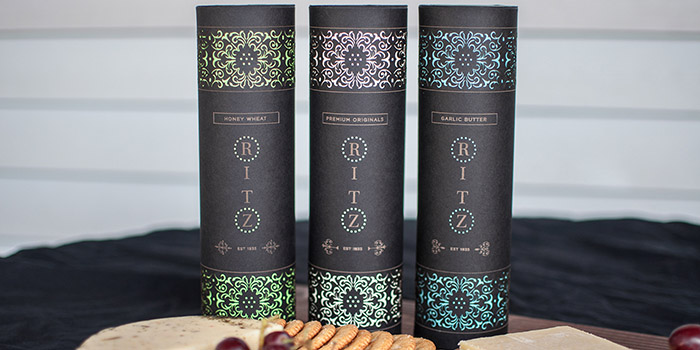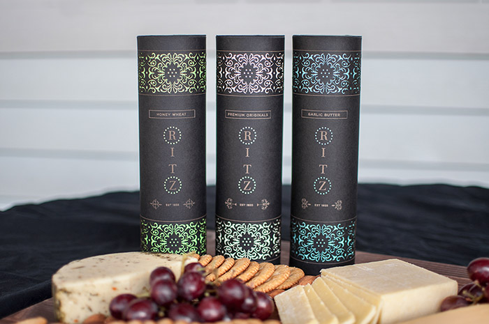
This packaging redesign for Ritz crackers focuses on shifting the target market towards high class consumers. By creating an elegant, sleek, and intricate design, more value is given to this product which accurately captures the reputation of the hotel the cracker was originally named after: The Ritz Carlton. The designs are laser cut, revealing a layer of colored paper underneath while all the other type is etched onto the black paper; no printing was used in this design.
Designed by: Mary-Louise Wang, USA.


Featured on Package Inspiration