Did someone forget that fruit is actually pleasurable? With help from the Dow Design agency in Auckland, Simply Squeezed has revived the chiller with fruitiness that’s not only good and healthy, but joyful and packed with personality.
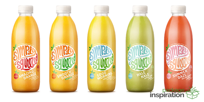
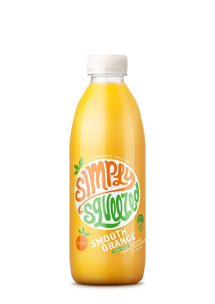
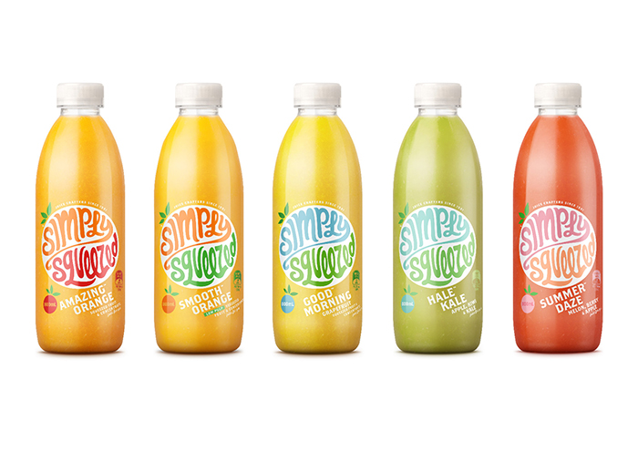
Simply Squeezed juice is award winning, market leading and crowd pleasing – so why change? It’s what’s happening beyond the supermarket that’s inspired the shift. People expect more from juice: they are concocting their own juice blends at home. Juice bars are pumping, smoothies pulse with pleasure and flavour. But pre-packed juices hadn’t responded to this desire for vitality from juice. Dow’s new packaging design for the juices aims to bring a smile to the lips as well as a glass each morning. And new colours help Simply Squeezed stand out on the shelf.
Says Donna McCort, Creative Director, ” The name kind of says it all. We wanted to make it the hero, rather than a pile of oranges. So we built a brand mark that totally owns the pack, and is hopping and skipping. The hand drawn logo combines movement with joy – and comes in a bunch of bright colours to match each flavour.
And then we made sure all of the other elements sang from the same song sheet. From the product names to the crafted font and the way the whole label flows around the bottle at a jaunty angle. You feel happy when you see it…and know you’re buying real, fresh juice.”
Designed by: Dow Design, New Zealand.
Featured on Package Inspiration
We are young team which works to inspire packaging designers every day! Our team select the best packaging of today and shares with you.
