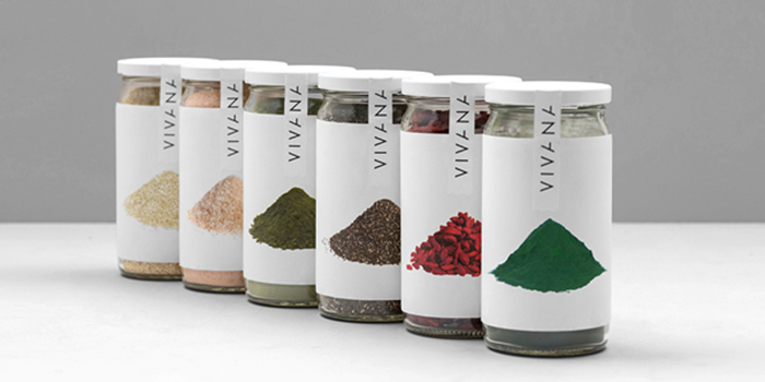
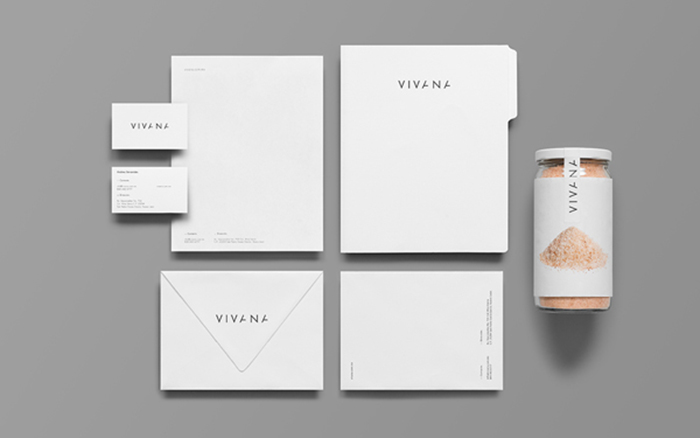
Viviana is a brand for highly nutritional food products made with natural ingredients, antioxidants and super-foods located in Monterrey, Mexico.
The brand name comes from the spanish word vivir and vida, meaning living and life. These words make direct reference to the product’s natural and purifying properties.
Honesty, one of the main values that the brand represents, is the main reason we decided to maintain the consistently simple and concrete graphic language in the logotype and packaging.
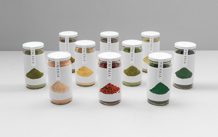
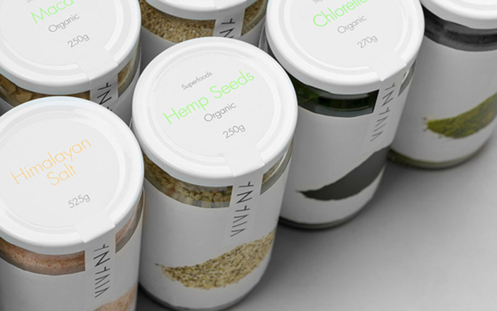
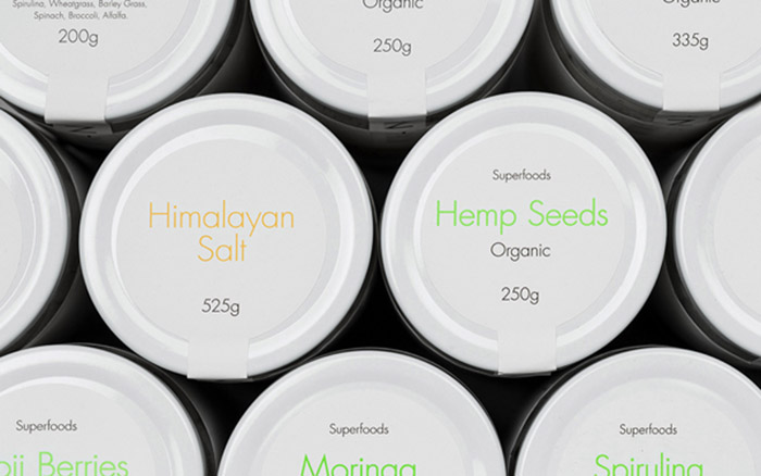
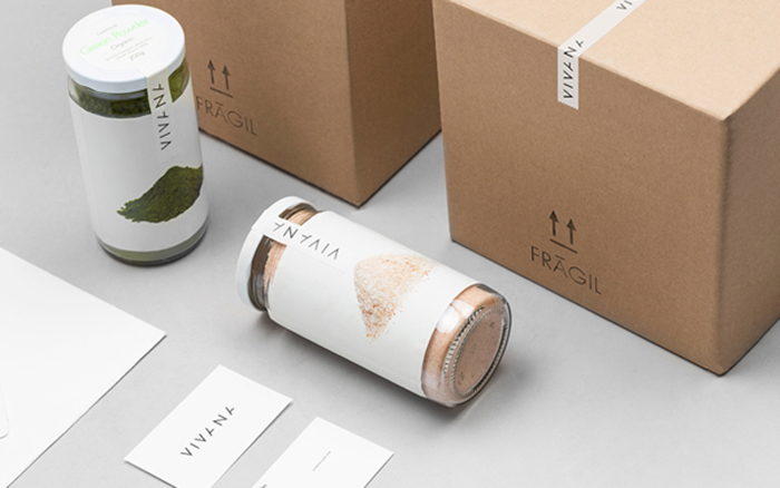
The main reason we decided to use product images on the packaging was the need to make sure one of the main product traits, being pure and organic, was communicated effectively. In addition to this, we located the product description on the upper part of the packaging making it easier to be read through the opening process for it’s consumption.
Designed by: Anagrama, Mexico.
Featured on Package Inspiration