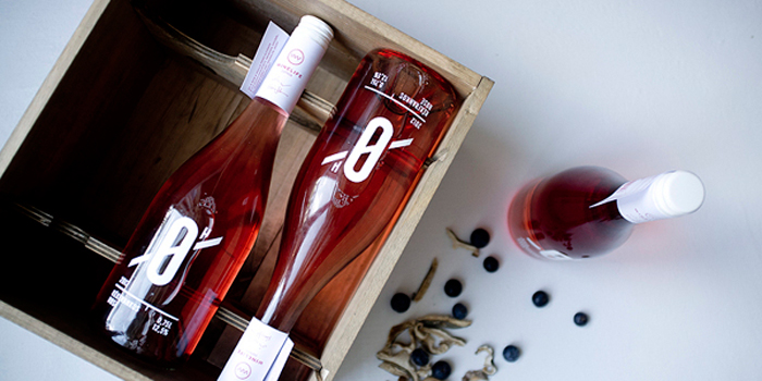
The rose of Winelife winery was made with great effort, through long nights, without a minute of sleep. The winemakers faced all problems and difficulties that could turn up during the process, but they never gave up, remained stubborn and never thought of failure. The efforts and hard work finally bloomed as the rose became an excellent beverage at the end. Picking the name was a mutual decision of us and the winery. It reflects the hard work and no rest, that was put into the making of this wine. Choosing the typography also mirrors the never ending endurance of creating quality.
“Planning the bottle we took it into consideration that the wine will be produced in large quantities. That is why we choose a technique which is relevant concerning this fact. The typography made with white stamp on printing stresses the beautiful color of the rose. We were modeling it with the help of masking folia and white acrylic spray on the current mock-up. We were also using this technique on the the wooden gift box. Finally we placed a paper tag with data and the barcode on the neck of the bottle.
As part of the design, we made a new logo for Winelife, where there’s a resemblance to a sinus curve, to a bottle opener and a letter ‘W’, which symbolizes the winery. The bottles will be delivered in gift box, where the typography of the Zero will be present. On the side of the box, we placed a fillable tag to be filled out with the latest actual data of the wine.”
Designed by Gergely Szoke and Eszter Laki, Hungary
Featured on Package Inspiration