Designed by: Tom Dent, Lilly Parr, UK.
The Brief
Create an original brand of yoghurt that conveys its Yorkshire origin, its simplicity and its organic properties and other health benefits.
The Client
Stamfrey Farm Organics are a family-run farm from Yorkshire who pride themselves on their ‘simple ingredients, simple methods’ mantra.
Every product made on the farm comes from the milk produced by their 147 grass-fed cows.
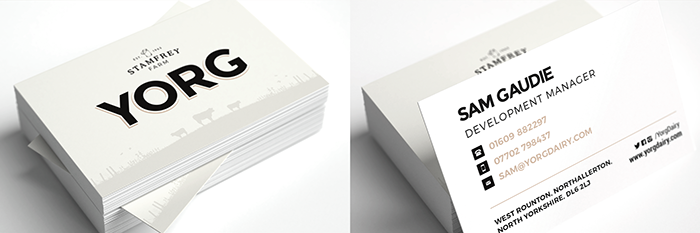
The client came to us with their yoghurt which was already being sold in local farm shops. They felt it wasn’t selling as well as it should in light of the overwhelmingly positive customer feedback. This lead to us being tasked with creating a completely new brand. This included a full branding exercise from name generation to packaging across three bottle sizes, as well as a website and other marketing collateral.
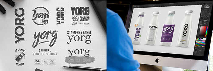
Stage 1: Name Generation
The first task was to generate an appropriate name for the brand. After consolidating our initial thoughts there were a few keywords we centred our ideas around:
Yorkshire – Simple – Organic – Honest
Stage 2: The Brand Name, Initial Logo Concepts & Pack Concepts
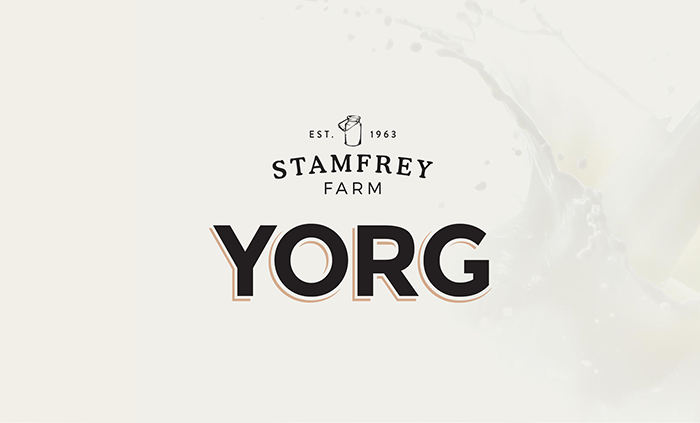
We submitted some concept names for consideration. These included ‘Blonc’, ‘Enkel’, Yog’t, Niice, and ‘Feel Good Farm’ but after much deliberation, ‘Yorg’ was the eventual winner.
Yorg was chosen as it encompassed a number of the key points from the original brief – Yorkshire, Organic and Yoghurt all feature in some way within the word.
Unlike some of the other concepts, it also eliminates any difficulty with pronunciation whilst retaining an onomatopoeic quality in relation to the physical properties of the yoghurt.
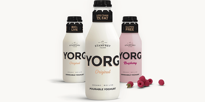
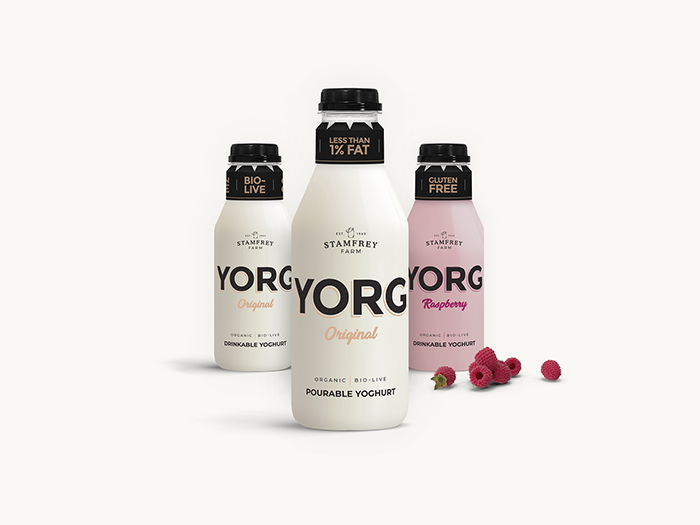
‘YORG’ also allowed us to future-proof the brand to accommodate any new flavours. ‘Original’ was preferred over words such as ‘Plain’ or ‘Regular’ for the standard flavour as we felt it implied the brand had history whilst adding a little gravitas. ‘Raspberry’ has since been added to the product range.
The Result
The vivid colour of the yoghurt was an ideal canvas to work with and contrasted nicely with the black logo and fonts. The subtle beige accents were added to give the brand a softer, more contemporary look whilst maintaining a traditional feel.
We wanted to leave the bottle as simple and minimal as possible whilst addressing all key selling points. Due to the relatively high number of USP’s our client wanted to include on the bottle, we decided the best compromise would be to produce and attach the black neck collars. These would contain all of the key stats, thus freeing up valuable space on the bottle itself.
After a little trial and error, we designed a bottle collar that fit perfectly over all 3x bottle sizes without sliding too far down the neck of each or being too loose and in danger of falling off during transportation.
So far YORG has received nothing but very positive feedback and plans are underway for nationwide distribution.
Website & Promo
As well as the initial branding and packaging we have recently finished the YORG website – www.yorgdairy.com
Designing the ‘YORG’ website then lead us to update the original Stamfrey Farm one. As YORG is a product of Stamfrey Farm it was important that branding for both tied in together. This is now evident when visiting the parent site – www.stamfrey.com


Featured on Package Inspiration
We are young team which works to inspire packaging designers every day! Our team select the best packaging of today and shares with you.
