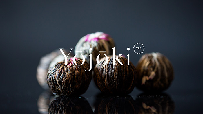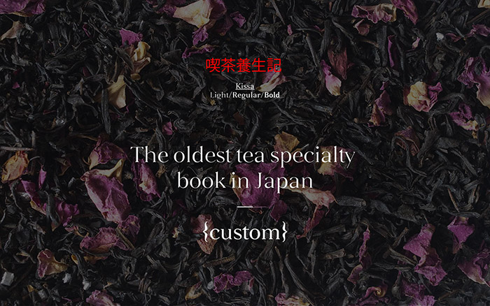
We were commissioned to develop an identity system for a Japanese brand of tea. Our creative process began by researching the ancient Asian tea culture; we found the oldest Japanese specialty tea book from, Kissa Yōjōki (喫茶 養生 記) ” be healthy through tea” written in 1211.
The ideas inspired by the book contents became the guiding concept behind the identity system; first of all we came up with name Yohoki. The brand always appears surrounded by white, within a context filled with handmade textures, shapes, floral elements and kanji script -one of the first writing systems. The concept of luxury is inherent to the product, we integrate it through a Didona typeface developed for the brand, which comes alive through subtle printed finishes and high-quality materials.
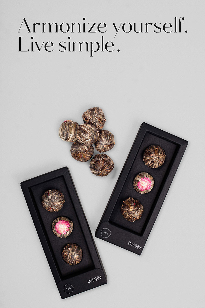
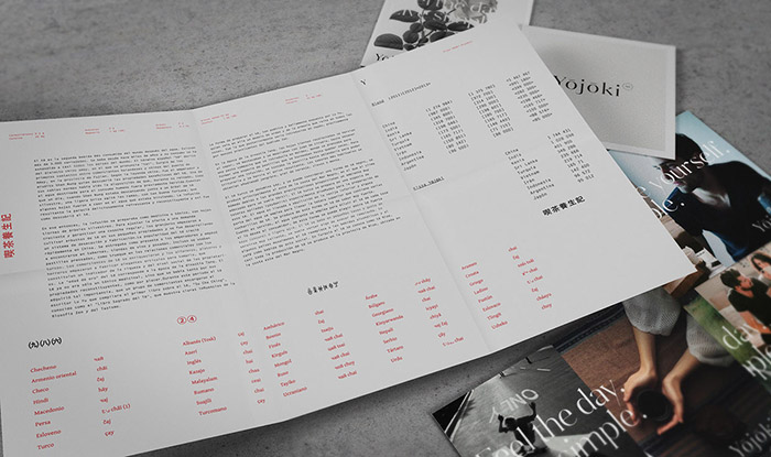
All the elements of the brand are interconnected through the packaging and its different presentations, as well as complementary elements such as wrapping paper, stickers, postcards and fact sheets which communicate the different types tea blends.
Designed by: Ariel Di Lisio, Argentina.


Featured on Package Inspiration