
We had a wonderful opportunity to prepare this daring yet traditional logo design, branding and identity for a small, local brewery that produces exceptional beer. The aim of this design was to avoid any typical beer-like clichés when it comes to brewery logo design or packaging itself. Rather than following a safe way across this problem by using traditional wide, bold and warped fonts with a lot of heraldic frames, we decided to keep it clean.
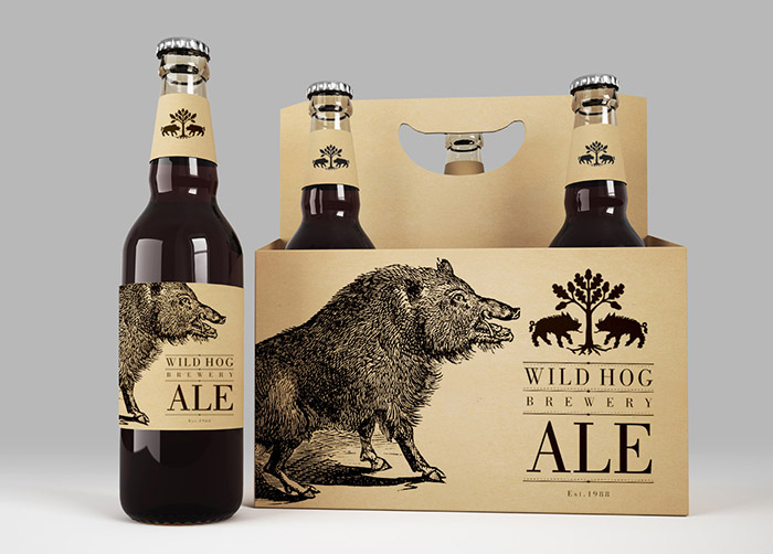
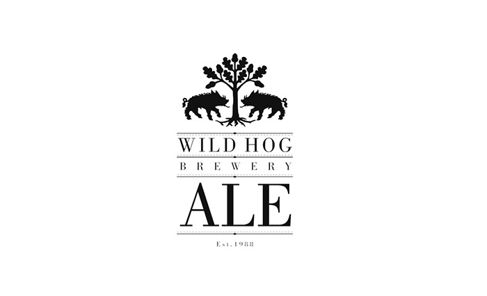
The logo of the brewery starts with an extract from an old heraldic shield. We got rid of the frame and only kept the very valuable symbols. Two wild hogs fighting under an oak tree – a typical symbol of the region where this wonderful brewery comes from. Although it is officially dated only back to 1988, the origin of brewing in this area go as far as to the 16th century. That is why the heraldic symbolism was kept – yet transformed into a more modern and clean logo design.
The logo furthermore transforms into the main packaging theme, carrying the additional information such as what kind of beer is being produced. Letters ALE are accompanying the logo in vertical composition – ensuring that the identity of the brewery plays the primary role in packaging design. Plus, there is another nicely illustrated wild hog on the side. Who wouldn’t love it. The detailed illustration is carried across the whole packaging design and corporate identity of the company, making stationary more lively as one can see on the business cards, paper bags or even letterhead. The letterhead design involves the use of the wild hog illustration in very subtle, 10% black so that it does not interfere with printed or written content.
The branding for the truck design was a bit more tricky. Because of the wide horizontal composition and the fact that a truck is a moving dynamic element, we have decided to brand it with a huge negative version of a wild hog close-up, adding the logotype on the side in tall, easily readable letters.
Inside the brewery, workers wear traditional clothes and equipment branded with what stands for the traditional identity of the brand – the re-used heraldic symbol of oak tree with two wild hogs fighting. Accompanied with typography, this brand proudly lies nearest to hearts of people who stand behind it.
Project name: Wild Hog Brewery Branding and Packaging Design
Art Director: Martin Kuspal
Agency: MAISON D’IDÉE
Client: Wild Hog Brewery
Design year: 2015


Featured on Package Inspiration
We are young team which works to inspire packaging designers every day! Our team select the best packaging of today and shares with you.


