–
Designed by: Josh Fidell, United Kingdom.
–
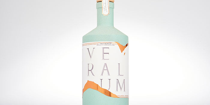
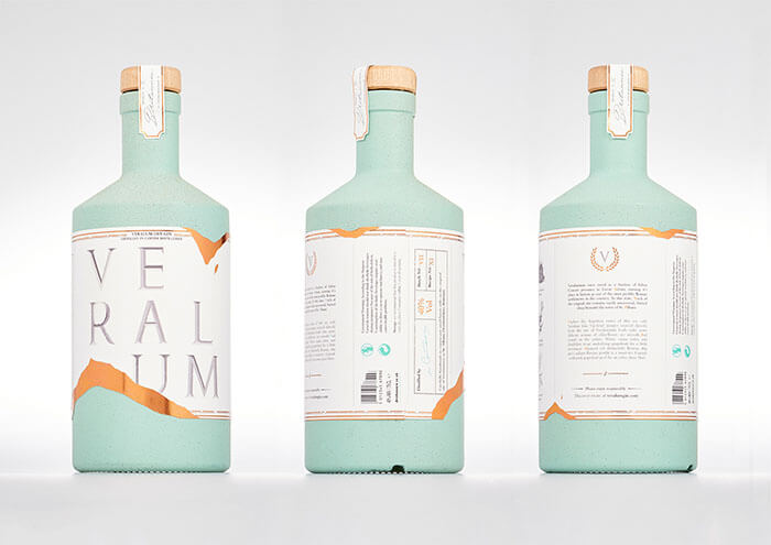
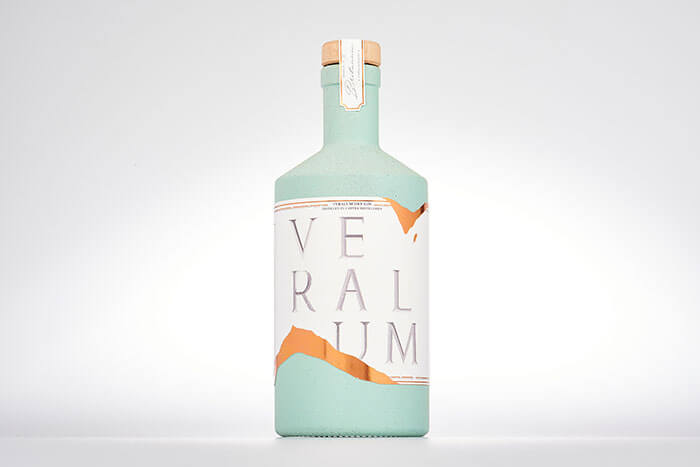
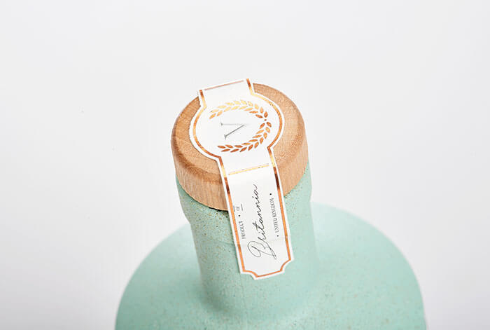
Inspired by the ancient Roman city of Verulamium, now buried deep beneath the public parks of St Albans, Hertfordshire. This classic British gin has been inspired by the decadent styles of architecture that were present throughout the city. The packaging utilises carefully selected materials to mimic the aesthetic of authentic Roman artefacts, and a distressed look has been purposelessly added to give a sense of age.
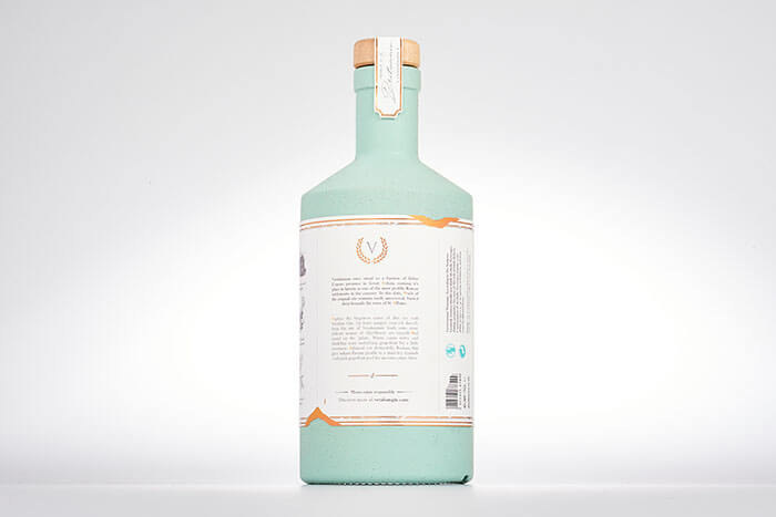
The label is formed of two separate layers combined to create an interesting and unique shape. The primary label is printed onto tactile 120gsm off-white paper, and beneath this, a layer of bronze foil can be seen peaking through a series of rips and tears.
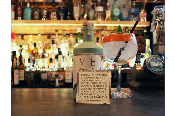
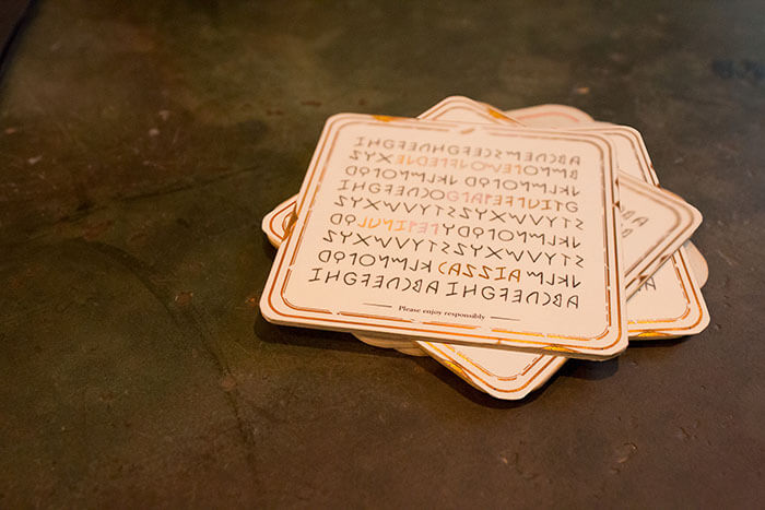
The branding flows through to a range of other applications, such as a limited edition run of coasters. One side of the coaster has the logo, and the other has a list of ancient Roman characters scattered all of over it, the secret behind this is that when looked upon with a careful eye, you will see a series of hidden words, all of which correspond to the botanicals that one can find within Veralum Gin.

Featured on Package Inspiration