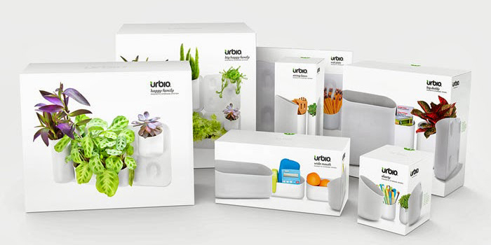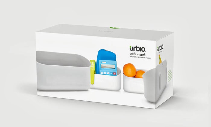
Urbio has been an exciting brand to develop over the past two years. It has grown tremendously and our mission was to evolve the brand and packaging to reflect that impressive growth. As the manufacturers of Urbio, we have the unique and fortunate advantage of both managing each phase of Urbio’s production and enjoying strong relationships with our retail partners and customers. This has allowed us to design packaging that is strong–physically and aesthetically–and aligned with our brand and fans, both old and new.”
“We felt that it was important that our packaging redesign communicated three things: that Urbio is magnetic, it is a vertical gardening and organization system, and it is beautifully minimal in its design. We believe that our redesign accomplishes just that. The packaging structure acts as a clean white canvas that showcases Urbio at a variety of angles and in a variety of uses. The photography wraps the side of the box guiding the consumer to view the magnetic magic found embedded in the backside of each Urbio vessel. This new element in our packaging design has been key to educating new consumers on the unique features that truly make Urbio one of a kind.
Our new packaging has been a huge success with our fans and retailers alike. The Container Store loved it so much that they dedicated an entire endcap in each of their stores to Urbio, beautifully displaying our new packaging.
Designed by Enlisted Design, United States.
Designers: Cristina Rotundo, Andrea Yung Toth, Beau Oyler and Jared Aller


Featured on Package Inspiration