Designed by: Nano Alfonsin, Argentina.
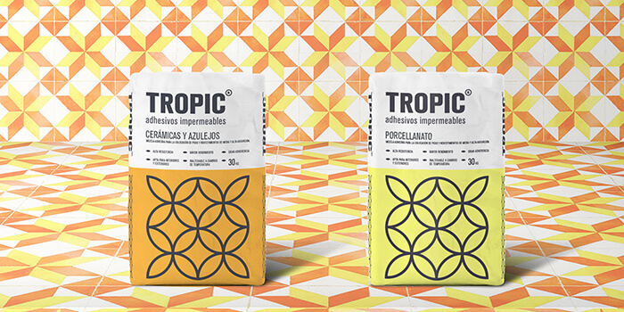
The challenge was clear on the part of the client, carry out a simple design where a generic basis could be used for both products and that at the same time they could be distinguished from each other.
This is how the new packaging for Tropic was developed, where it was intended to give a simple aesthetic, with vintage bases and that we managed to impact and differentiate ourselves from the rest.
It was granted a different personality to the products that were in the market, through an aesthetic that broke the stereotype of the rest of its competitors.
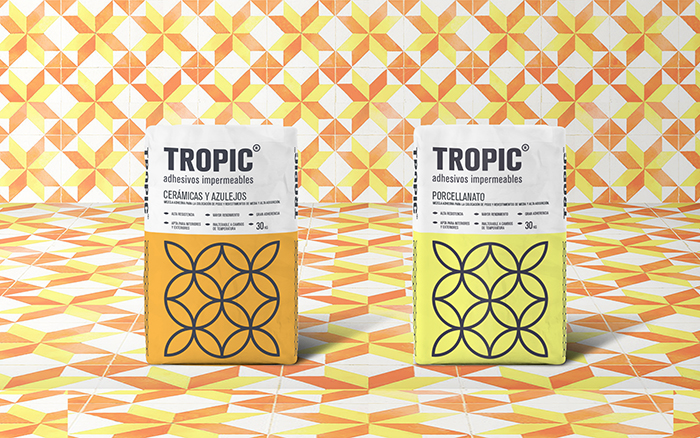
The brand was resolved through the iconic design of an old tile and this was applied as a decorative module for the packaging. His two presentations have the same image but they are differentiated through the orange and yellow colors in desaturated tones to give the design a vintage character.

Featured on Package Inspiration