
Spirits made with back, hand and heart.
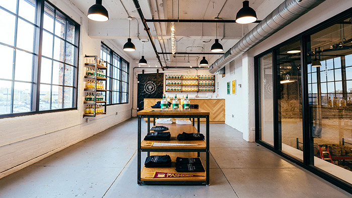
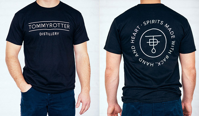
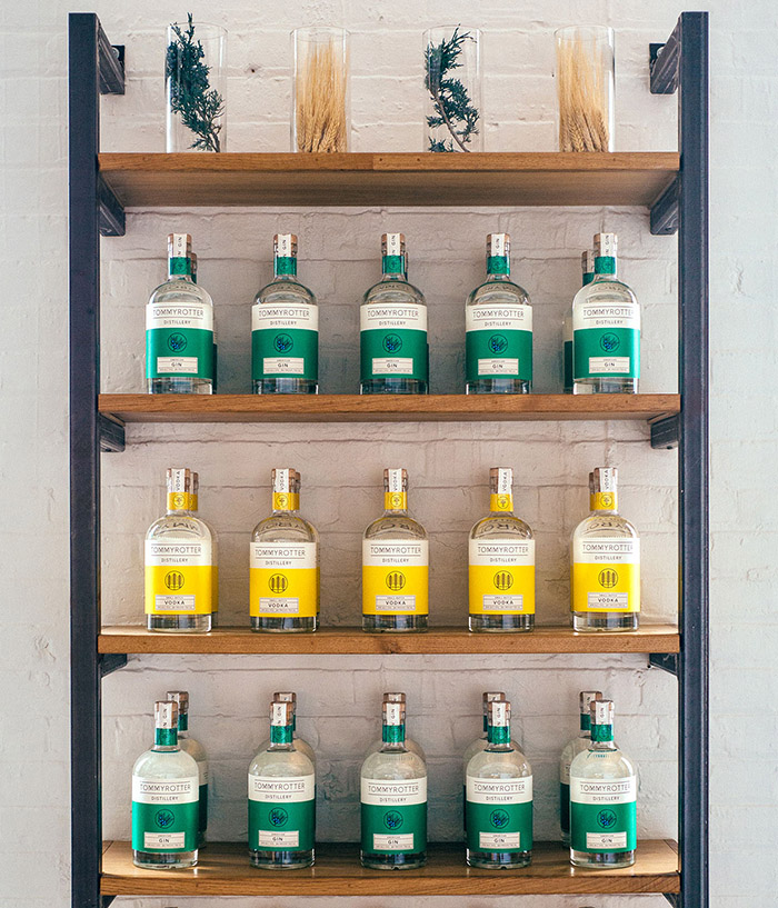
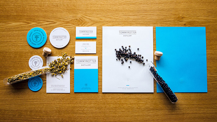
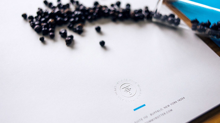
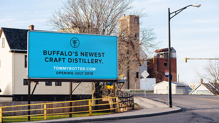
Tommyrotter Distillery pays homage to the Tommyrotters’ Club, a band of rebellious artisans who broke rank from the influential Arts & Crafts movement in the early 20th century to create for creation’s sake. We began by developing the distillery’s identity, brand story and tagline, before moving onto packaging and label design for gin and vodka bottles, stationery, printed collateral materials, an ad campaign, website, and the interior design of the distillery’s tasting room. The branding is clean and simple, with honest intentions and understated style. The identity is a modern take on the Arts & Crafts movement’s handcrafted style: a custom sans serif wordmark and accompanying brandmark draws inspiration from the movement’s nature-inspired aesthetic. Embellishments provide updates for the 21st century: a neon blue Pantone floods applications; embossed, color-blocked bottle labels, with saw-tooth edging and illustrated patterns depict the spirits’ natural ingredients. The distillery’s interior, an industrial space in Buffalo’s historic Hydraulics manufacturing district, embodies the marriage of modern and minimalistic: white-painted brick walls, warm white oak, and accents of raw steel and black allow the Tommyrotter gin and vodka bottles to stand out with color and focus. The bar’s herringbone pattern and custom retail furniture, designed by Block Club and built by a local craftsman, complete the space.
Designed by: Block Club, USA.






Featured on Package Inspiration