
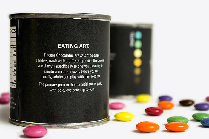
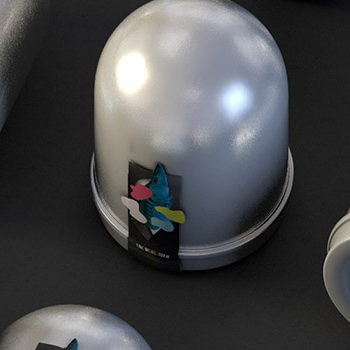
Tingere is a student project based on the objective of repackaging Smarties in a way that will attract a different demographic to the product. The idea behind the Tingere brand is to appeal to a more mature, adult audience. It is not, however, attempting to appeal to that demographic through the stereotypical approach of making candy seem high class. It encourages the consumer to play with their food; to use it as an artistic medium. This is executed through packaging the candy as if it is paint in a tin, with colour swatches on the side.
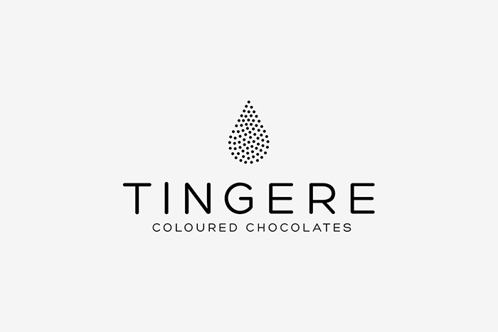
The logo is a tear drop shape that alludes to ink and paint icons that are so prevalent in printing, but it is composed of dots that represent the candies. The word ‘Tingere’ is Latin for ‘to colour’ or ‘to dye’.
Designed by: Will Erickson, Canada.


Featured on Package Inspiration
We are young team which works to inspire packaging designers every day! Our team select the best packaging of today and shares with you.