TIM & TAMMY’S – Brand Packaging
2016 | Peanut Butter
Tim & Tammy’s is a genuinely American product, a peanut butter developed by a couple of American missionaries who have livein Brazil since 1967.
Timothy Evans, Tim, started making his own peanut butter simply because he did not like the products he found in Brazilian markets, after a while his friends started experimenting and ordering.
That way, unpretentiously Tim & Tammy’s was created, with traditional recipes with subtle adaptations to the Brazilian palate, uniting the best in both worlds.
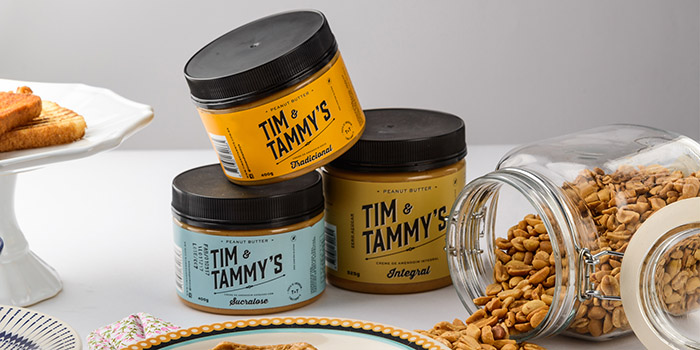
The project was based on translating elements of the American culture in a visual way, while maintaining aspects of hand craftsmanship, which is undoubtedly one of the great differentials of the product.
We developed three packages were developed for different types of pulp:
Traditional:
Typical peanut paste sweetened with sugar and cane syrup;
Sucralose:
Product aimed especially for people with diabetes or who simply want to avoid the conventional sugar.
Whole/Integral:
Taking advantage of all the benefits of pure peanut butter.
With a quality product and a graphic design project aligned to the product’s proposal, despite it’s recent entrance in shelves, the brand quickly gained space in major markets.
By having distinct packaging project within Brazil’s competition of mostly industrialized products or extremely visually aligned with food supplement packaging or even medicine, the packaging stands out in shelves, arousing curiosity and consequently consumption.
The awakened perceptions were the desired ones:
an artisan product, organic and of extreme quality.
Designed by: BR/ BAUEN, Brazil.

Featured on Package Inspiration