
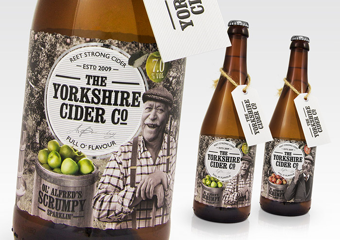
Brief: The Yorkshire Cider Co is looking for a new identity and accompanying bottle/label designs that will help create a clear positioning within the marketplace. The designs need to aid in the overall promotion of the company, whilst effectively communicating its Yorkshire heritage.
Competitors: UK cider brands (specifically boutique and farm house) Creative Solution: The new range was designed to have instant shelf appeal through an eye-catching combination of typography and photography.The client was keen for the design to be quirky and fun, so we explored the Yorkshire heritage through the use of famed dialect, conventional farming landscapes and Yorkshire references. Building on this research, we created a brand story about two Yorkshire brothers working as orchard farmers, including typical items you would expect to find in this setting like apple crates and barrels. We even includeda friendly Yorkshire ferret!
We aimed to communicate a farmhouse notion, in keeping with the Yorkshire stereotypes whilst maintaining a premium look and feel. To achieve this we explored a range of materials and print finishes. Alternative ideas we explored included external packaging, taking cues directly from the label. Concepts we explored included creating a wooden crate and a cider barrel for the bottle to sit in. Ultimately, we concluded these routes were not commercially viable and so decided that a swing tag and standard label would be most effective.
Designed by: Ben Lambe, United Kingdom.


Featured on Package Inspiration
We are young team which works to inspire packaging designers every day! Our team select the best packaging of today and shares with you.
