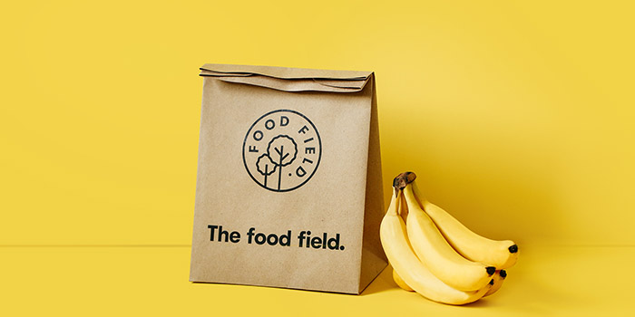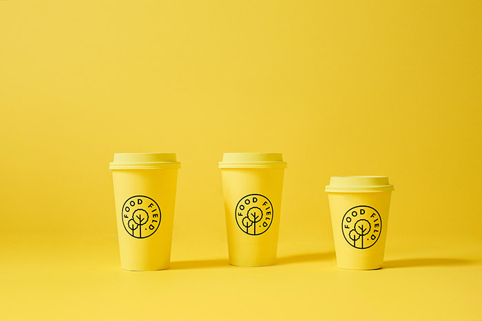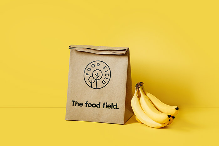
The Food Field
Organic food store located in San Pedro GG, México. We created all the visual identity; from naming, packaging and all sales peripherals. For the color palette we wanted to avoid an obvious green palette so we used instead a set of 3 different shades of yellow which symbolize the dawn and start of a fresh new day. The logotype is accompanied by a simple and geometric icon that can be easily used to mark their wide range of edible products.
Designed by: Parámetro Studio, Mexico.


Featured on Package Inspiration