Designed by: YG, Argentina.
Brief
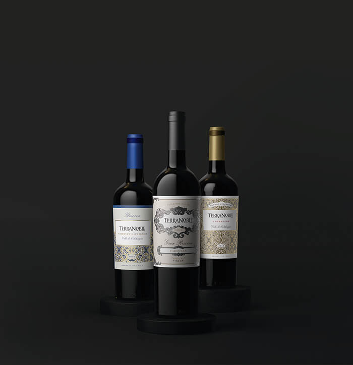
Creation of identity for the line Terranoble.
Challenge
To create a consistent and contemporary identity for the entire line while preserving the DNA of the flagship product: Gran Reserva.
Suggested Approach
Gran Reserva has received many awards and is the most well-known product of the line. Therefore, Gran Reserva became the starting point to develop the entire range. We broke down all essential visual attributes to rearrange the brand’s DNA. We worked carefully on every detail to strike a balance between static and dynamic elements. The resulting image had to be elegant but not boring.
The logo was changed completely to add meaning and to make it legible and simple. These important improvements were implemented so as not to alter Gran Reserva’s DNA. We added value to the entire line using a rococo style while differencing our approach from their competitors.
Result
The resulting range has a consistent identity and excellent differentiation between price segments and from its main competitors.
Shelf-awareness has improved significantly for all the other products in the line. Gran Reserva enthusiasts are now able to recognize the other products and link them to the Terranoble family. In addition to this, the new image has made a positive impact on importers and, therefore, on sales.

Featured on Package Inspiration