Quebec is the francophone province of Canada. With only 400 years of history, Quebec was the first North American province to be colonized by the Europeans in the sixteenth century. The province is known for its cold climate as well as its rich culture. Today’s Quebec culture is the result of the fusion of many people; due to the abundance of colonization. Primitively, the territory was occupied by the first nations followed by the French, the English, the Irish, and later came the Portuguese, the Chinese, the Italians, the Vietnamese, etc. ..
The mission of the project was to create a visual identity represent Quebec culture. The mix of people from different ethnical backgrounds make it a very rich culture. The branding of Swing microbrewery was inspired by Quebec’s cultural, historical, and natural references.
Typography and Logo
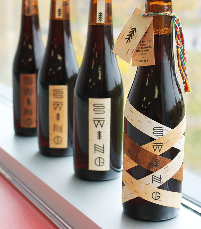
This Quebec vernacular typography was used for the logo of the Swing brewery. The shapes of the letters were inspired by Native American petroglyphs considering many Quebecois identity symbols are borrowed from Native American culture. (The racket sinew, bark canoes, fur, etc. ..)
Native American petroglyphs illustrate these concepts and elements of nature as the Amerindian language was primarily oral. We can observe a river (s), spruce (i), etc… within the logo.
Packaging
1) Limited edition:
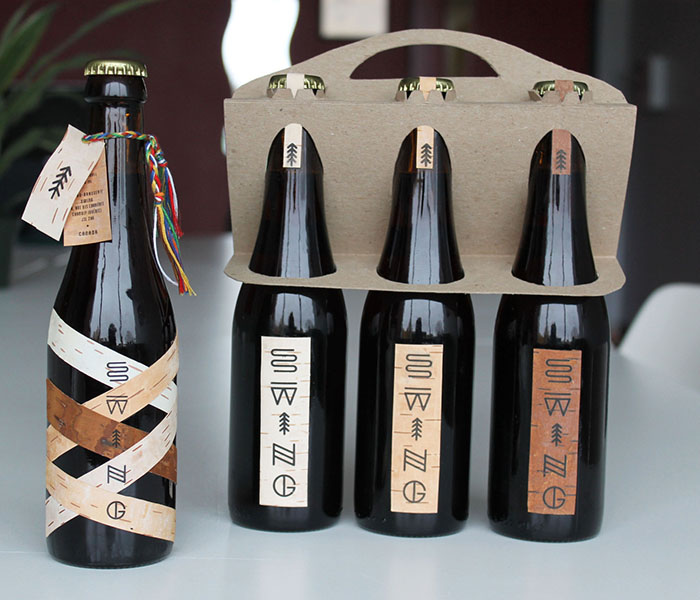
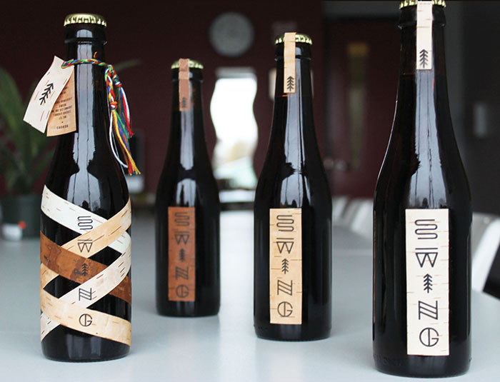
This limited edition is produced and used exclusively during the launch party of the Swing brewery. The label is composed of strips of different coloured birch that criss-cross to represent the blend of cultures that make up Quebec’s identity today. The information was printed on a label then attached by a braided twine made up using the traditional colors of Quebec’s arrow belt.
2) Commercial edition:
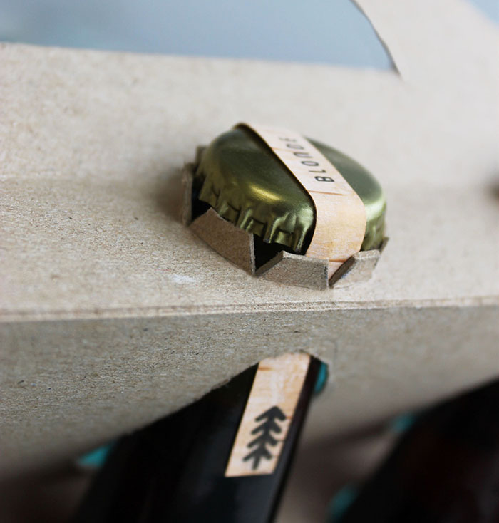
The goal was to visually communicate a traditional sensation for the image of Quebec. The bottle is dark in order to create a contrast with the lable. The second label, attached to the cap, seals the beer and indicates the type; wether it be is blanche (white), blonde (lagger) or rousse (red).
The commercial packaging has been specially designed to highlight the bottle. Additionally, the objective was to minimize the amount of cardboard used in order to promote efforts that are deemed eco-friendly. The packaging information is located on a label, similar to the main one, found on the back of the bottle.
The taste:
This beer is dynamic enough to appeal to a young crowd due to its reinvented traditional design. The beer is fresh and has a woody aroma thanks to the organic spruce and brown sugar. Taste will envelop your glass with an invigorating foam that is both creamy and persistent. To the sent, it shines by in a subtle way. Once on the tongue, its flavor and finesse is dominated by the maple sap that composes it. This beer will give you dynamic energy to your gigues endiablés (traditional Quebec dance).
Designed by: Simon Langlois, Canada.


Featured on Package Inspiration