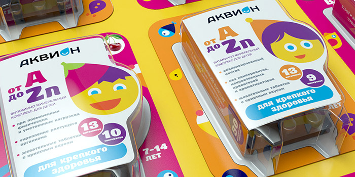
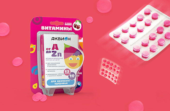
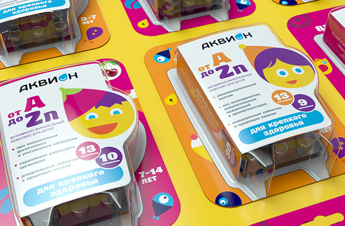
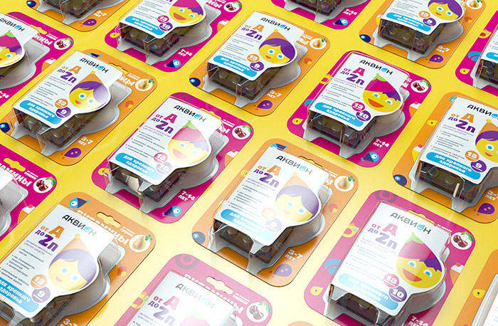
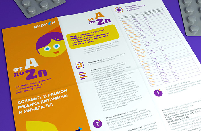
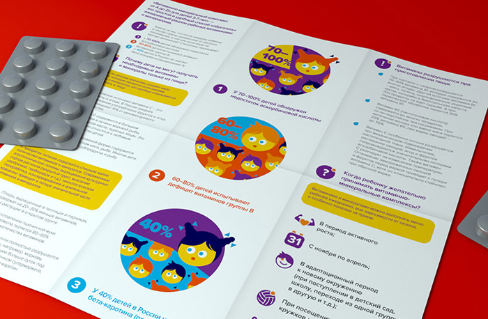
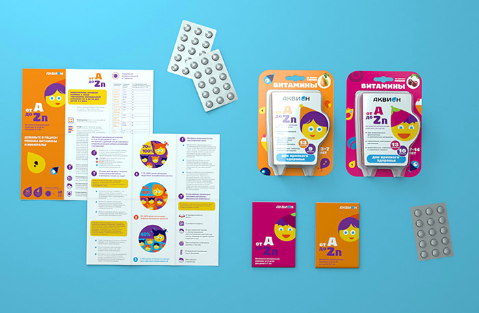
We created series of packaging for the children’s vitamins.
The shelves of pharmacies are filled with variety of the range of children’s vitamins. They stand out by brightness and color. The photo or the illustration are often used as attractive color sport. But all of them are oriented on the attraction of parents’ attention, as they are the main buyers. And the consumers – children – obediently follow adults’ rational choice.
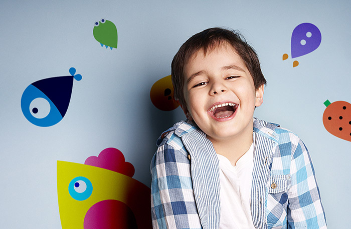
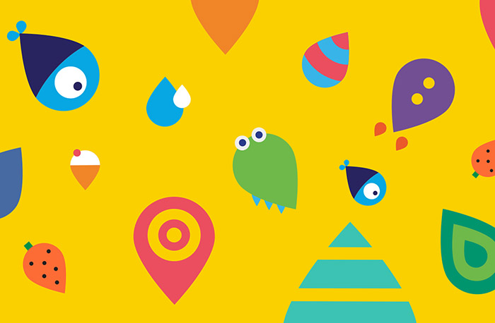
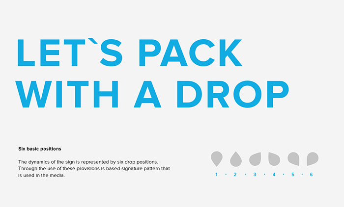
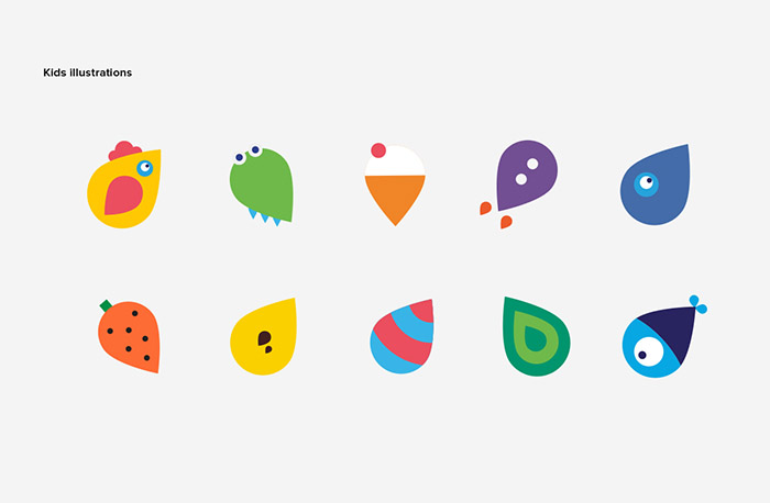
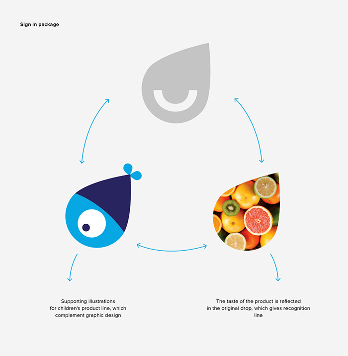
We decided to change the rules and attract children’s attention, as they are the main consumers of the product. The main corporate element of the Acvion company – the drop – became the base of illustrative story. Children themselves and fairy creatures, citizens of the vitamin world, take part in this story. They are compositions of the product (carotene, phosphorus etc.) and unexpected creatures, interesting to meet (crocodile-baby, brave rocket, yummy ice cream cone etc.).
Thereby we set the connection with the consumers with help of understandable language of images: both familiar and unknown, and those you want to become friends with at the first moment. That means – take them home, communicate every day and tell friends about them.
Designed by: DEZA Design, Russia.
Featured on Package Inspiration