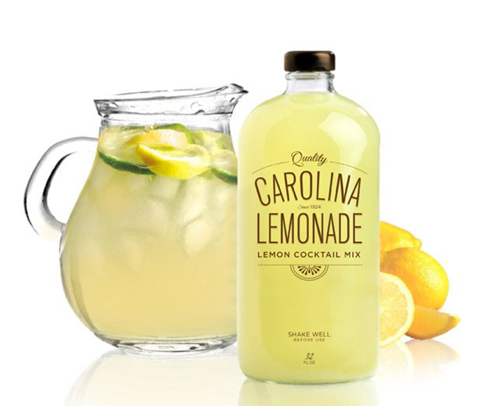
“This was a school assignment in Packaging 101. The project was to design a beverage of your choice and the challenge was hat you’re limited to only one color. We the lack of 4 color imagery I was forced to utilize the color of the beverage itself. A few people in my class were doing juice so I moved to a more fun option, a cocktail mix which allowed me to experiment with different bottle shapes. The Boston round had a great feel to it and was calling out for typography. I decided to keep it simple and just use type but my professor felt it needed some sort of appetite appeal. I finished the assignment off with a small illustration of a lemon slice which I think really makes the piece eye catching.”
Designed by Jessica Haas, United States.


Featured on Package Inspiration