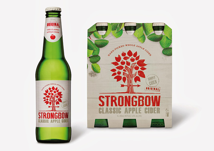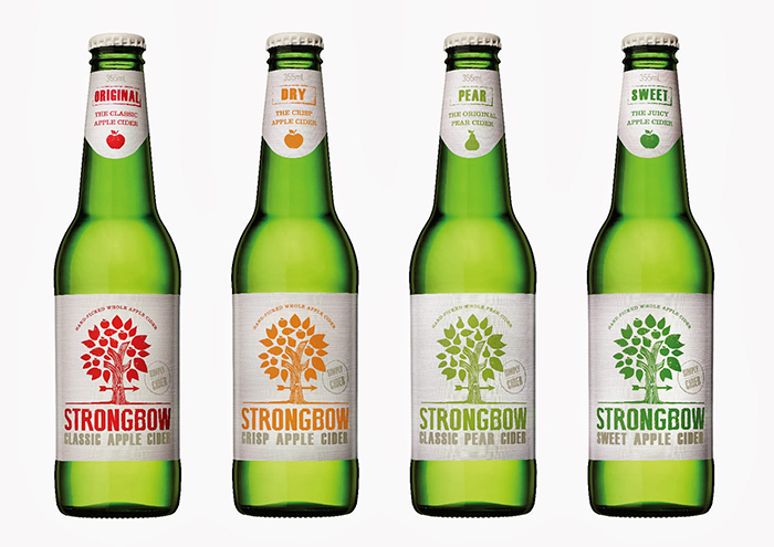
Australia’s favourite cider Strongbow has launched a new look pack design.
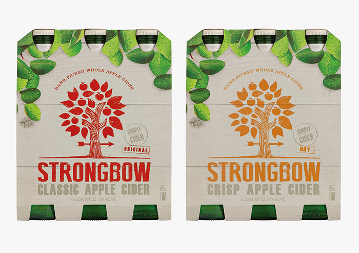
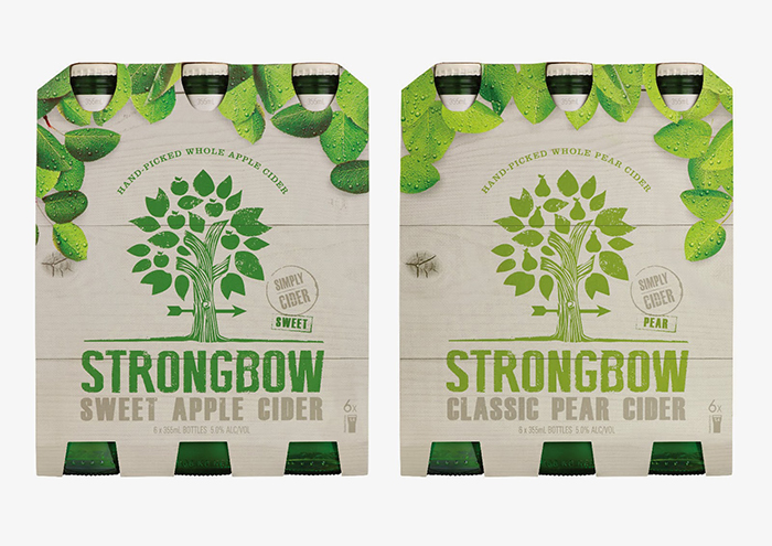
The newly refreshed packaging has been crafted to bring to life the Strongbow essence of relaxed simplicity. Featuring a bold wood-cut style tree illustration, the label has a printed wood grain finish to reinforce the cider’s origins in the orchard. The natural colouring of the labels give an earthy feel and complements the refreshing cues of the green glass bottle colour.
Each Strongbow variant features the new logo represented in a colour to differentiate between the flavours. The colours across the range are natural and down to earth, and connected in tone to the former variant colours.
Designed by The Collective, Australia.


Featured on Package Inspiration