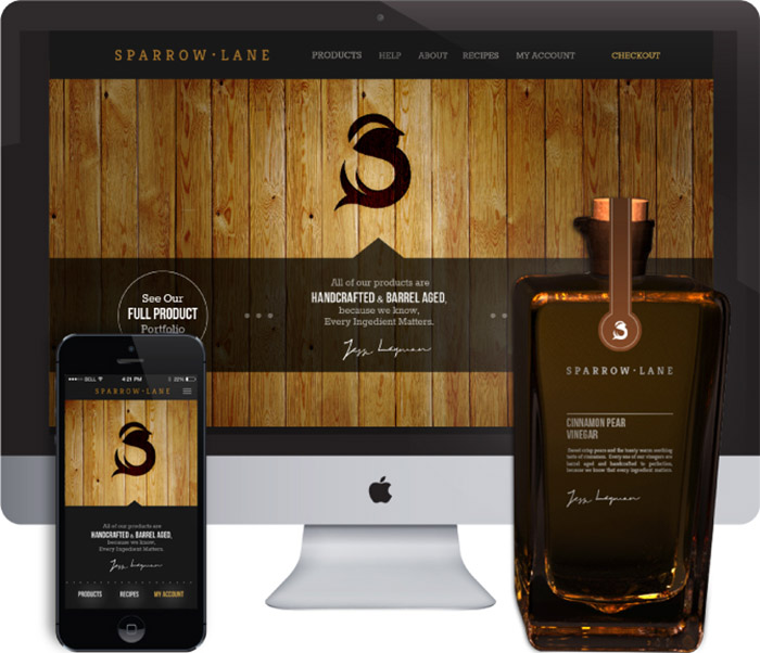
The rebranding of Sparrow Lane Vinegars.
My goal for the project was to maintain the hand-crafted feel of the brand while conveying refined elegance. The company takes tremendous pride in their selection of only the finest ingredients and their Orleans Method of aging their products to perfection.
I modified the company’s previous tagline from, “When every ingredient matters” to “Because we know, every ingredient matters” to personalize the brand and emphasize the care taken when producing Sparrow Lane products.
Logo
The logo is a stylistic sparrow, taking form in the shape of an “S”. I chose to use “round” forms when designing the logo to relate to the curves of the oak barrels and the gracefulness of the sparrow.
Packaging
I designed a simple and sleek glass bottle in Autodesk Maya to showcase and show off the rich colors of the vinegars. The labeling consists of a brief flavor description and the promise of quality and signature from the Executive Chef.
The bottles, each, have a small spout to ease pouring and a slight taper from the top of the bottle to the bottom.
Web and Mobile
In designing the website and mobile application, I took the opportunity to use the rich and earthy texture of the oak barrels that the vinegar is aged in. I reworked the secondary navigation of the website to allow the user to, intuitively, flow through the products and recipes. I simplified the secondary navigation, while maintaining the convenience of filters to sort the items being viewed. I used subtle details, like the ascending and descending peaks of the wood texture from the primary navigation to the secondary navigation, so that the components of the site felt cohesive.
I vamped up the recipe section of the site by showing images of the recipes to draw the viewers in. I included links from the recipes to the products used to further encourage the purchase of the products.
This project was done for educational purposes, only.
Designed by: Jade Cole, USA.


Featured on Package Inspiration