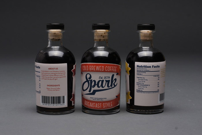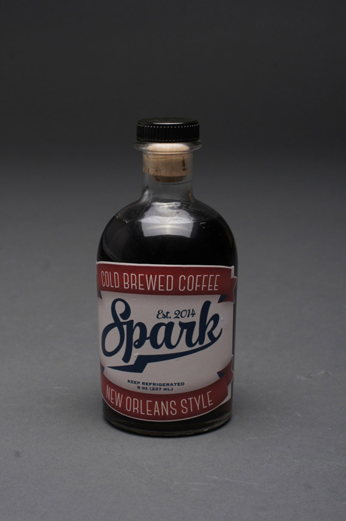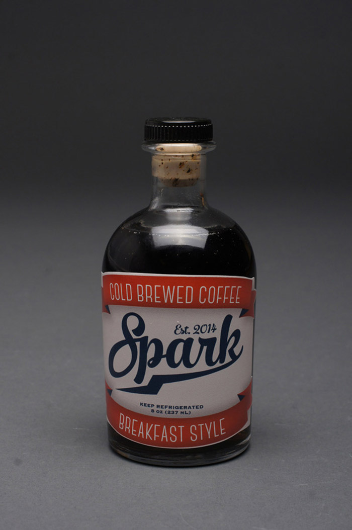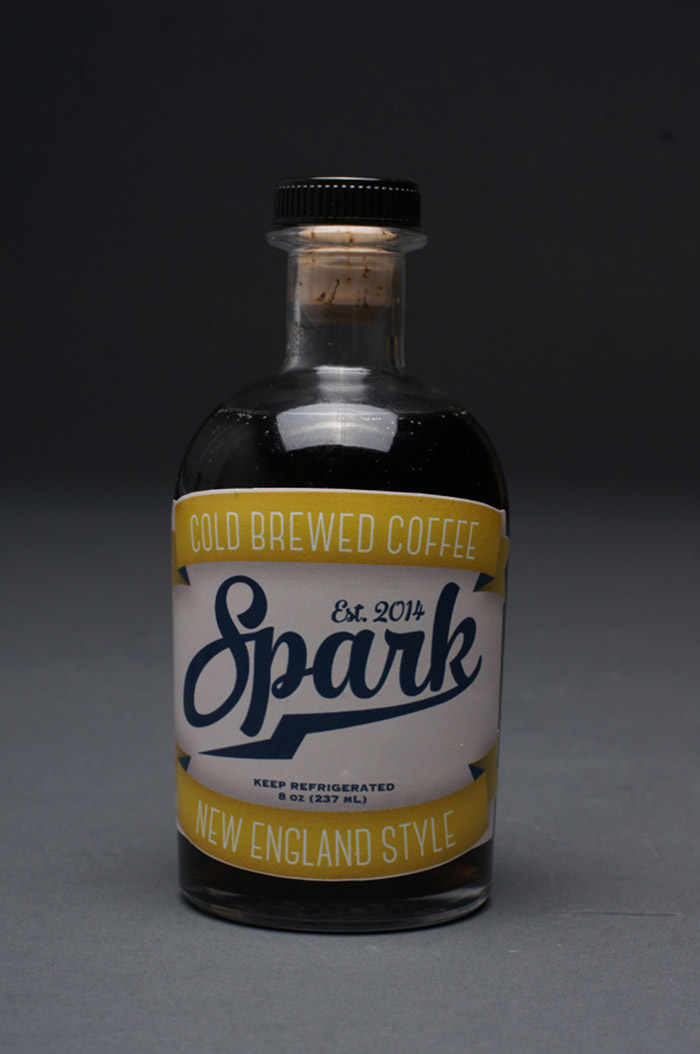
My first packaging project project that focuses on typographical hierarchy when creating a design. The vintage look and colors used is meant to instill a more homemade feel in the viewer.
Designed by: Donny Blanchard, USA.


Featured on Package Inspiration