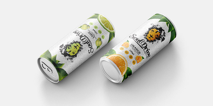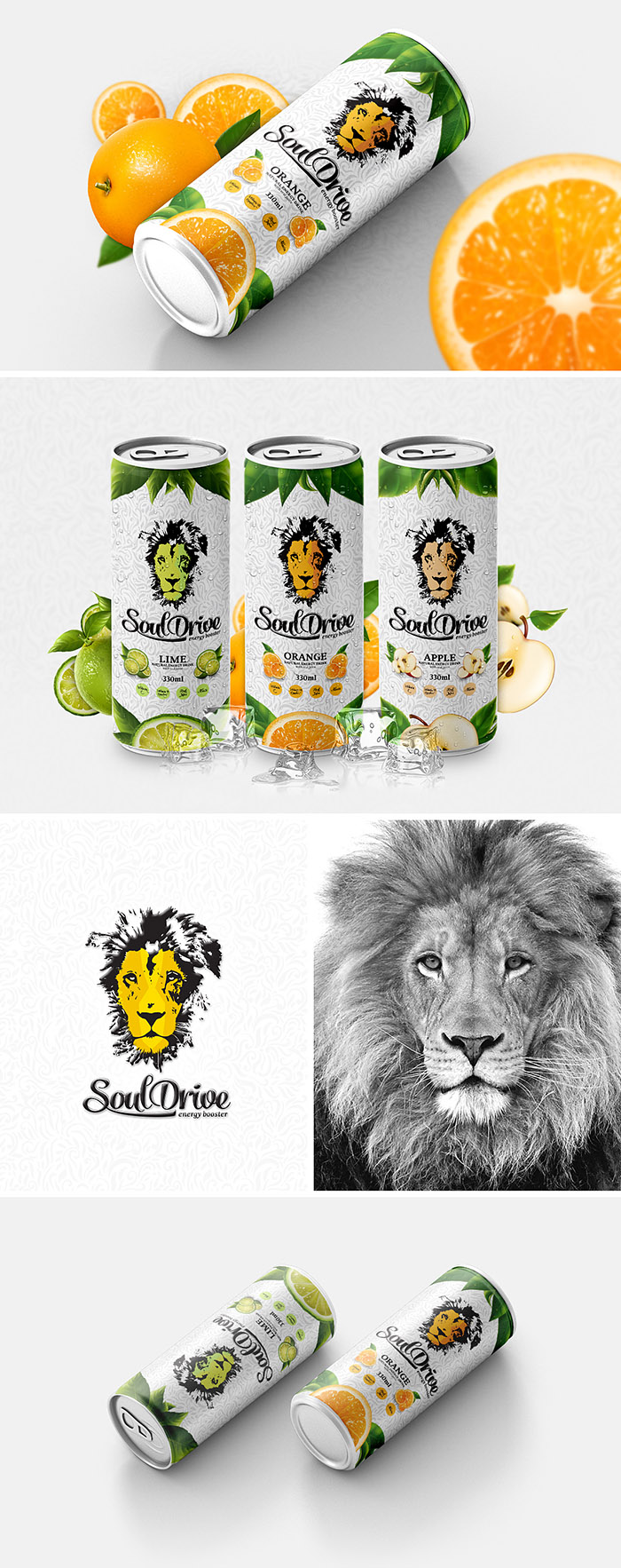
The concept of Soul Drive packaging design was developed from the idea of healthy and natural energy drink made with juice. Soul Drive comes in three different taste options (orange, lime and apple), in tins of 330 ml. Soul drive packaging design is colourful, fresh and vivid. The main colours used in the design: green, orange and yellow. The name „Soul Drive“ represents the essence and scope of the product. Lion head placed on the packaging communicates energy and swiftness, clearly defining the scope of the product – energy drink. As the drink includes natural juices, green leaves were used on each adaptation of packaging design. Each design adaptation was created using different fruit placement on the packaging as well as different colour used on lion‘s head. Calligraphic typography adds a more dynamic look to the design of the drink. Fine-lined silver pattern on Soul Drive‘s packaging adds completeness and a provides a nice final touch to the design.
Designed by: Martynas Vežbickas, Lithuania.

Featured on Package Inspiration