
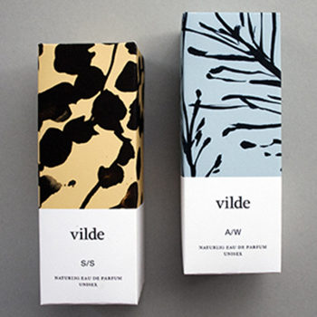
Agency: Mullen Lowe 43 / Alejandro Gutiérrez P
Creative Director: Natalia Hernández
–
Description:
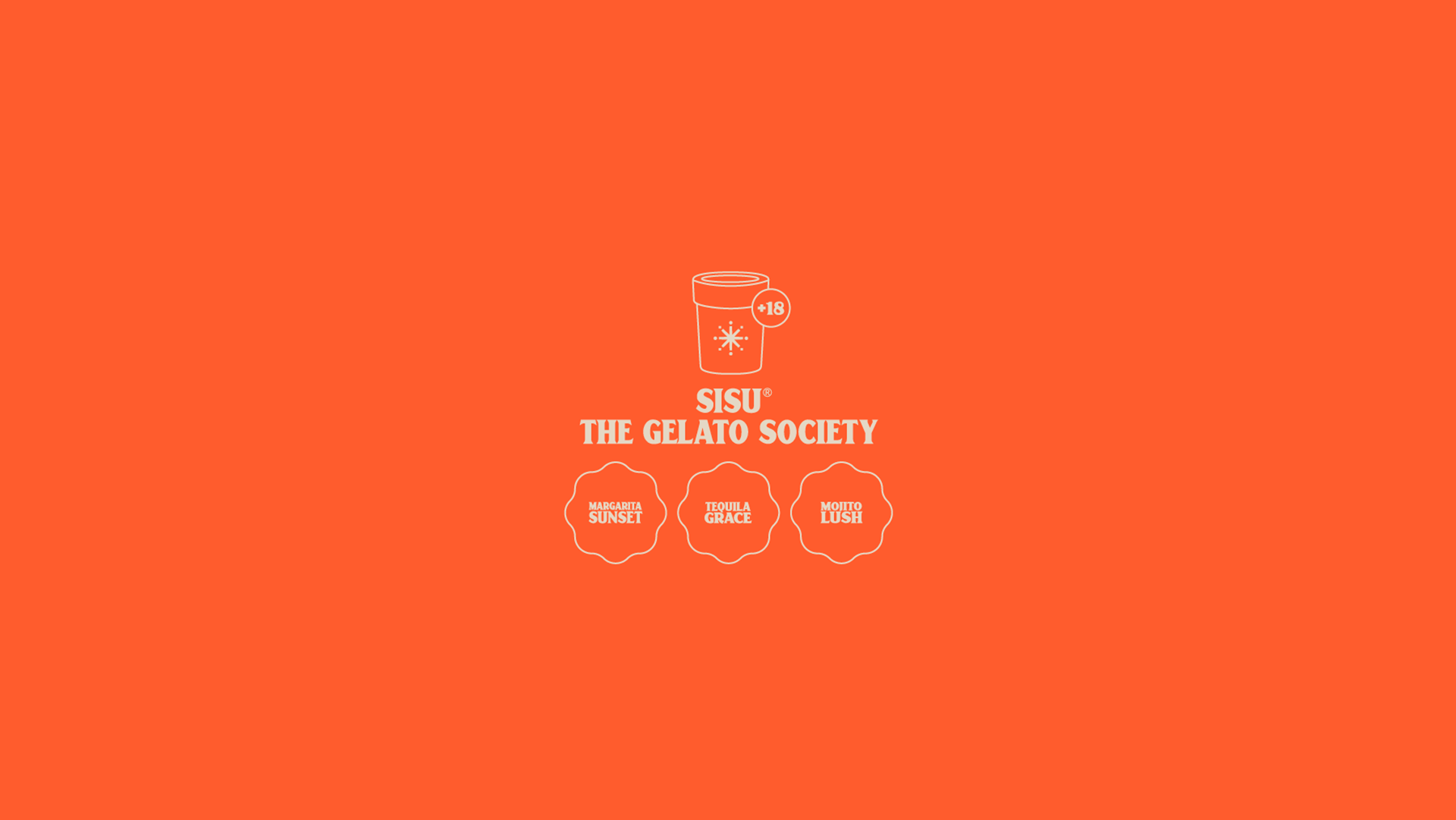
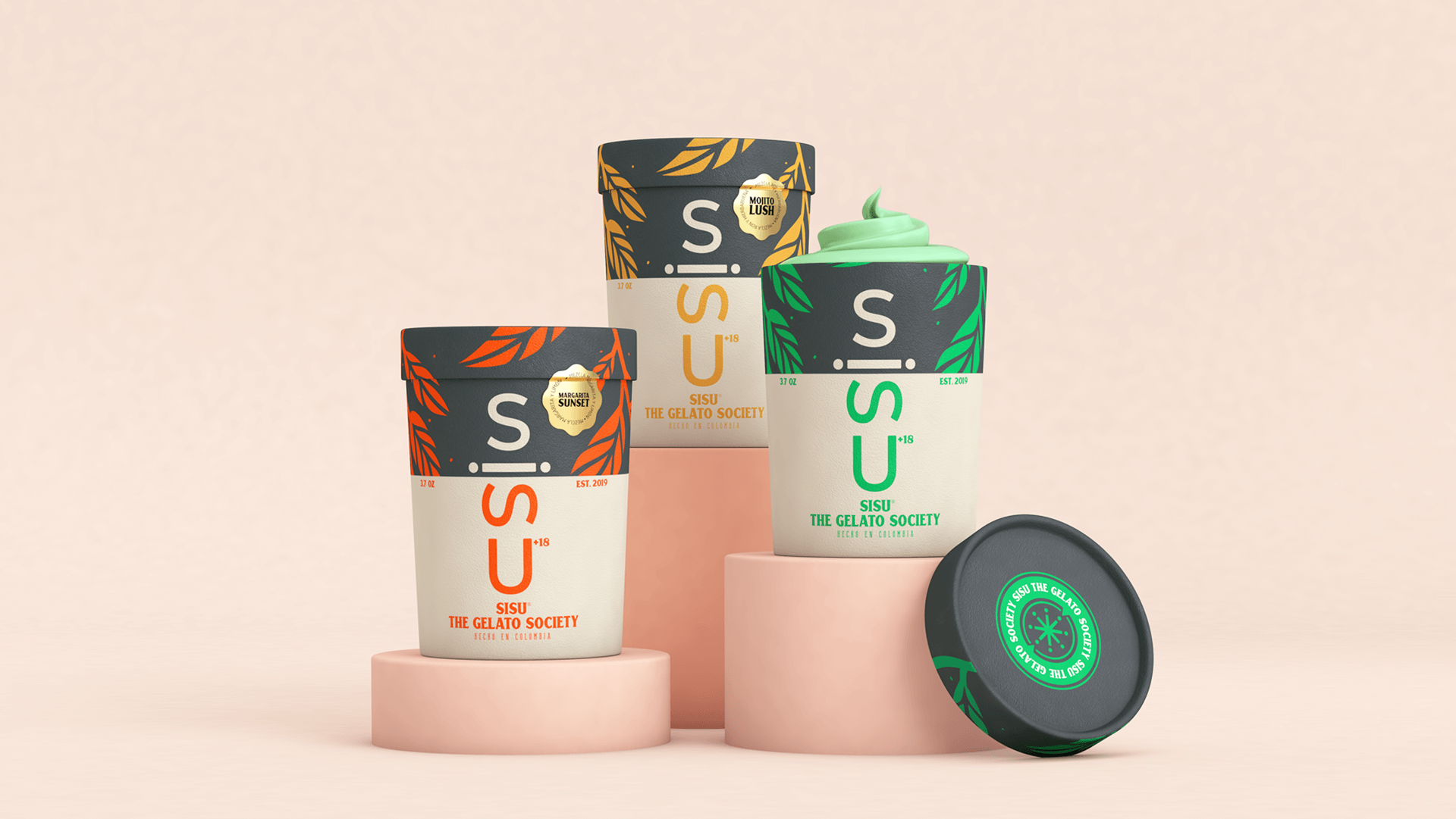
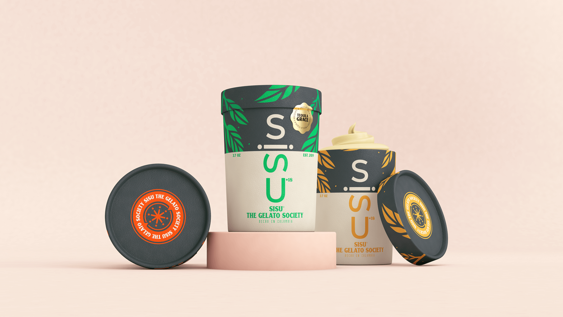
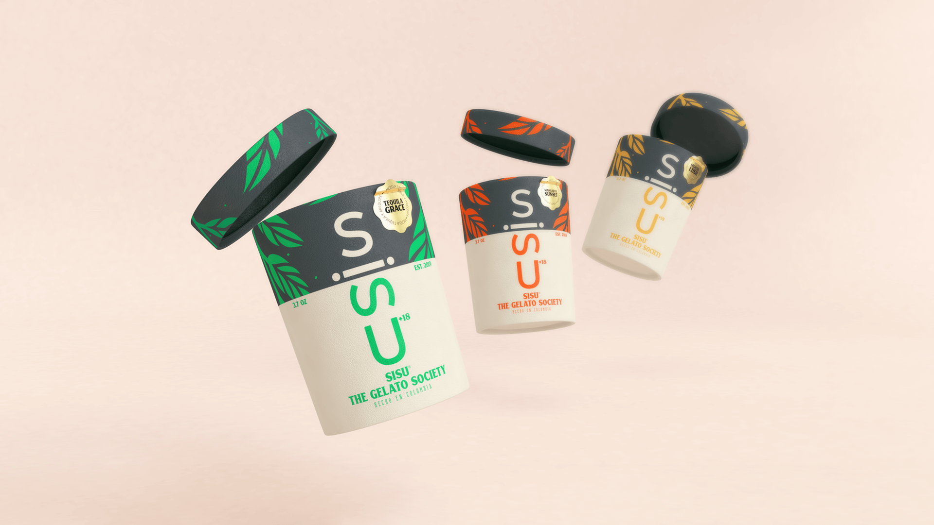
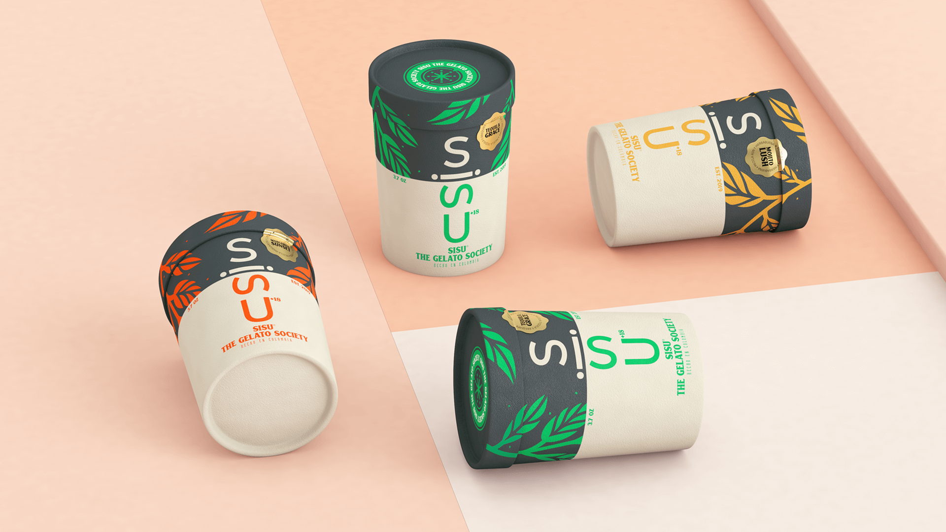
The design evokes the mountains and plants of Finland, where the word “SISU” comes from, meaning strength and perseverance, because the owner of the brand provided this information and wanted the name to be remembered for something other than alcohol. This was the first concept, the brand went to market and is a success.
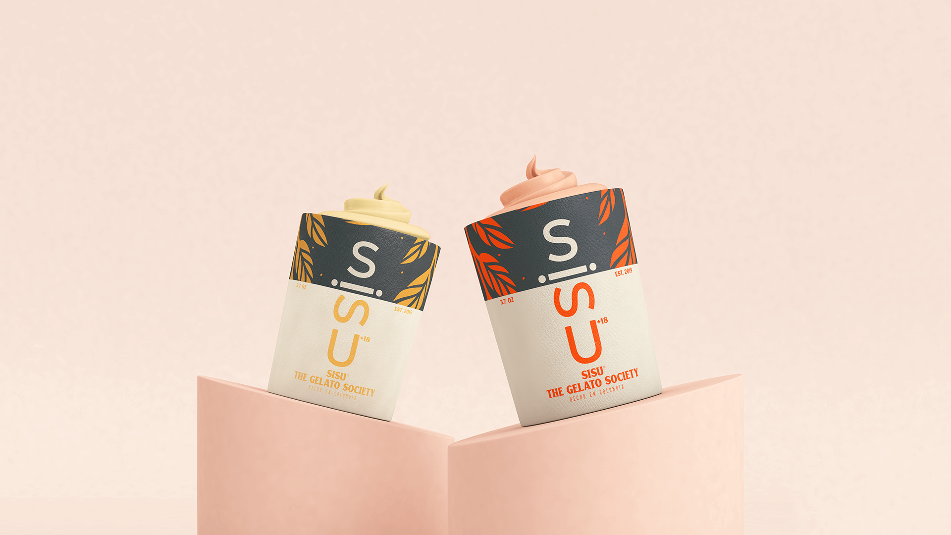
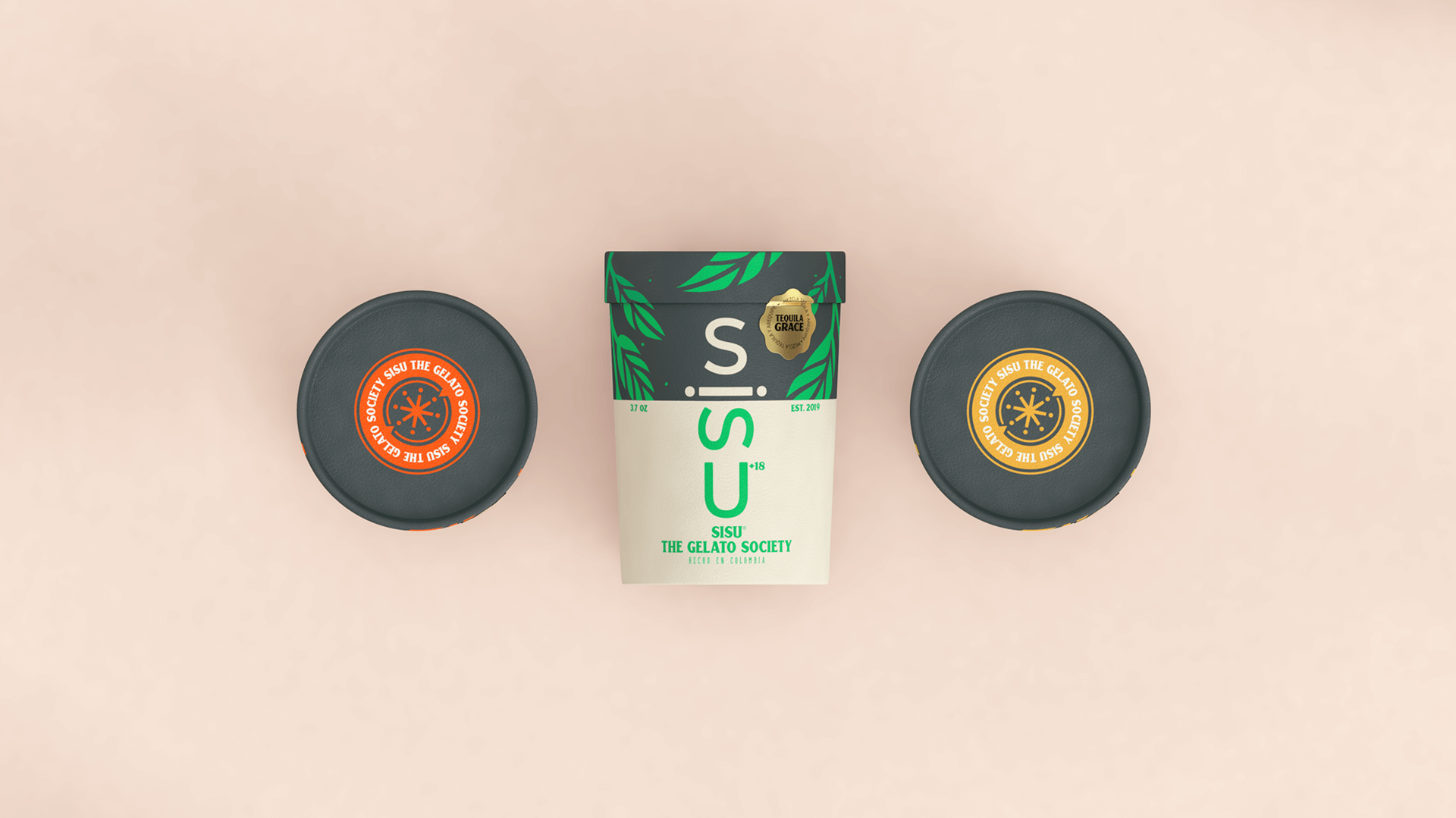
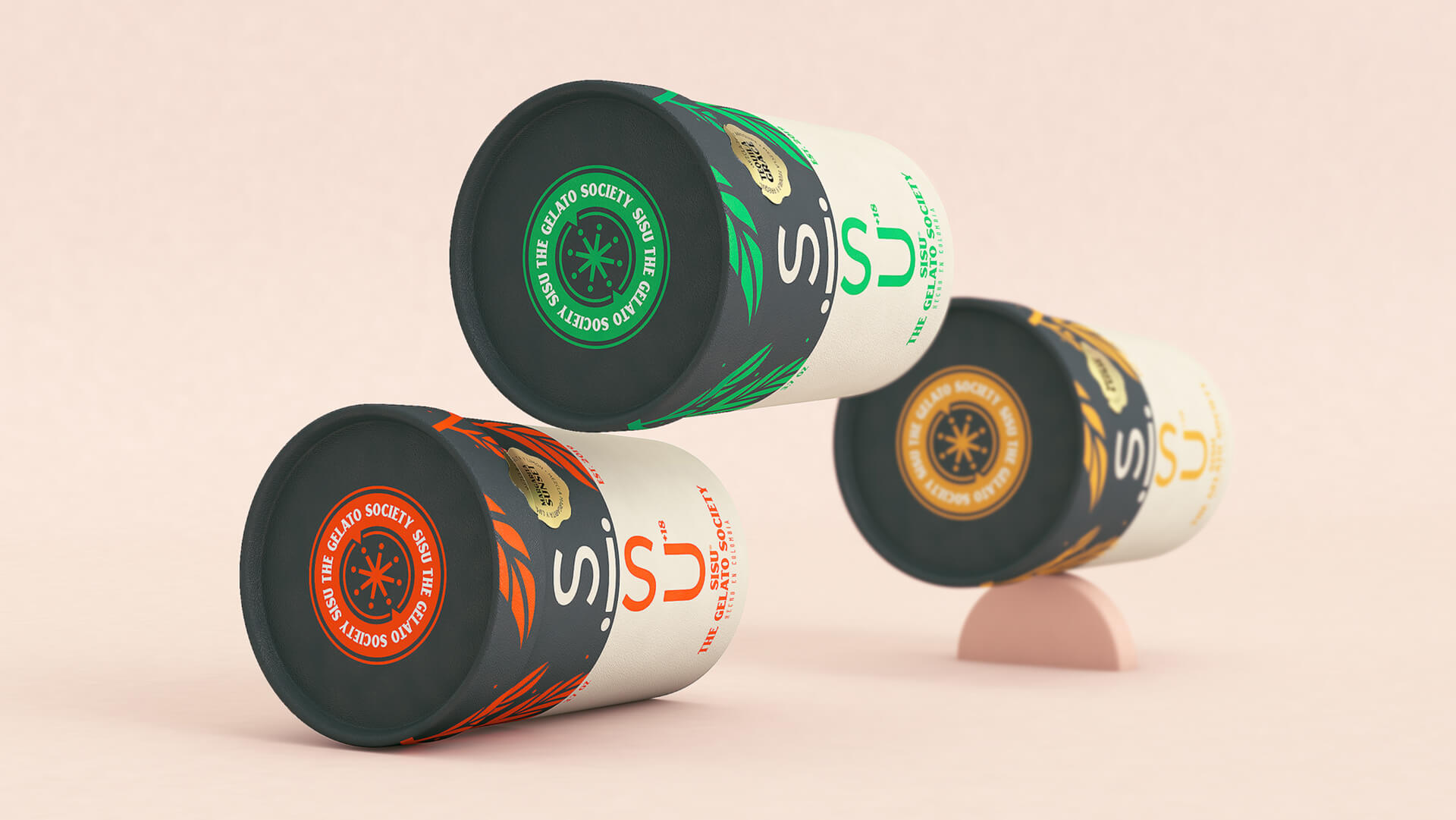
This product is aimed at people over 18 years of age who like to enjoy a rich flavor, but with some spice, although it is not only for the holidays as it is currently sold for plans such as watching series or heartbreak. These are the initial 3d and the idea was to have for each flavor a color that would identify it and a special name that would define the flavor of the ice cream and the cocktail of which it is composed. One of the main challenges was that people did not confuse it with a simple ice cream, so sub-names were created so that the public would associate the ice cream with alcohol and more with the mixtures of recognized cocktails such as the Margarita. A product with these characteristics had not been marketed in Colombia before and it has been very well received since it is an innovative idea.
![]()
Featured on Package Inspiration
We are young team which works to inspire packaging designers every day! Our team select the best packaging of today and shares with you.
