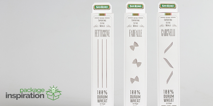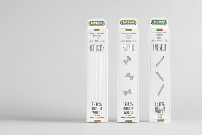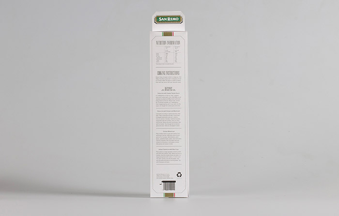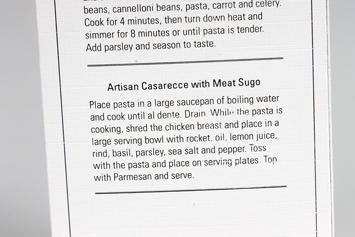
This Packaging was designed as possible replacement to the dated and cheap look of San Remo’s classic plastic pasta packaging. The clear plastic has been replaced by a clear paper that reduces the waste and adds the opinion of recycling. Each type of pasta has different packaging windows shaped into the shape of the pasta so that people can still find their favourite type without moving onto a different brand. This was my first design using multiple fonts from different font family’s.
Designed by: Samuel Murray, New Zealand.


Featured on Package Inspiration