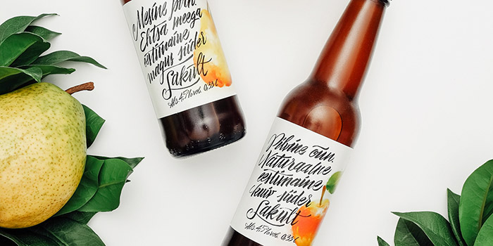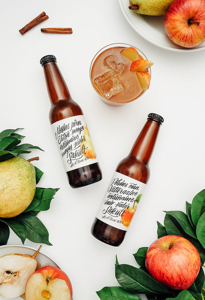
The brief was to create a new cider brand which should be an alternative to mainstream ciders – sitting firmly in the mainstream craft category, but taking strong cues from craft cider culture.
The mainstream producer that wanted to attract those wanting something a little different an artisanal.
This was executed without using the brewery logo, with calligraphic text being used to shake off mainstream brewery stereotypes, and custom water colour illustrations used to portray the natural feeling customers desired.
Translation:
Sweet pear. With real honey, Estonian sweet sider from Saku.
Cloudy apple. Natural Estonian dry cider from Saku.
Photos by Märt Lillesiim
Designed by: KOOR Packaging design, Estonia.

Featured on Package Inspiration