
Rota das Cores is a project that comes in the academic context, as graduate project of Bachelor Design and Advertising.
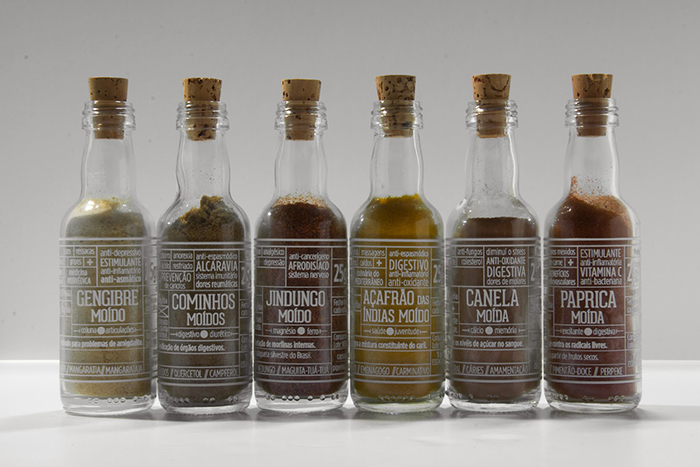
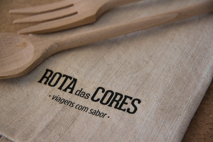
Rota das Cores is the name that was given to sea voyages of the Portuguese in Brazil, at the time of discovery. This was the name chosen for the range of spices and giving mood to any conceptualization of the project.
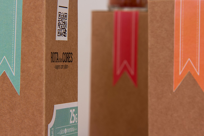
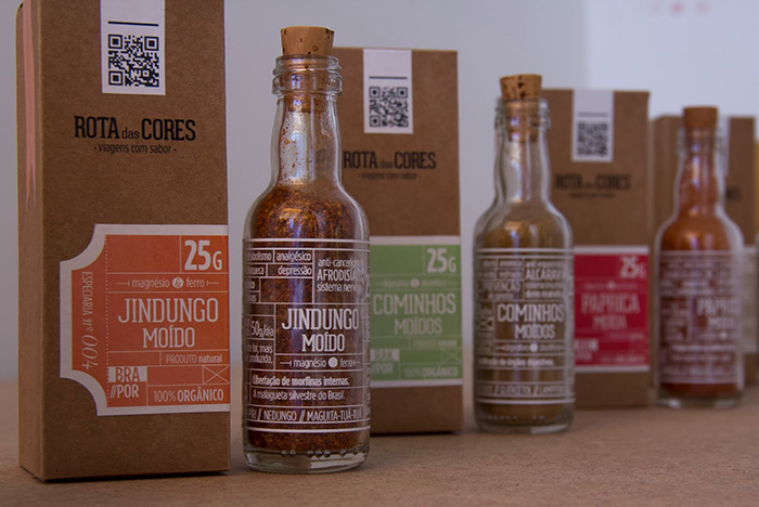
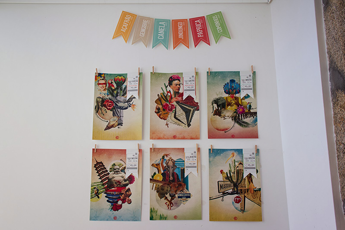
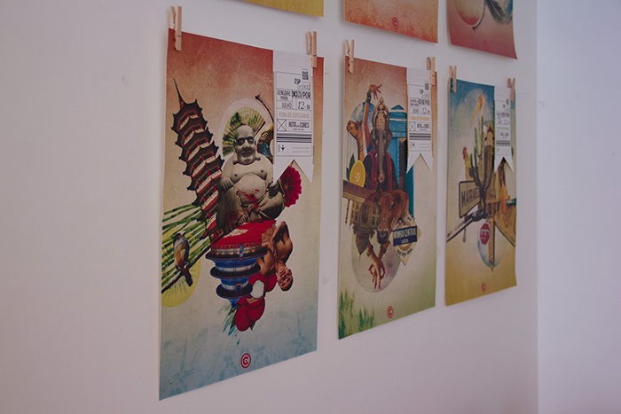
All graphic design of the packaging revolves around the theme “travel”. The idea that is intended to convey is that all the spices come directly from their country of origin to the final consumer, with all its properties and benefits.
The glass was chosen for the conservation of spices for being a tough, practical and hygienic materials and each label is specifically made in accordance with the product that carries support, making known all their properties in a comprehensive way, as a full benefits of the drug they were.
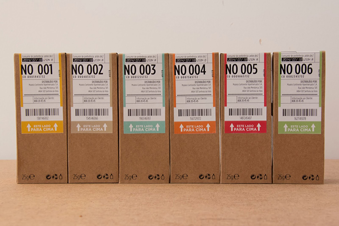
For the exterior, the material chosen was the card, referring to orders coming from abroad, as all graphic communication that inspires us tickets.
Designer: Rita Clemente, Portugal.
School: ESEIG


Featured on Package Inspiration
We are young team which works to inspire packaging designers every day! Our team select the best packaging of today and shares with you.
