Agency: Robot Food
–
Description:
Robot Food has created a new brand positioning and visual identity for independent craft brewer Vocation.
As one of the largest volume craft breweries in the UK, Vocation has played a key role in the driving of the craft category since launching in 2015. The new branding by Robot Food respects this, celebrating the committed and passionate spirit of its team and drinkers, simultaneously creating a recognisable brand presence that feels at home at craft shops, bars, and supermarkets alike.
“I’ve always seen Robot Food as our 5th Beatle,” says Vocation founder John Hickling. “It’s our vocation to bring better beer to more people and from the start I’ve relied on them to tell our story and manage how we present ourselves. We’re genuine partners so we’re proud to have them along for the ride as Vocation continues to champion its calling.”
Getting better beer to more people
Robot Food has been the brand guardian and design partner for Vocation since the brewery was founded in 2015, creating its initial branding. Robot Food also coined the brand name—a testament to its founder and now growing teams’ dedication to brewing.
Six years on and already a brand refresh later, Robot Food’s recent task was to overhaul the design to achieve greater brand stand-out as well as more consistency between the core Vocation range and its ongoing specials. Consideration was also to be given to creating brand recognition in bar settings.
“When we first created the brand it was a startup: now they’re one of the biggest brands in UK craft,” says Simon Forster, founder and executive creative director at Robot Food.
“The craft category is ever-growing and it’s still quite noisy,” adds Rich Robinson, Robot Food senior designer. “Vocation wanted to become better established in the on-trade bar scene, so it was about striking a balance between being brand focused and keeping its craft sensibility at the same time.
Natalie Redford, creative strategist at Robot Food adds: “As a brand, what Vocation really wants is to be accessible—at the end of the day, it’s simply about getting better beer to more people.”
Heroing Vocation
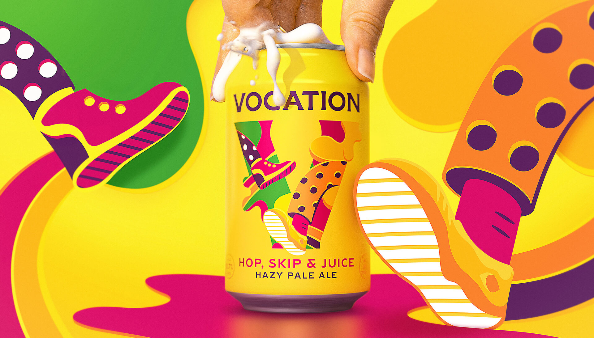
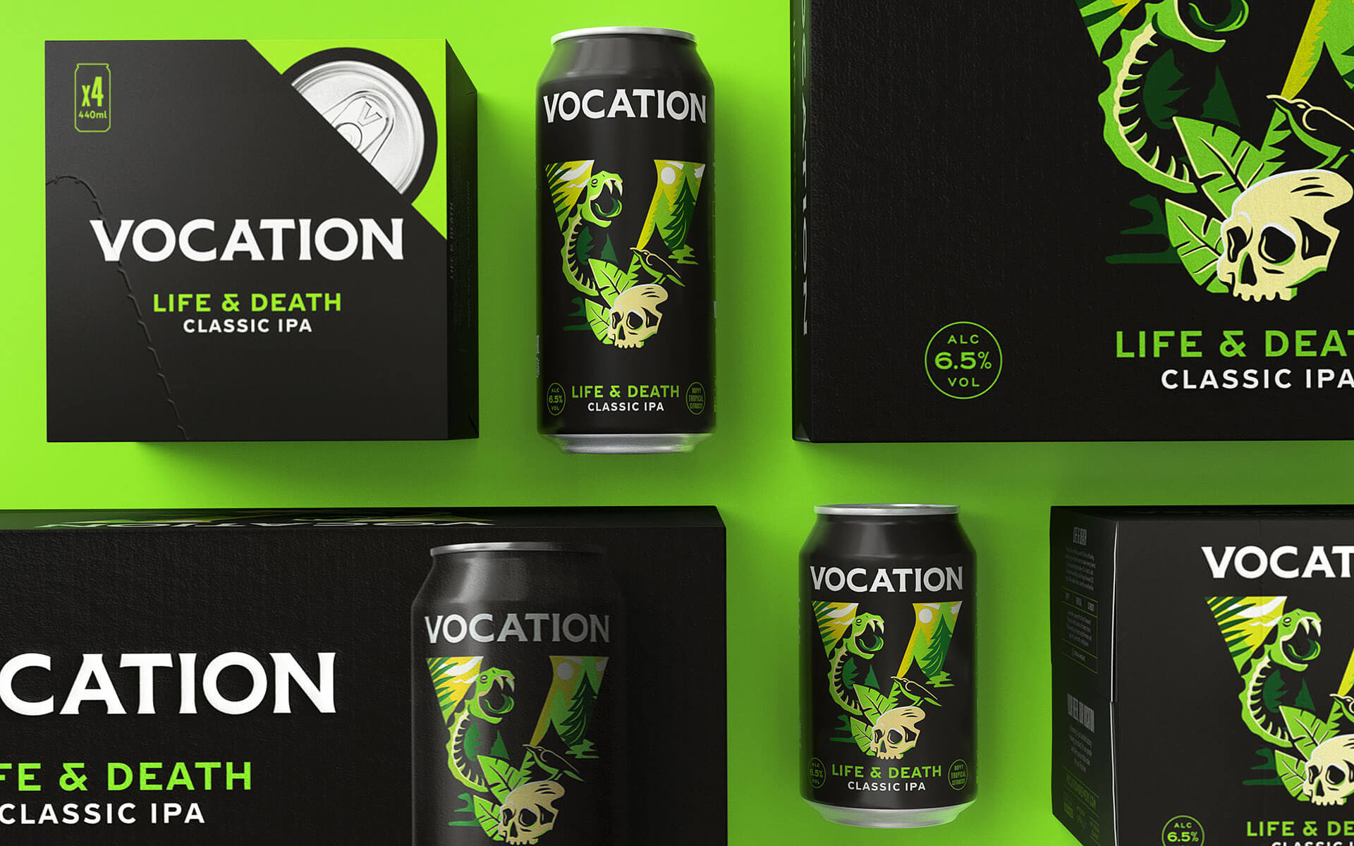
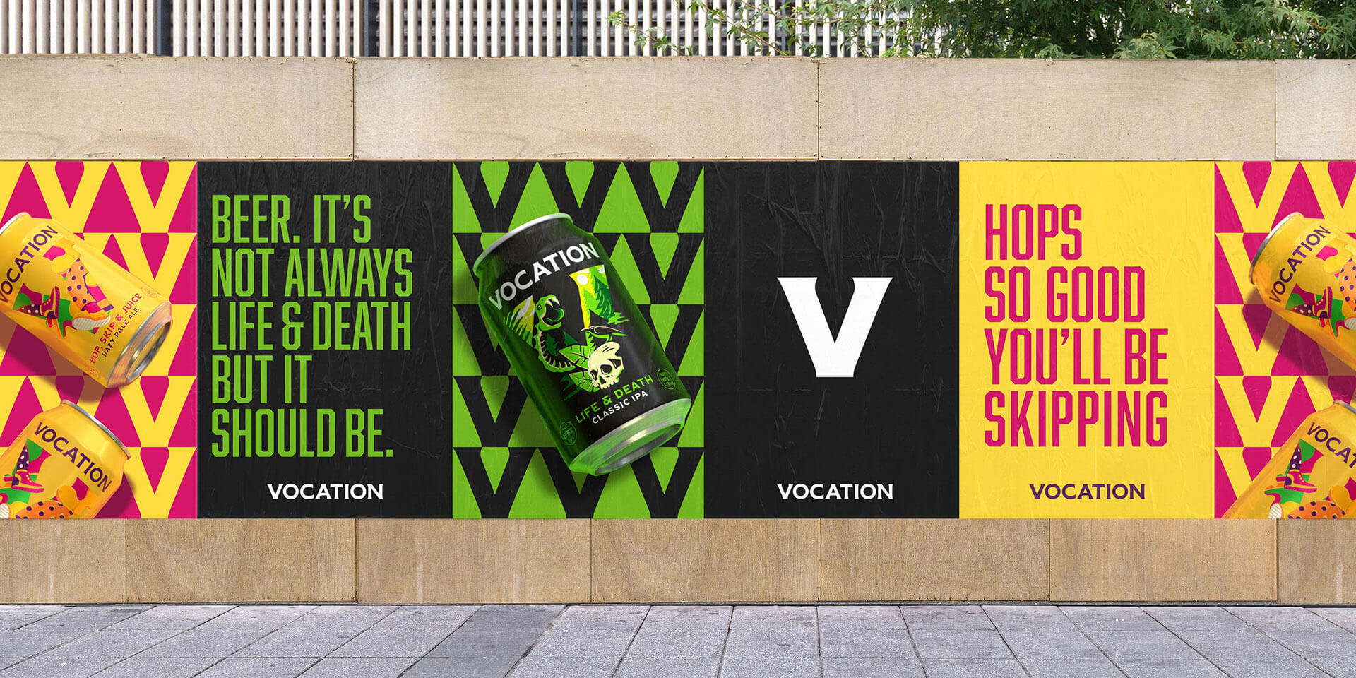
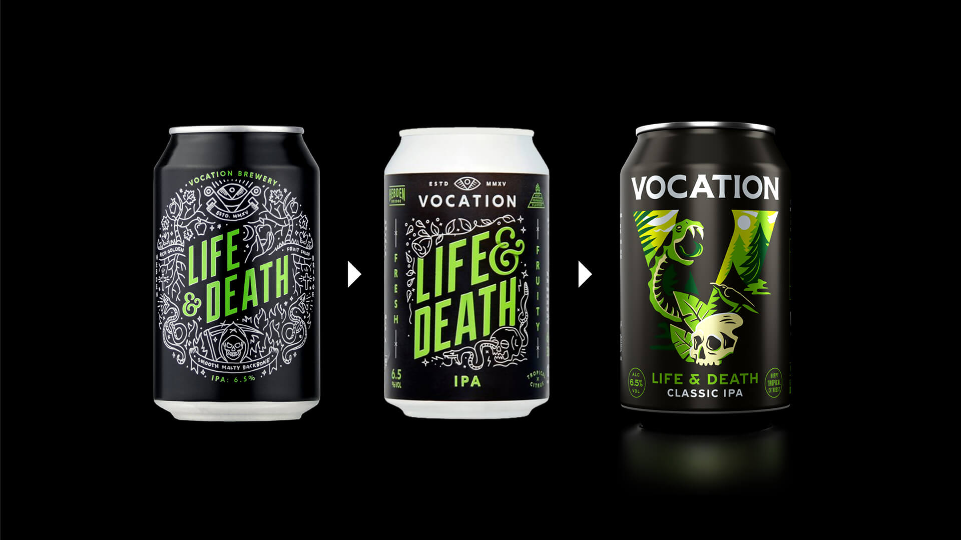
Until this new branding work, the can designs heroed the beers’ names rather than the brewery’s as they’ve always been beer first.
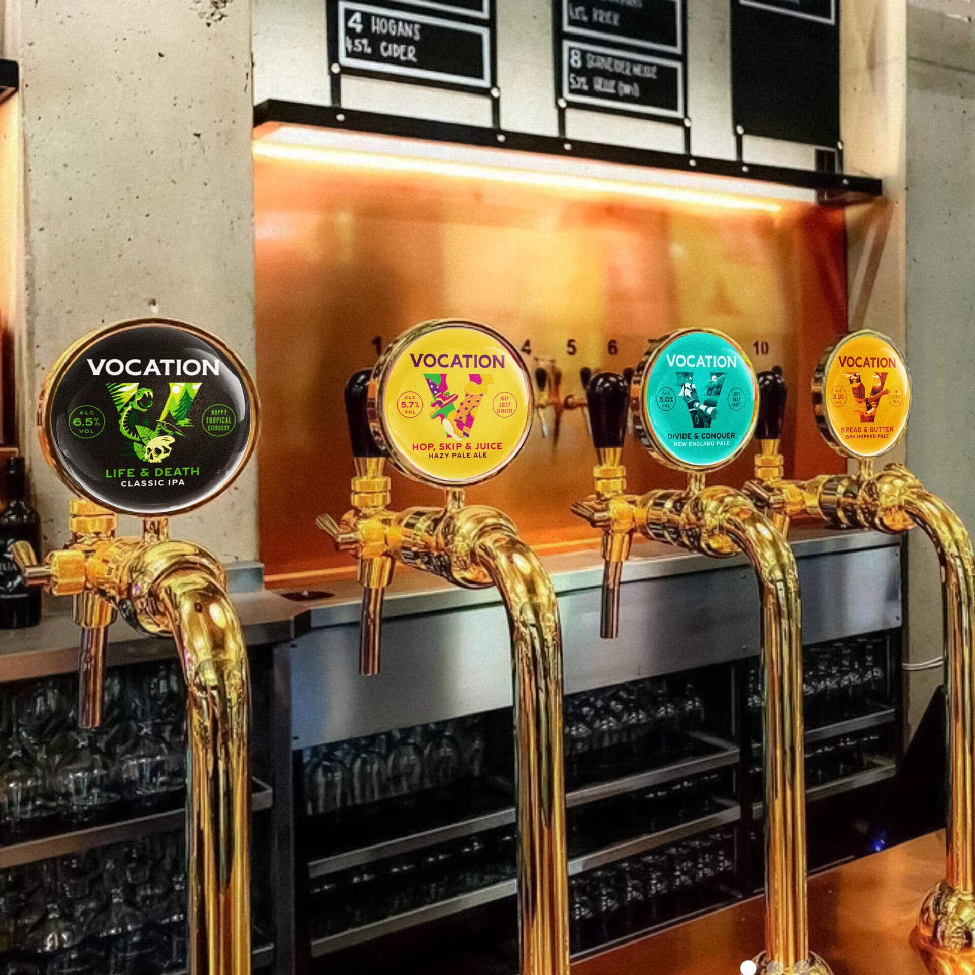
With the brewery’s aim to sell more on-trade, it became vital that Vocation had a branding system that united its offer and amplified brand recognition everywhere the beer was sold.
“If there was a new special on tap, people wouldn’t make the connection between Vocation and the Life & Death they’d seen in the supermarket. The brand was getting a bit lost,” says Ben Brears, Robot Food strategic design director. “Part of the challenge was building a bigger brand in the craft beer category, where people are a bit suspicious of big brands: it had to be more prominent, but keep all that excitement, fun and difference of craft beer.”
Simplified and amplified
The new designs exemplify Robot Food’s “simplify and amplify” approach: they’re impactful, but functional in creating cohesion across the brand while allowing for flexibility.
The strong, confident new wordmark acts as the primary logo across all brand communications, with a typographic style that pays homage to the brand’s Yorkshire roots with its heavy weighting and visual nods to industrial lettering.
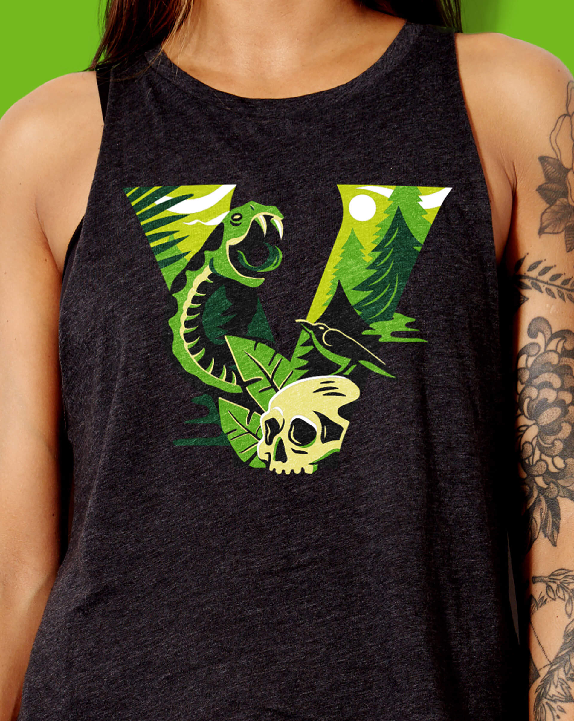
Moving away from the former black core range cans, the new packs use impactful bold colours and illustrations, to add to each beers’ own distinct personality.
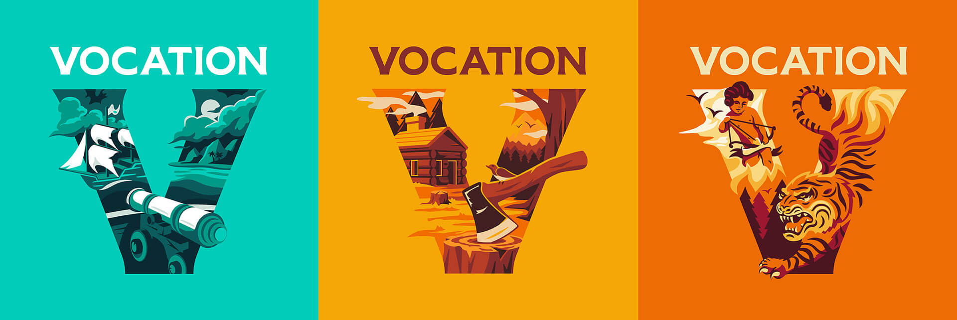
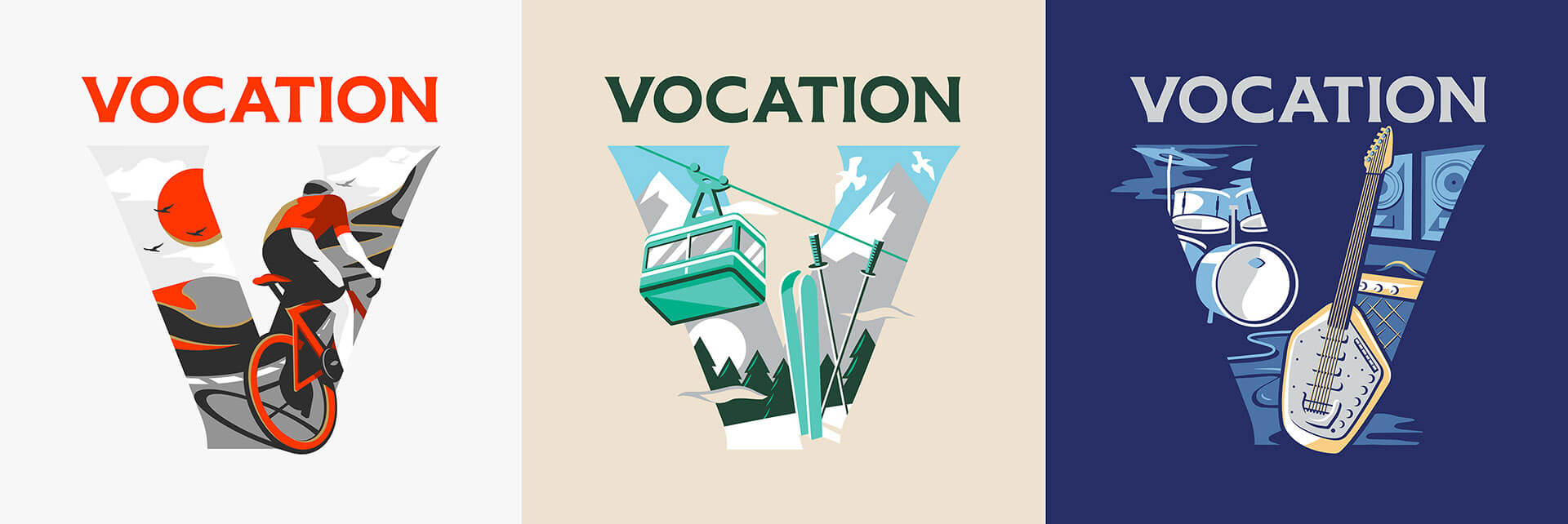
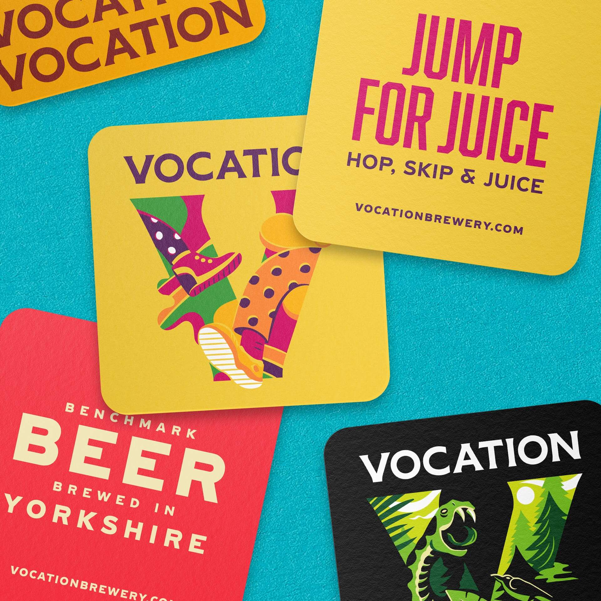
A new “Vocation V” brand icon is used to support the wordmark and create a frame for the packaging illustrations, which are brimming with personality to best reflect each beer.
Away from packaging, the V icon can be used to create visual impact, acting as a background piece to help product photography pop, for instance.
The colours used on each can are based on the previous design’s typography (such as green for Life & Death and blue for Pride & Joy) to aid recognition.
“There’s a familiarity, but as everything’s evolved the brand’s become bigger and stronger,” says Robinson. “We didn’t rip up the rule book—we just upped the weighting.”
The designs use a bespoke, specially commissioned cut of the font Hebden, created by Lewis McGuffie based on Victorian train station signage in the area, in a nod to the brewery’s Yorkshire location.
Robot Food also created a separate architecture for the designs of specials and limited-edition beers to allow for flexibility as new variants launch, while keeping the Vocation brand at the forefront.
The brand tone of voice is confident, ambitious and authoritative, but thoroughly down to earth, underscoring Vocation’s bold flavours and uncompromising quality without needing to shout the loudest, or play the underdog.
True grit
The new Vocation branding plays into the very nature of the brand itself; celebrating the perseverance, passion, talent and friendly Yorkshire grit of the brewery team for whom good beer is their vocation.
The brand isn’t about trying to be cutting edge and cool, but authenticity and inclusivity—proving the “supermarket stigma” to be irrelevant.
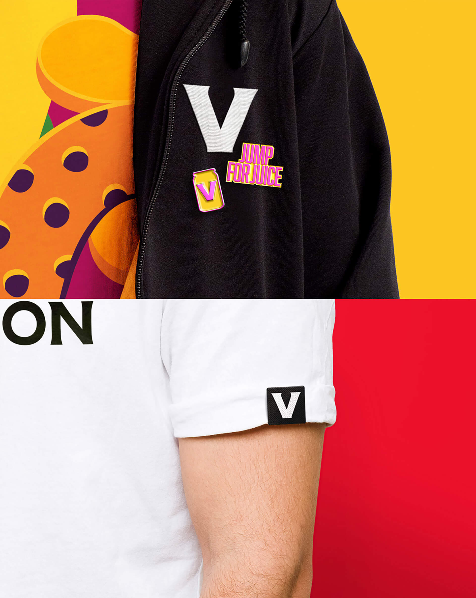
The new designs by Robot Food are used across all touchpoints including packaging, out-of-home campaign materials, digital and social touchpoints, merchandise such as t-shirts and hats, glassware, in-bar and outdoor promotion such as beer mats, umbrellas and tap lenses, and more.
![]()


Featured on Package Inspiration
We are young team which works to inspire packaging designers every day! Our team select the best packaging of today and shares with you.


