Design by:
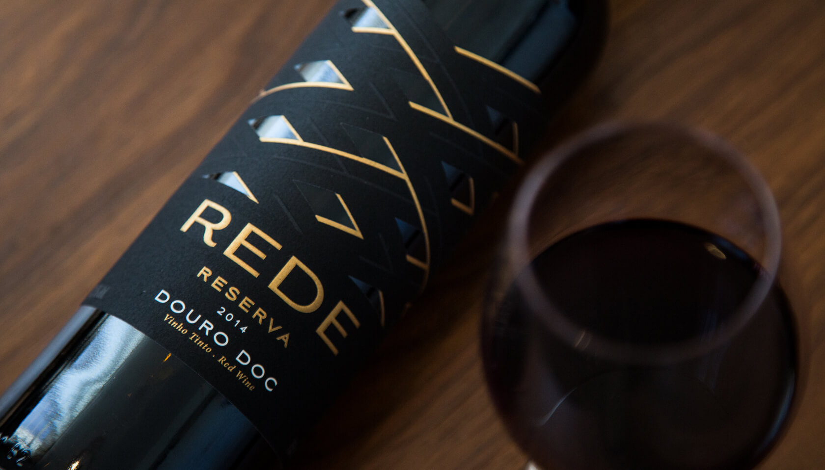
Rede – A range of labels that materializes the historical heritage of Quinta da Rede
The oldest historical records of Quinta da Rede date back to 1484, being part of the wine region of the Douro even before the demarcation of 1756. With a unique positioning and a fantastic 180º view of the river Douro at an altitude ranging from 90 to 140 meters, the memories of the time dictate that this recognized Quinta was an important point for the local economy, where the fishing nets extended from one side to the other in the Douro River. Naturally, Alves family found the inspiration necessary to give life to 4 sublime wines from the brand REDE.
The labeling signed by M&A Creative Agency, perfectly highlights the historical heritage, but with a very modern character.
The typography minimalism that strongly emphasizes the brand “REDE”, the design materializes the shape of the nets through a cutter that completely leaks sections of the label, accompanied by soft strokes of stamped color, to the high relief applied in lines, give the body to the Rede (“net”) concept.
The final result from a creative / functional point of view is a coherent, visually distinct, solid, transverse range that appeals to any generation, without discrediting Quinta da Rede’s history.
![]()
![]()
![]()
![]()
![]()
Featured on Package Inspiration
We are young team which works to inspire packaging designers every day! Our team select the best packaging of today and shares with you.

